Visualize ontology data with Microsoft Fabric IQ
In this lab, you’ll create an ontology from a notebook for a fictitious company called Lamna Healthcare. You’ll visualize entity instances, explore entity relationships through interactive graphs, and see your data through property charts and time-series visualizations.
[!IMPORTANT] Ontology in Microsoft Fabric is currently in preview.
This lab takes approximately 30 minutes to complete.
Note: You need access to a Fabric paid or trial capacity to complete this exercise. For information about the free Fabric trial, see Fabric trial. You’ll also need to enable the following tenant settings: Enable Ontology item (preview) and User can create Graph (preview).
Create a workspace
- Navigate to the Microsoft Fabric home page in a browser, and sign in with your Fabric credentials.
- In the menu bar on the left, select Workspaces (the icon looks similar to 🗇).
- Create a new workspace with a name of your choice, selecting a licensing mode in one of the following workspace types: Fabric, Fabric Trial, or Power BI Premium.
- When your new workspace opens, it should be empty.
Create the ontology from a notebook
This lab focuses on visualizing an ontology using the preview experience—examining entity instances, exploring relationships in the graph, and filtering data using the Query builder. To maximize your time working with these features, you’ll use a notebook that automates the ontology creation process, including setting up the lakehouse, eventhouse, entity types, data bindings, and relationships.
The Lamna Healthcare ontology includes sample data representing hospitals, departments, rooms, patients, vital sign equipment, and vital signs readings.
Note: If you want to learn how to build ontologies step-by-step, see the exercises on creating an ontology manually or generating an ontology from a semantic model.
-
Select setup-ontology.ipynb to open the notebook file in your browser, then right-click and save it to your local computer. If your browser saves it as
setup-ontology.ipynb.txt, rename the file to remove the.txtextension. -
In your workspace, select Import from the ribbon.
- In the Import dialog:
- Select Upload and browse to the setup-ontology.ipynb file you downloaded
- Select Open
-
Wait for the import to complete. The notebook appears in your workspace item list.
-
Select the setup-ontology notebook to open it.
The notebook contains detailed markdown cells explaining each step. It will:
- Create a lakehouse named LamnaHealthcareLH with 5 hospital data tables (Hospitals, Departments, Rooms, Patients, VitalSignEquipment)
- Create an eventhouse named LamnaHealthcareEH with time-series vital signs readings
- Build the LamnaHealthcareOntology with 5 entity types, data bindings, and relationship types via the Fabric REST API
-
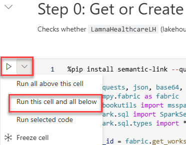
In the notebook, locate the first Python code cell under Step 0: Get or Create Infrastructure. To the left of the cell, select Run this cell and all below.
What to expect when the notebook runs
As the notebook executes, watch for these success indicators in the cell outputs:
- Step 0: Displays “✅ Infrastructure ready!” with lakehouse and eventhouse IDs
- Step 1: Shows “✅ All lakehouse tables written!” with a count of 5 tables
- Step 2: Confirms “✅ Eventhouse step complete!” (may skip ingestion if data already exists)
- Step 3: Reports “✅ Entity and relationship definitions ready!”
- Step 4: After polling, displays “✅ SUCCESS” (this step creates the ontology via REST API)
- Step 5: Lists “Ontologies in workspace:” with your ontology name marked with ✅
Troubleshooting: If Step 4 shows “❌ FAILED”, the notebook will display error details. Common causes include insufficient permissions or missing tenant settings. Verify you have the required tenant settings enabled and try re-running the notebook.
- When execution finishes, verify the following items appear in your workspace:
- LamnaHealthcareLH (lakehouse)
- LamnaHealthcareEH (eventhouse)
- LamnaHealthcareOntology (ontology)
- LamnaHealthcareOntology (graph) — automatically created with the same name as the ontology
Important: After the notebook completes, Fabric processes the data bindings and builds the graph model in the background. This processing typically completes in a few minutes, depending on capacity load and complexity. This is a one-time setup process—once complete, the ontology remains responsive. To check if data is ready, open the LamnaHealthcareOntology item, select an entity type (e.g., Departments), and select Entity type overview. If you see “Setting up your ontology” or “Updating your ontology”, wait on the page—it will automatically update when the preview experience finishes loading. Once entity instances appear, you can continue to the next section.
Now you’re ready to explore the ontology.
Explore entity instances
Now that your ontology is built and the preview experience has loaded, you can explore the entity instances—the actual data records from your lakehouse and eventhouse that populate each entity type.
View the Departments entity instances
You may already have the Departments entity type overview open from checking if the data loaded. If you navigated away:
- Return to the LamnaHealthcareOntology ontology canvas
- Select the Departments entity type to highlight it
-
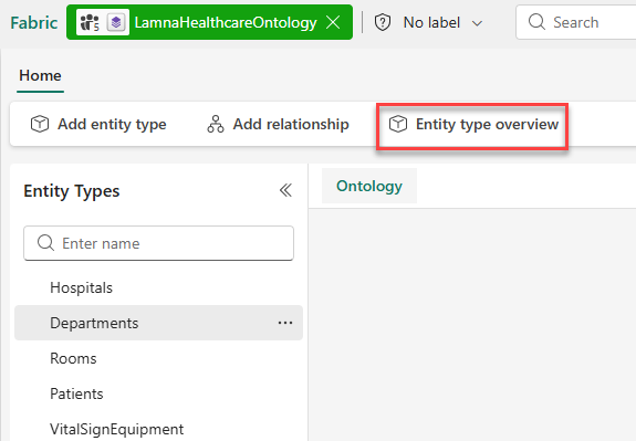
In the ribbon, select Entity type overview
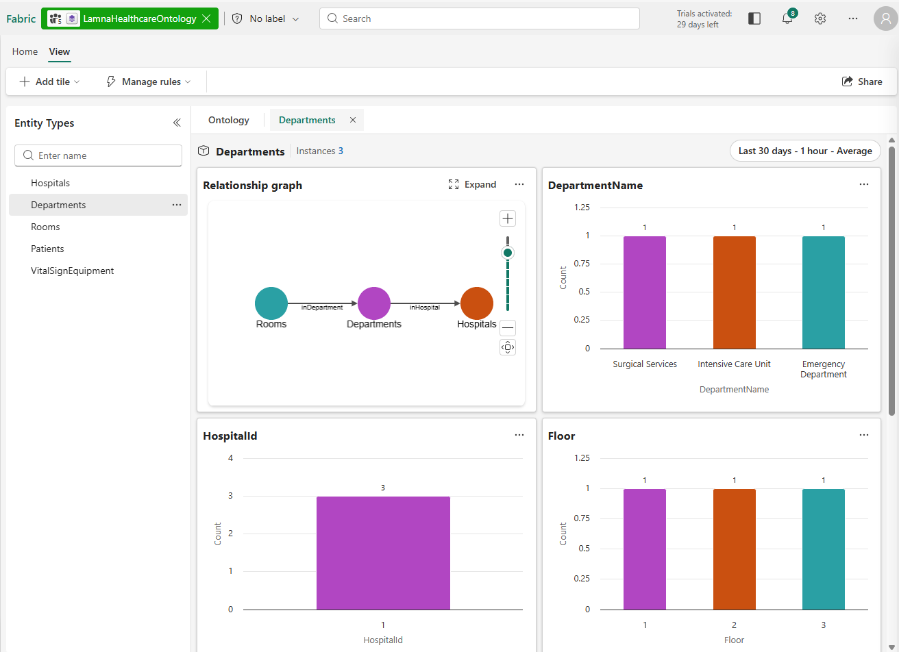
Once in the entity type overview:
- The overview page shows several tiles:
- A relationship graph tile showing how Departments connects to other entity types
- Property chart tiles visualizing the distribution of property values across the department records:
- DepartmentName: Shows the three department names in your data
- HospitalId: Shows which hospital the departments belong to (all departments belong to HospitalId 1)
- Floor: Shows the floor numbers where each department is located (floors 1, 2, and 3)
- An Entity instances table (at the bottom) listing actual department records from the lakehouse
-
Observe how the property chart tiles provide a visual summary of your data before drilling into individual records.
-
In the Entity instances table, verify you can see department records such as Intensive Care Unit, Emergency Department, and Surgical Services.
- Select any row in the Entity instances table (for example, Intensive Care Unit).
- The Instance view opens, showing:
- All property values for the selected department instance
- A relationship graph that shows the entity type connections for Departments (Rooms, and Hospitals)
- Select the X next to the Instance tab to return to the Departments entity type overview.
Explore time-series data from the eventhouse
The VitalSignEquipment entity is bound to your eventhouse for time-series data. Unlike the lakehouse entities you explored earlier (Departments, Hospitals), which contain relatively static records, the eventhouse stores continuously streaming vital signs readings—measurements captured at specific timestamps that change frequently.
Here’s how static and time-series data connect in this ontology:
- VitalSignEquipment (static): Each equipment record in the lakehouse has properties like EquipmentId, PatientId, and MonitoringStartDate that rarely change
- VitalSignsReadings (time-series): The measurements from that equipment—heart rate, oxygen saturation, respiratory rate—are captured at regular intervals in the eventhouse and associated with an equipment record
This combination lets you see both the equipment details and its real-time readings in one unified view. The entity type overview displays time-series charts showing how these measurements change over time.
- Select the VitalSignEquipment entity type on the canvas.
- In the ribbon, select Entity type overview.
- Notice that this entity type displays differently than lakehouse-bound entities:
- Time-series charts show measurements over time (HeartRate, OxygenSaturation, RespiratoryRate) in addition to the standard property distribution charts (PatientId, EquipmentType)
- The time range selector at the top controls what time period is displayed in the time-series charts
- The sample data is timestamped for when you ran the setup notebook. To view the detailed time-series charts, configure the time range selector at the top:
- Time range: Select Last 3 days
- Time granularity: Select 5 minutes
- Aggregation: Select Average
-
Observe the time-series charts showing vital sign readings (heart rate, oxygen saturation, respiratory rate) with data points at 5-minute intervals.
-
In the Entity instances tile, select an equipment ID (for example, VS-1004) to view the specific readings in the HeartRate, OxygenSaturation, and RespiratoryRate tiles.
- Return to the ontology canvas when you are finished exploring.
Visualize the relationship graph
The ontology relationship graph lets you see how entity types connect to each other and navigate through multi-hop relationships. Next, you’ll expand the graph from the Department entity and explore connections across your healthcare model.
Expand and explore the graph
- On the ontology canvas, select the Departments entity type.
- Select Entity type overview from the ribbon.
- In the relationship graph tile, select Expand.
- The graph view opens, showing entity type nodes (not actual data instances yet).
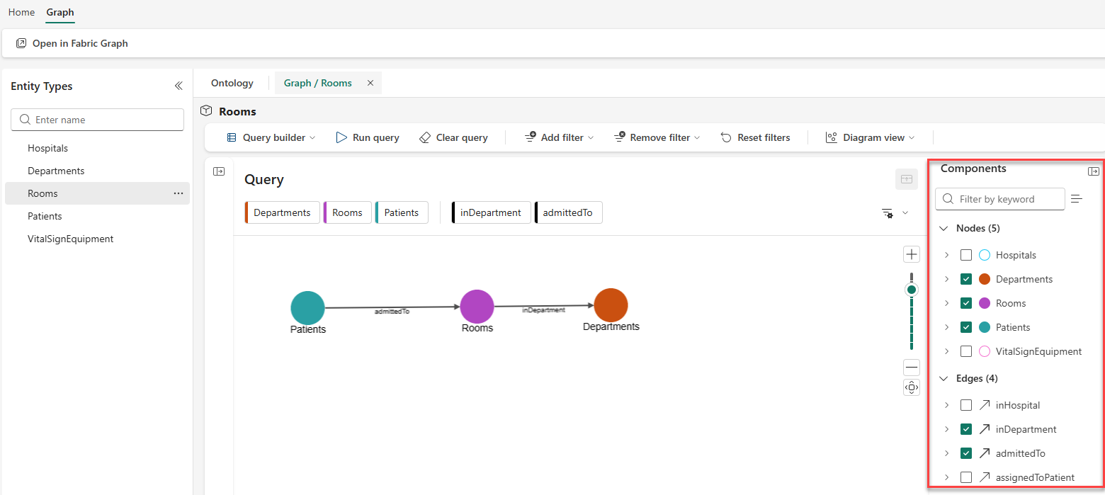
- Select Run query from the ribbon.
- The graph at the bottom of the screen now loads actual entity instances from your bound data:
- Entity type nodes expand into clusters of individual instances
- Edges show labeled relationship connections between instances (inHospital, inDepartment).
- You can add additional nodes and edges to the canvas by selecting them in the Components pane.
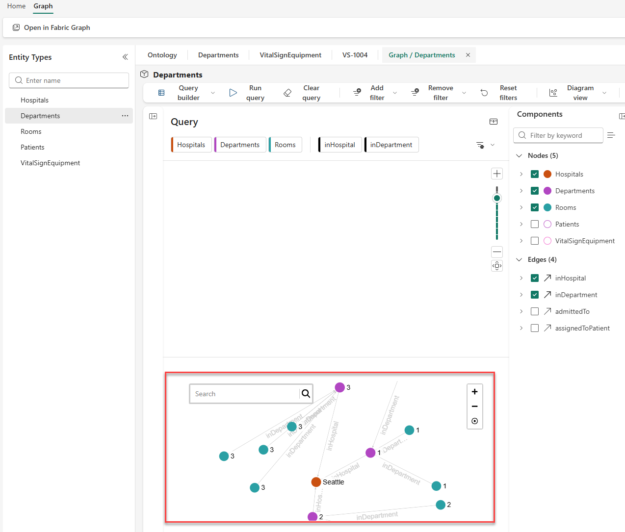
- Select the Hospitals node (labeled Seattle) to view its properties in the side panel.
- Follow the relationship edges to see how the entities connect:
- Departments connect to hospitals via inHospital edges
- Rooms connect to departments via inDepartment edges
Note: You can zoom and pan in the graph view using your mouse or the controls in the bottom-right corner. Double-click a node to center and zoom on it.
- When finished exploring, close the graph view.
Filter data with the Query builder
The Query builder lets you filter and shape the data you retrieve from the ontology graph. You’ll create two filtered views: one to find patients in a specific department, and another that uses the Add a node feature to include monitoring equipment in your results.
Find patients in the Intensive Care Unit department
- From the ontology canvas, select Entity type overview on the Rooms entity type, then select Expand on the relationship graph tile to open the graph view.
- In the Query builder ribbon, select Add filter.
- Configure the filter:
- Entity type: Departments
- Property: DepartmentName
- Operator: equals
- Value: Intensive Care Unit
- In the Components pane, check only the following items:
- Entity types: Departments, Rooms, Patients
- Relationships: inDepartment, admittedTo
- Uncheck all other entity types and relationships
- Select Run query.
- The graph now shows only:
- The Intensive Care Unit department instance
- Rooms that belong to ICU (inDepartment relationship)
- Patients admitted to those rooms (admittedTo relationship)
- Above the graph visualization, locate the Diagram view mode selector and explore the three result views:
- Diagram: Interactive graph structure (current view)
- Card: Property values displayed as cards for each instance
- Table: Tabular rows and columns format
- Switch to Card view to see each patient’s details displayed in individual cards.
- In Card view, notice the Index by dropdown at the top. This lets you organize the cards by different entity types in your query results.
- Try selecting Departments or Rooms from the dropdown to see how the data reorganizes around that entity type.
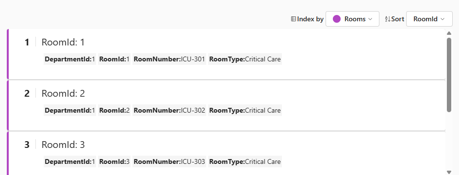
- Switch to Table view to see a spreadsheet-like format of your query results.
- Return to Diagram view.
- In the ribbon, select Clear query to reset the graph.
Find monitoring equipment for ICU patients
This query demonstrates the Add a node feature, which lets you include additional entity types in your query results.
- In the graph view, you should have a cleared query from the previous step.
- In the Query canvas, select Add a node.
-
Select VitalSignEquipment from the list of available entity types. This adds VitalSignEquipment to your query canvas.
Note: Adding a node only includes that specific entity type in your query. To see how VitalSignEquipment connects to patients, rooms, and departments, you need to select additional components.
-
Open the Components pane (if not already open). Notice that only VitalSignEquipment is checked under Nodes, and no Edges (relationships) are selected.
- In the Components pane, add the other entity types and relationships needed to connect VitalSignEquipment back to departments:
- Nodes: Select: Departments, Rooms, and Patients (VitalSignEquipment is already checked)
- Edges: Select: inDepartment, admittedTo, and assignedToPatient
- Select Add filter and configure:
- Entity type: Departments
- Property: DepartmentName
- Operator: equals
- Value: Intensive Care Unit
- Select Run query.
- The graph now shows the complete chain from ICU department through rooms and patients to their vital sign monitoring equipment.
- Select a VitalSignEquipment node to view its properties, including the patient it monitors and when monitoring began.
Clean up resources
If you’re finished exploring Fabric IQ ontologies, you can delete the workspace you created for this exercise.
- In the bar on the left, select the icon for your workspace.
- In the toolbar, select Workspace settings.
- In the General section, select Remove this workspace.
- Select Delete to confirm deletion.
Summary
In this exercise, you explored the Lamna Healthcare ontology to understand how bound data populates entity types. You:
- Examined entity instances in the overview page and instance view
- Explored time-series data from the eventhouse with date range filtering
- Visualized multi-hop relationships in the graph (Departments → Rooms → Patients → VitalSignEquipment)
- Filtered data using the Query builder and Components pane
- Used the Add a node feature to extend your filtered views
These visualization capabilities let you explore your business data through the lens of the ontology model, following relationships across multiple data sources without writing complex queries.