Design scalable semantic models
In this exercise, you will work with DAX functions to enhance flexibility and efficiency of data models, particularly through features like calculation groups and field parameters. By using these features together, you can make interactive reports without needing multiple visuals or complex DAX expressions, creating highly flexible and scalable semantic models.
In this exercise, you learn how to:
- Use DAX functions to modify relationship behavior.
- Create calculation groups and apply them in dynamic time intelligence calculations.
- Create field parameters to dynamically select and display different fields and measures.
This lab takes approximately 30 minutes to complete.
Before you start
-
Download the Sales Analysis starter file from
https://github.com/MicrosoftLearning/mslearn-fabric/raw/main/Allfiles/Labs/15/15-scalable-semantic-models.zipand save it locally. -
Extract the folder to the C:\Users\Student\Downloads\15-scalable-semantic-models folder.
-
Open the 15-Starter-Sales Analysis.pbix file.
Ignore and close any warnings asking to apply changes - don’t select Discard changes.
Work with relationships
In this task, you will open a pre-developed Power BI Desktop solution to learn about the data model. You will then explore the behavior of active model relationships.
-
In Power BI Desktop, at the left, switch to Model view.

-
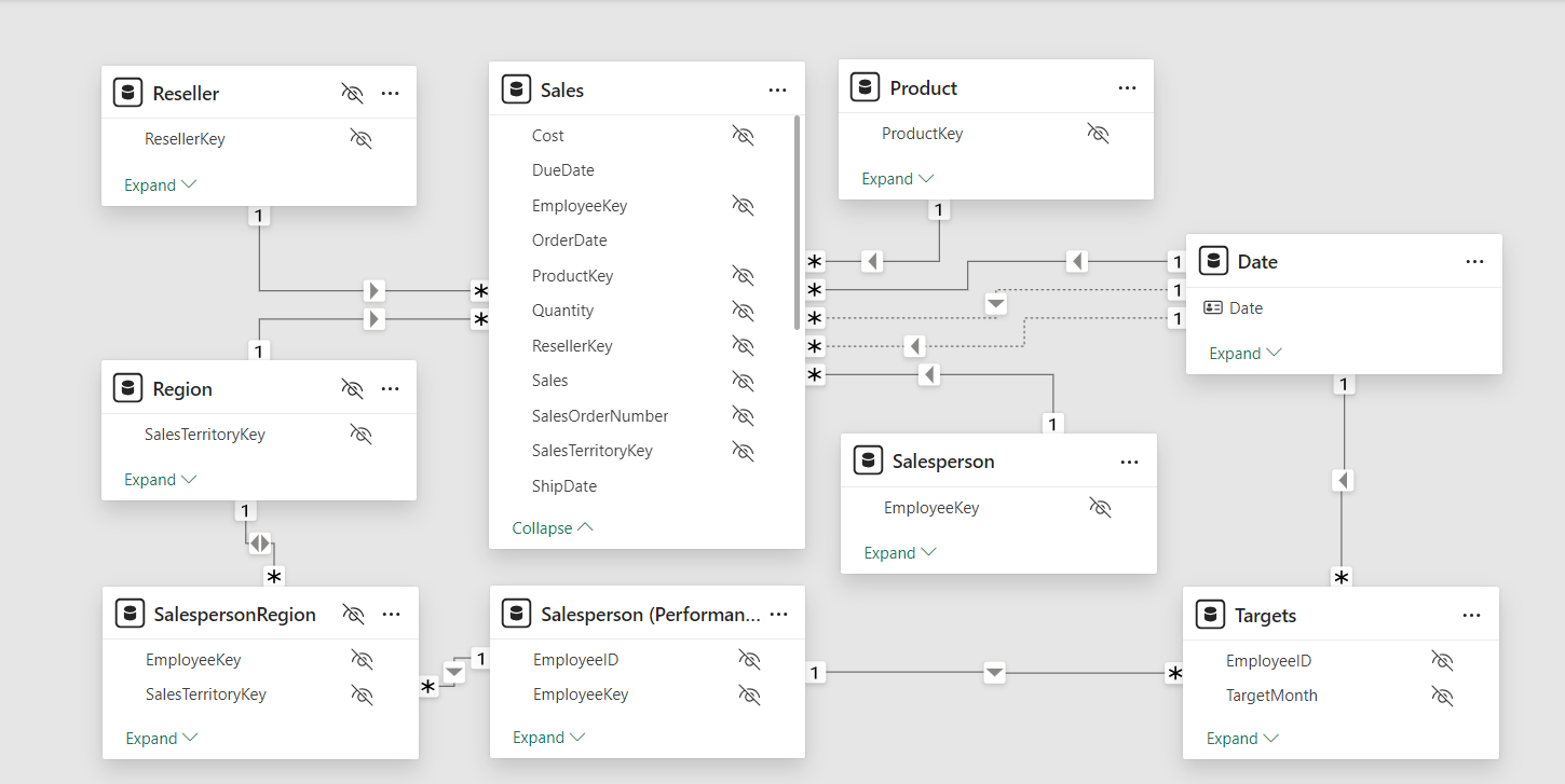
Use the model diagram to review the model design.
-
Notice that there are three relationships between the Date and Sales tables.
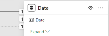
The Date column in the Date table is a unique column representing the “one” side of the relationships. Filters applied to any column of the Date table propagate to the Sales table using one of the relationships.*
-
Hover the cursor over each of the three relationships to highlight the “many” side column in the Sales table.
-
Notice that the relationship between Date and OrderDate is active. The current model design indicates that the Date table is a role-playing dimension. This dimension could play the role of order date, due date, or ship date. Which role depends on the analytical requirements of the report.
We’ll use DAX later to use these inactive relationships without creating another table just to get two active relationships for different date columns.
Visualize sales data by date
In this task, you will visualize the total sales by year and use inactive relationships.
-
Switch to Report view.

-
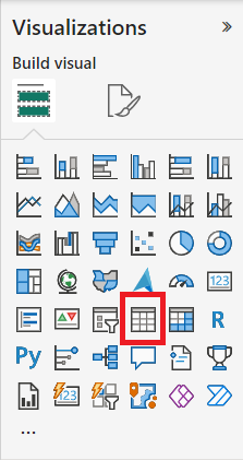
To add a table visual, in the Visualizations pane, select the Table visual icon.
-
To add columns to the table visual, in the Data pane (located at the right), first expand the Date table.
-
Drag the Year column and drop it into the table visual.
-
Expand open the Sales table, and then drag and drop the Total Sales column into the table visual.
-
Review the table visual.
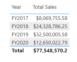
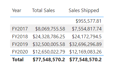
The table visual shows the sum of the Total Sales column grouped by year. But what does Year mean? Because there’s an active relationship between the Date and Sales tables to the OrderDate column, Year means the fiscal year in which the orders were made.
Use inactive relationships
In this task, you will use the USERELATIONSHIP function to make an inactive relationship active.
-
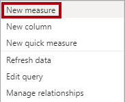
In the Data pane, right-click the Sales table, and then select New measure.
-
In the formula bar (located beneath the ribbon), replace the text with the following measure definition, and then press Enter.
 Sales Shipped =
 CALCULATE (
 SUM ('Sales'[Sales]),
 USERELATIONSHIP('Date'[Date], 'Sales'[ShipDate])
 )
This formula uses the CALCULATE function to modify the filter context. It’s the USERELATIONSHIP function that makes the ShipDate relationship active, only for this measure.
-
Add the Sales Shipped measure to the table visual.
-
Widen the table visual so all columns are fully visible. Observe that the Total row is the same but the sales amount for each year in Total Sales and Sales Shipped is different. That difference is due to orders being received in a given year while being shipped only in the following year or that are not even shipped yet.
Creating measures that temporarily set relationships as active is one way to work with role-playing dimensions. However, it can become tedious when there’s a need to create role-playing versions for many measures. For example, if there were 10 sales-related measures and three role-playing dates, it could mean creating 30 measures. Creating them with calculation groups makes the process easier.
Create calculation groups
In this task, you will create a calculation group for Time Intelligence analysis.
-
Switch to Model view.
-
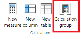
In the Model view, select Calculation Group to create a new calculation group table, group column, and item. If a warning window pops up, select Yes to confirm the creation of the calculation group.
Note: An implicit measure occurs when, in the Report view, you use a data column from the Data pane directly in a visual. The visual allows you to aggregate it as a SUM, AVERAGE, MIN, MAX, or some other basic aggregation, which becomes an implicit measure. Once you create a calculation group, Power BI Desktop won’t create implicit measures anymore, meaning you must create measures explicitly to aggregate data columns.
-
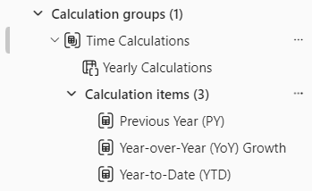
Rename the calculation group to Time Calculations and the calculation column to Yearly Calculations.
-
In the Model tab of the Data pane, select the calculation item automatically created with your calculation group.
-
Replace and commit the item’s formula with the following:
Year-to-Date (YTD) = CALCULATE(SELECTEDMEASURE(), DATESYTD('Date'[Date])) -
Right-click on the Calculation items field and select New calculation item.
-
Use the following DAX formula for the new item:
Previous Year (PY) = CALCULATE(SELECTEDMEASURE(), PREVIOUSYEAR('Date'[Date])) -
Create a third item with the following DAX formula:
Year-over-Year (YoY) Growth =
VAR MeasurePriorYear =
CALCULATE(
    SELECTEDMEASURE(),
    SAMEPERIODLASTYEAR('Date'[Date])
)
RETURN
DIVIDE(
    (SELECTEDMEASURE() - MeasurePriorYear),
    MeasurePriorYear
)
The last calculation item should return values in percentage only, so it needs a dynamic format string to change the format of the measures it affects.
-
In the Properties pane of the YoY item, enable the Dynamic format string feature.
-
In the DAX formula bar, verify that the field to its left is set as Format, and write the following format string:
"0.##%" -
Confirm that your calculation group looks as follows:
Apply a calculation group to measures
In this task, you will visualize how the calculation items affect measures in a visual.
-
Switch to Report view.
-
At the bottom of the canvas, select the Overview tab.
-
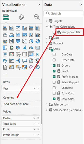
Select the matrix visual already created in the canvas and drag the Yearly Calculations calculation column from the Data pane to the Columns field in the Visualizations pane.
-
Observe that now the matrix has a set of sales figures for each calculation item.

Having all this information in one visual at once can be hard to read and therefore, it would be convenient to limit the visual to one sales figure at a time. In order to do that, we can use a field parameter.
Create field parameters
In this task, you will create field parameters to change visuals.
-
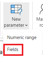
Select the Modeling tab in the top ribbon, then expand the New parameter button and select Fields.
-
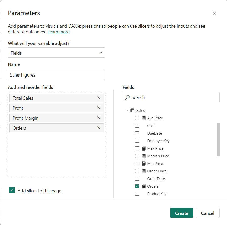
In the Parameters window, rename the parameter to Sales Figures, verify that the option Add slicer to this page is checked, and add the following fields from the Sales table:
- Total Sales
- Profit
- Profit Margin
- Orders
-
Select Create.
-
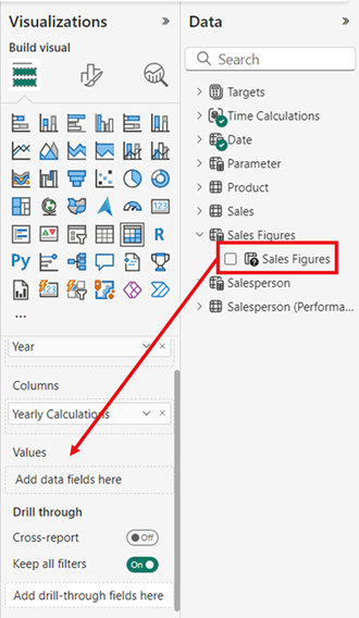
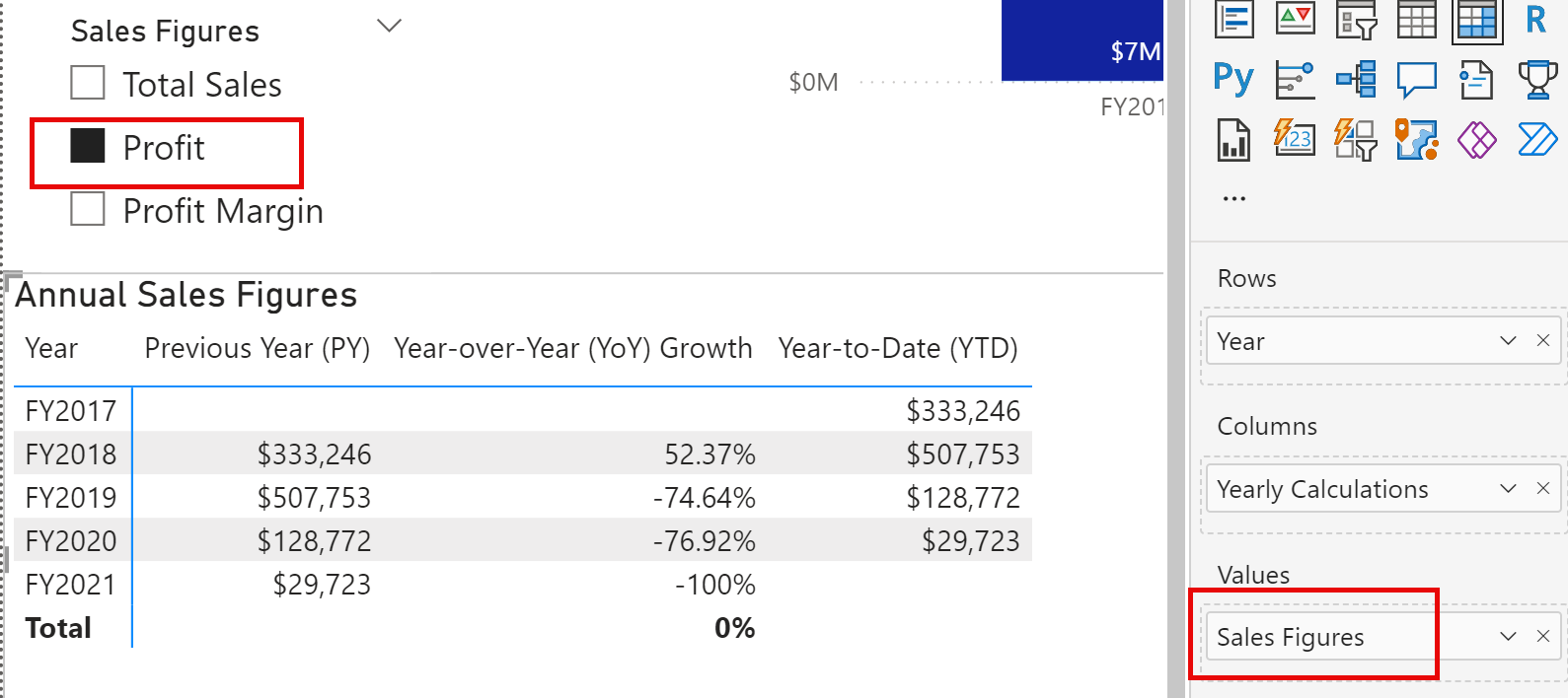
Once the slicer is created, you can select the matrix and remove all fields from Values in the Visualizations pane and add instead the Sales Figures field parameter.
-
Check the different sales figures in the slicer and how the matrix changes when each of them is selected.
-
See how the Profit field is selected using the slicer for the Sales Figures field parameter. This is the same matrix from above, so you can see the three calculation items (PY, YoY, YTD) but only applied to Profit because of the slicer.
Edit field parameters
In this task, you will edit the Sales Figures field parameter by directly modifying its DAX expression.
-
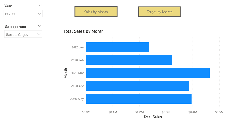
Select the Salesperson Performance tab at the bottom of the canvas. Notice the clustered bar chart to switch the chart between Sales by Month and Target by Month.
While creating the bookmark buttons allows you to change the visual type with each option, if you need to switch between many measures, you will have to create a bookmark button for each of them and that can be very time consuming. Instead, we can use a field parameter with all the measures we want to analyze and quickly switch between them.
-
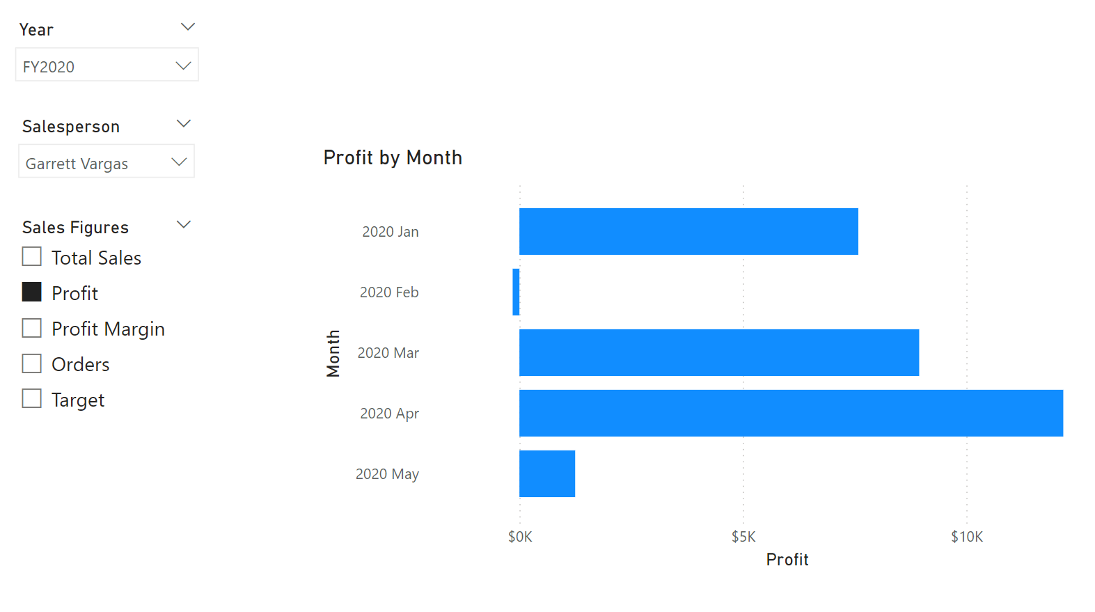
Select the bar chart visual and replace the Total Sales field in X-axis with the Sales Figures field parameter.
-
Create a Slicer visual and drag the Sales Figures parameter to the Field area.
For this visual you still need to evaluate the Target by Month, which is not in the field parameter.
-
Select the Sales Figures parameter in the Data pane and add the Target field in the parameter’s DAX expression as below:
Sales Figures = { ("Total Sales", NAMEOF('Sales'[Total Sales]), 0), ("Profit", NAMEOF('Sales'[Profit]), 1), ("Profit Margin", NAMEOF('Sales'[Profit Margin]), 2), ("Orders", NAMEOF('Sales'[Orders]), 3), ("Target", NAMEOF('Targets'[Target]), 4) } -
Commit the changes and verify that the visual changes as you select the different Sales figures.
-
Delete the bookmark buttons, and observe the final state of the report page.
Lab complete
To finish the exercise, close Power BI Desktop - no need to save the file.