Create and explore a semantic model
In this exercise, you’ll use Microsoft Fabric to develop a data model for the sample NY Taxi data in a data warehouse.
You’ll practice:
- Creating a custom semantic model from a Fabric data warehouse.
- Create relationships and organize the model diagram.
- Explore the data in your semantic model directly in Fabric.
This lab takes approximately 30 minutes to complete.
Note: You need a Microsoft Fabric trial to complete this exercise.
Create a workspace
Before working with data in Fabric, create a workspace with the Fabric trial enabled.
- Navigate to the Microsoft Fabric home page at
https://app.fabric.microsoft.com/home?experience=fabricin a browser and sign in with your Fabric credentials. - In the menu bar on the left, select Workspaces (the icon looks similar to 🗇).
- Create a new workspace with a name of your choice, selecting a licensing mode that includes Fabric capacity (Trial, Premium, or Fabric).
- When your new workspace opens, it should be empty.
Create a data warehouse and load sample data
Now that you have a workspace, it’s time to create a data warehouse:
-
On the menu bar on the left, select Create. In the New page, under the Data Warehouse section, select Warehouse. Give it a unique name of your choice.
Note: If the Create option is not pinned to the sidebar, you need to select the ellipsis (…) option first.
After a minute or so, a new warehouse will be created:
-
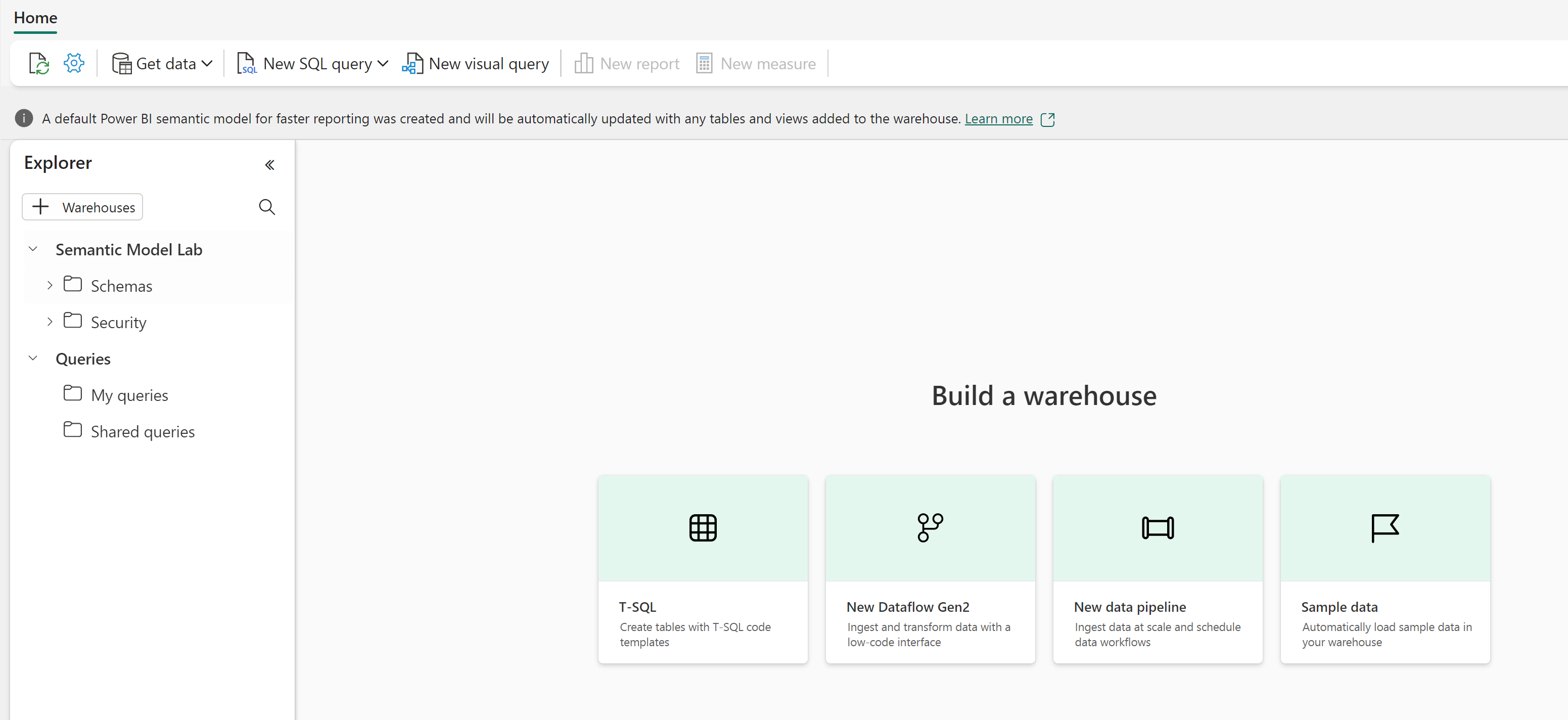
In the center of the data warehouse user interface, you’ll see a few different ways to load data into your warehouse. Select Sample data to load NYC Taxi data into your data warehouse. This will take a couple of minutes.
-
After your sample data has loaded, use the Explorer pane on the left to see what tables and views already exist in the sample data warehouse.
-
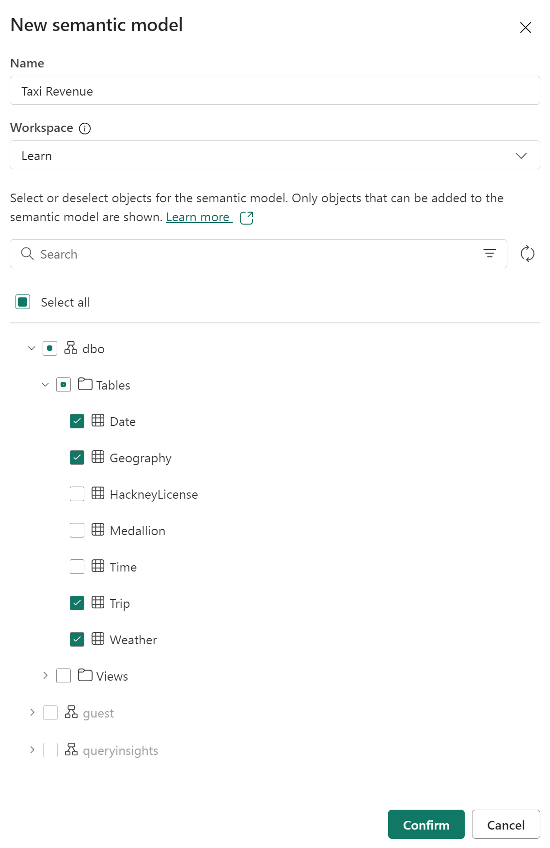
Select the Reporting tab of the ribbon and choose New semantic model. This enables you to create a new semantic model using only specific tables and views from your data warehouse, for use by data teams and the business to build reports.
-
Name the semantic model Taxi Revenue, ensure it’s in the workspace you just created, and select the following tables:
- Date
- Trip
- Geography
- Weather
Create relationships between tables
Now you’ll create relationships between the tables to accurrately analyze and visualize your data. If you’re familiar with creating relationships in Power BI desktop, this will look familiar.
-
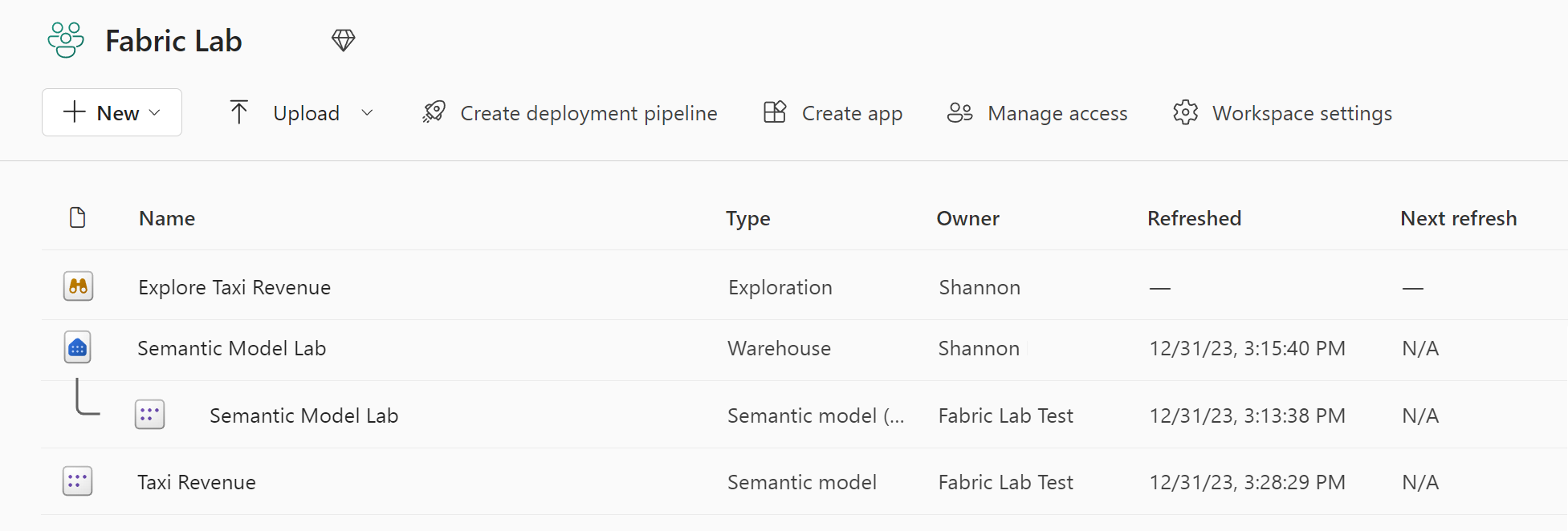
Navigate back to your workspace and confirm that you see your new semantic model, Taxi Revenue. Notice that the item type is Semantic model, as opposed to the Semantic model (default) that is automatically created when you create a data warehouse.
Note: A default semantic model is created automatically when you create a Warehouse or SQL analytics endpoint in Microsoft Fabric, and it inherits the business logic from the parent Lakehouse or Warehouse. A semantic model that you create yourself, as we’ve done here, is a custom model that you can design and modify according to your specific needs and preferences. You can create a custom semantic model by using Power BI Desktop, Power BI service, or other tools that connect to Microsoft Fabric.
-
Select Open data model from the ribbon.
Now, you’ll create relationships between the tables. If you’re familiar with creating relationships in Power BI desktop, this will look familiar!
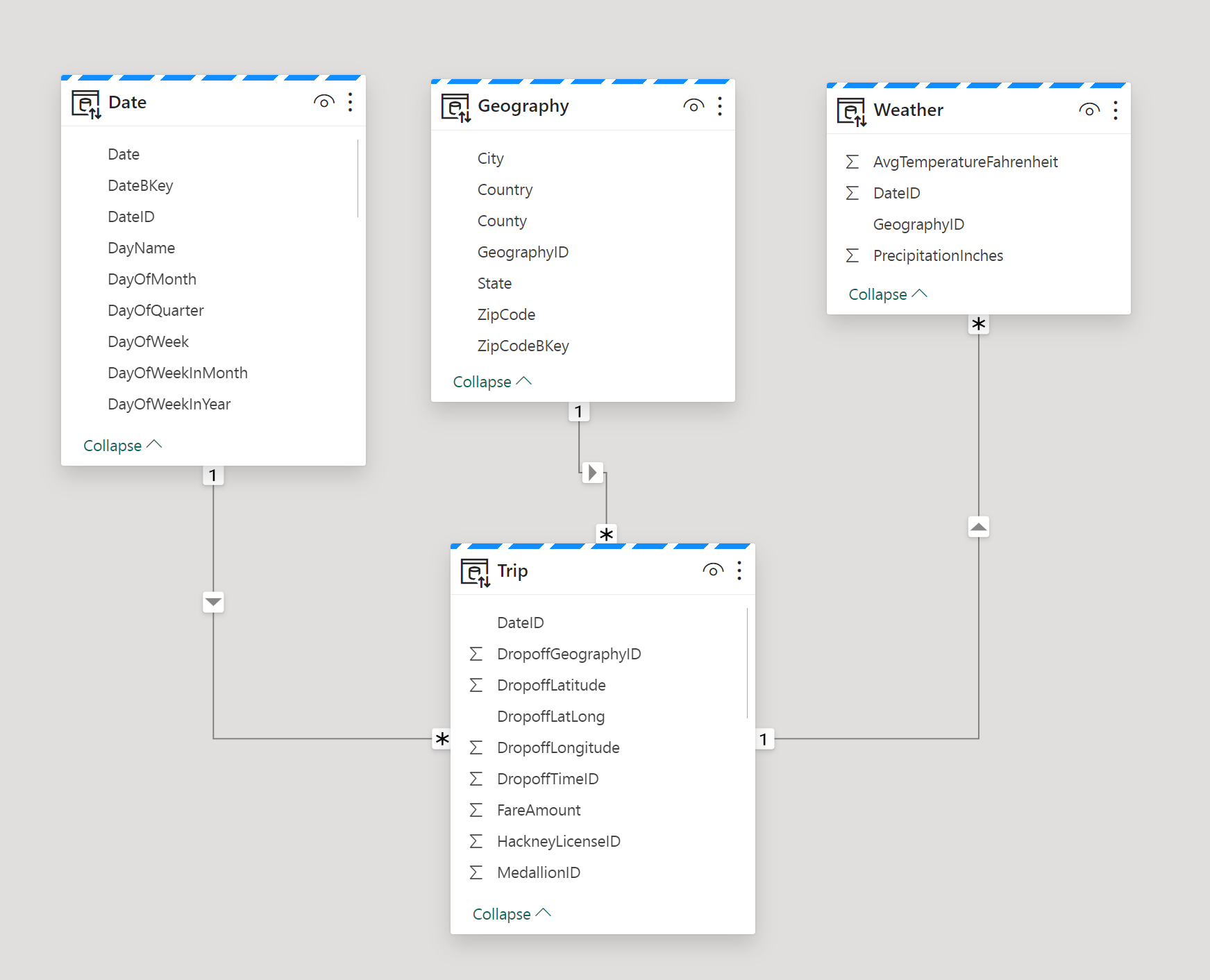
Reviewing the star schema concept, we’ll organize the tables in our model into a Fact table and Dimension tables. In this model, the Trip table is our fact table, and our dimensions are Date, Geography, and Weather.
-
Create a relationship between the Date table and the Trip table using the DateID column.
Select the DateID column in the Date table and drag and drop it on top of the DateID column in the Trip table.
Ensure the relationship is a One to many relationship from the Date table to the Trip table.
-
Create two more relationships to the Trip fact table as follows:
- Geography [GeographyID] to Trip [DropoffGeographyID] (1:Many)
- Weather [GeographyID] to Trip [DropoffGeographyID] (1:Many)
Note: you need to change the relationship default cardinality to 1:Many for both relationships.
-
Drag the tables into position so that the Trip fact table is located at the bottom of the diagram, and the remaining tables, which are dimension tables, are located around the fact table.
The creation of the star schema model is now complete. There are many modeling configurations that could now be applied, like adding hierarchies, calculations, and setting properties like column visibility.
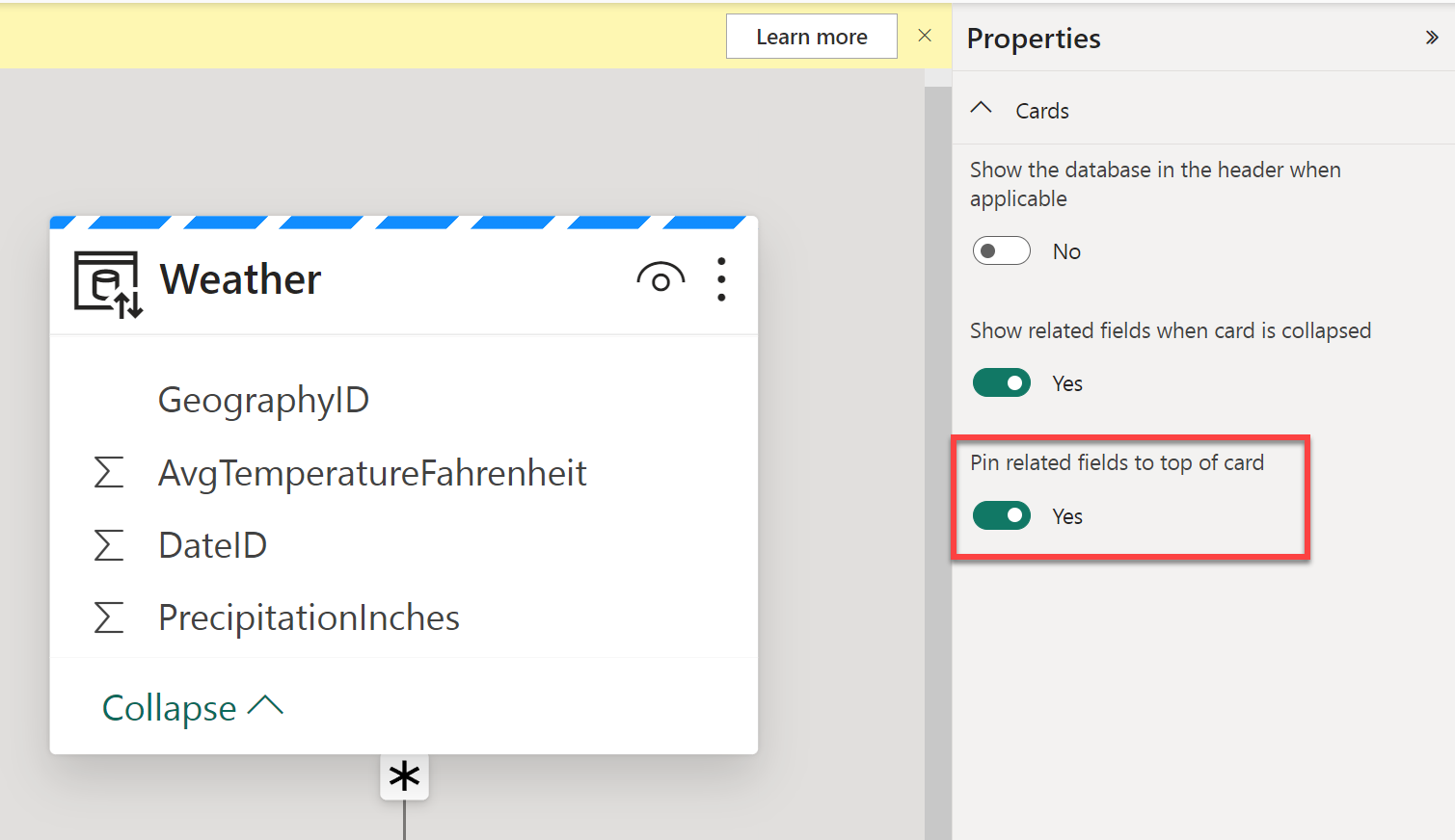
Tip: In the Properties pane of the window, toggle Pin related fields to top of card to Yes. This will help you (and others reporting off of this model) see which fields are being used in relationships at a glance. You can also interact with the fields in your tables using the properties pane. For example, if you want to confirm data types are set properly, you can select a field and review the format in the properties pane.
Explore your data
You now have a semantic model built off your warehouse that has relationships established that are necessary for reporting. Let’s take a look at the data using the Explore data feature.
-
Navigate back to your workspace and select your Taxi Revenue semantic model.
-
In the window, select Explore this data from the ribbon. Here you’ll take a look at your data in tabular format. This offers a focused experience to explore your data without creating a full Power BI report.
-
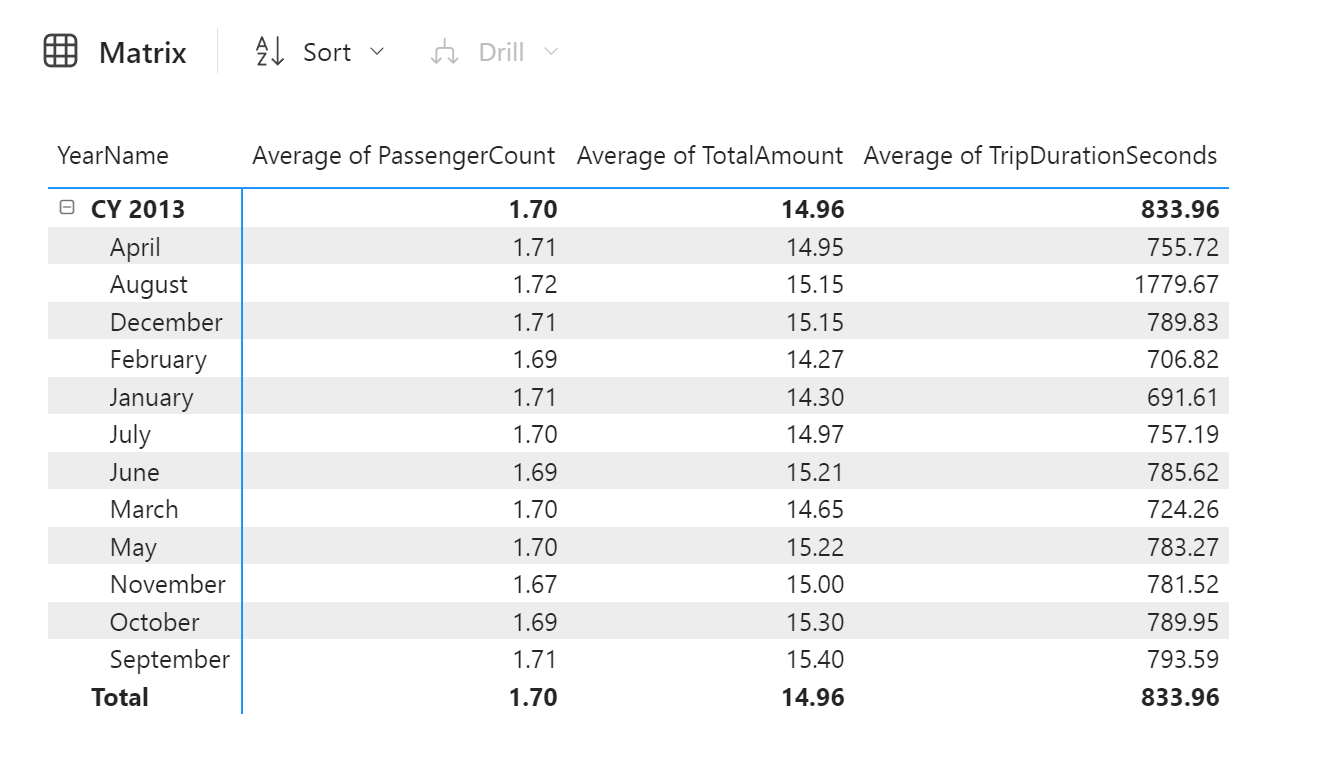
Add YearName and MonthName to the rows, and explore the average number of passengers, average trip amount, and average trip duration in the values field well.
When you drag and drop a numeric field into the explore pane, it will default to summarize the number. To change the aggregation from Summarize to Average, select the field and change the aggregation in the popup window.
-
To look at this data as a visual rather than just a matrix, select Visual at the bottom of the window. Select a bar chart to quickly visualize this data.
A bar chart is not the best way to look at this data. Play around with the different visuals and the fields you’re looking at in the “Rearrange data” section of the Data pane on the right side of the screen.
-
You can now save this Exploration view to your workspace by clicking the Save button in the top left corner. You also have the ability to Share the view by selecting Share in the upper right corner. This will enable you to share the data exploration with colleagues.
-
After you have Saved your exploration, navigate back to your workspace to see your data warehouse, default semantic model, the semantic model you created, and your exploration.