Get started with Real-Time Dashboards in Microsoft Fabric
Real-time dashboards in Microsoft Fabric enable you to visualize and explore streaming data using the Kusto Query Language (KQL). In this exercise, you’ll explore how to create and use a real-time dashboard based on a real-time data source.
This lab takes approximately 25 minutes to complete.
Create a workspace
Note: You need access to a Fabric paid or trial capacity to complete this exercise. For information about the free Fabric trial, see Fabric trial.
- Navigate to the Microsoft Fabric home page at
https://app.fabric.microsoft.com/home?experience=fabricin a browser and sign in with your Fabric credentials. - In the menu bar on the left, select Workspaces (the icon looks similar to 🗇).
- Create a new workspace with a name of your choice, selecting a licensing mode that includes Fabric capacity (Trial, Premium, or Fabric).
-
When your new workspace opens, it should be empty.
Create an eventhouse
Now that you have a workspace, you can start creating the Fabric items you’ll need for your real-time intelligence solution. we’ll start by creating an eventhouse.
-
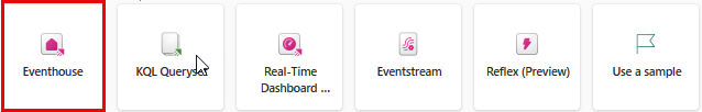
On the menu bar on the left, select Create. In the New page, under the Real-Time Inteligence section, select Eventhouse. Give it a unique name of your choice.
Note: If the Create option is not pinned to the sidebar, you need to select the ellipsis (…) option first.
-
Close any tips or prompts that are displayed until you see your new empty eventhouse.
- In the pane on the left, note that your eventhouse contains a KQL database with the same name as the eventhouse.
- Select the KQL database to view it.
Create an eventstream
Currently there are no tables in the database. We’ll use an eventstream to load data from a real-time source into a table.
- In the main page of your KQL database, select Get data.
-
For the data source, select Eventstream > New eventstream. Name the eventstream
Bicycle-data.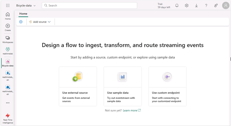
The creation of your new event stream in the workspace will be completed in just a few moments. Once established, you will be automatically redirected to select a data source for your eventstream.
- Select Use sample data.
-
Name the source name
Bicycles, and select the Bicycles sample data.Your stream will be mapped and you will be automatically displayed on the eventstream canvas.
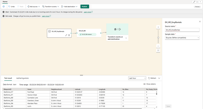
- In the Add destination drop-down list, select Eventhouse.
- In the Eventhouse pane, configure the following setup options.
- Data ingestion mode: Event processing before ingestion
- Destination name:
bikes-table - Workspace: Select the workspace you created at the beginning of this exercise
- Eventhouse: Select your eventhouse
- KQL database: Select your KQL database
- Destination table: Create a new table named
bikes - Input data format: JSON
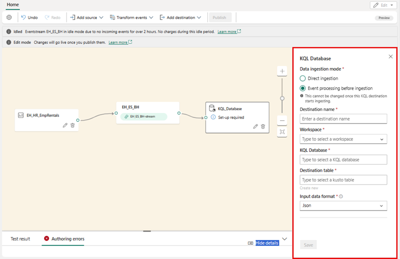
- In the Eventhouse pane, select Save.
- Connect the Bicycles-data node’s output to the bikes-table node, then select Publish.
-
Wait a minute or so for the data destination to become active. Then select the bikes-table node in the design canvas and view the Data preview pane underneath to see the latest data that has been ingested:
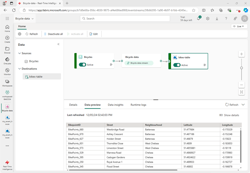
- Wait a few minutes and then use the Refresh button to refresh the Data preview pane. The stream is running perpetually, so new data may have been added to the table.
Create a real-time dashboard
Now that you have a stream of real-time data being loaded into a table in the eventhouse, you can visualize it with a real-time dashboard.
-
On the menu bar on the left, select Create. In the New page, under the Real-Time Inteligence section, select Real-Time Dashboard and name it
bikes-dashboard.Note: If the Create option is not pinned to the sidebar, you need to select the ellipsis (…) option first.
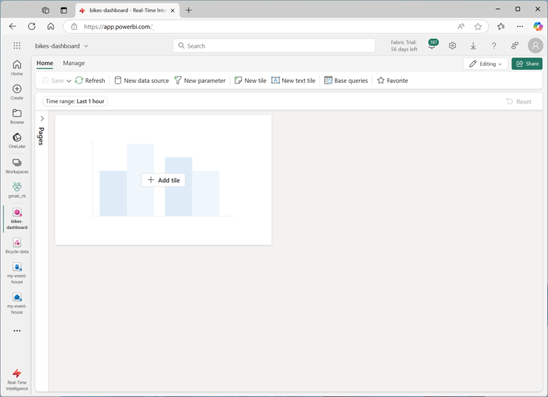
A new empty dashboard is created.
- In the toolbar, select New data source, and then select Eventhouse / KQL Database. Then select your eventhouse and create a new data source with the following settings:
- Display name:
Bike Rental Data - Database: The default database in your eventhouse.
- Passthrough identity: Selected
- Display name:
- Select Add.
- On the dashboard design canvas, select Add tile.
-
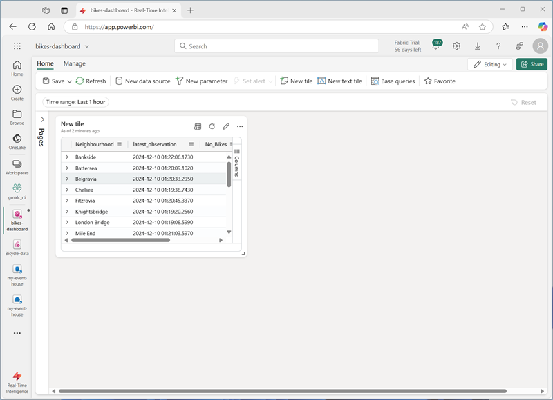
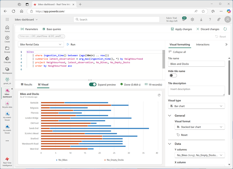
In the query editor, ensure that the Bike Rental Data source is selected and enter the following KQL code:
bikes | where ingestion_time() between (ago(30min) .. now()) | summarize latest_observation = arg_max(ingestion_time(), *) by Neighbourhood | project Neighbourhood, latest_observation, No_Bikes, No_Empty_Docks | order by Neighbourhood asc - Run the query, which shows the number of bikes and empty bike docks observed in each neighbourhood in the last 30 minutes.
-
Apply the changes to see the data shown in a table in the tile on the dashboard.
- On the tile, select the Edit icon (which looks like a pencil). Then in the Visual Formatting pane, set the following properties:
- Tile name: Bikes and Docks
- Visual type: Bar chart
- Visual format: Stacked bar chart
- Y columns: No_Bikes, No-Empty_Docks
- X column: Neighbourhood
- Series columns: infer
- Legend location: Bottom
Your edited time should look like this:
-
Apply the changes and then resize the tile to take up the full height of the left side of the dashboard.
- In the toolbar, select New tile
-
In the query editor, ensure that the Bike Rental Data source is selected and enter the following KQL code:
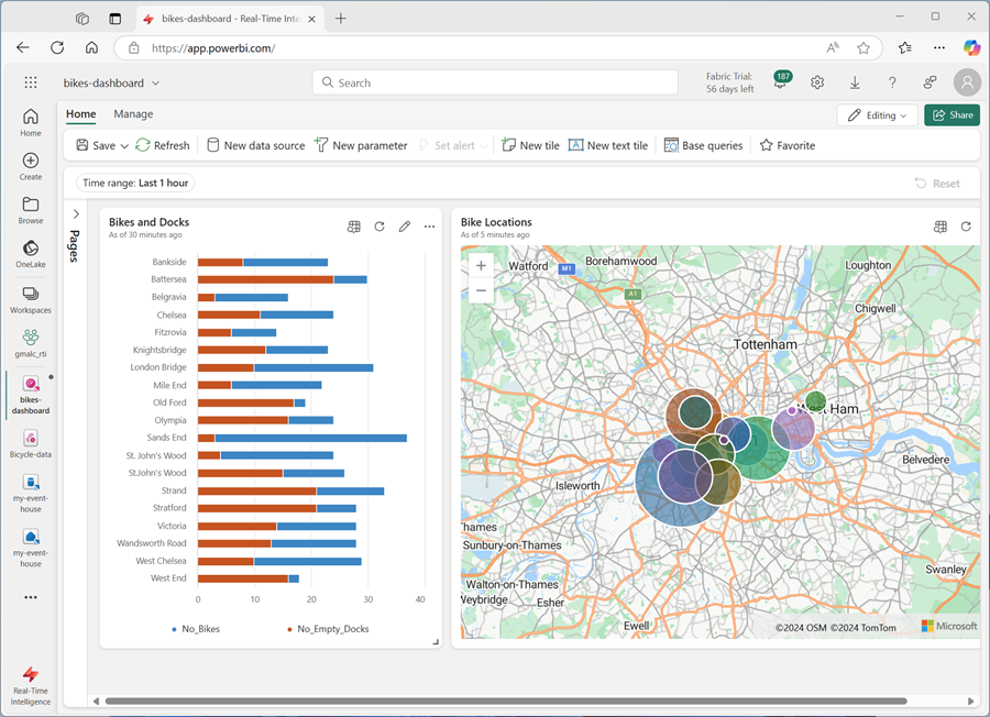
bikes | where ingestion_time() between (ago(30min) .. now()) | summarize latest_observation = arg_max(ingestion_time(), *) by Neighbourhood | project Neighbourhood, latest_observation, Latitude, Longitude, No_Bikes | order by Neighbourhood asc - Run the query, which shows the location and number of bikes observed in each neighbourhood in the last 30 minutes.
- Apply the changes to see the data shown in a table in the tile on the dashboard.
- On the tile, select the Edit icon (which looks like a pencil). Then in the Visual Formatting pane, set the following properties:
- Tile name: Bike Locations
- Visual type: Map
- Define location by: Latitude and longitude
- Latitude column: Latitude
- Longitude column: Longitude
- Label column: Neighbourhood
- Size: Show
- Size column: No_Bikes
-
Apply the changes, and then resize the map tile to fill the right side of the available space on the dashboard:
Create a base query
Your dashboard contains two visuals that are based on similar queries. To avoid duplication and make your dashboard more maintainable, you can consolidate the common data into a single base query.
- On the dashboard toolbar, select Base queries. Then select +Add.
-
In the base query editor, set the Variable name to
base_bike_dataand ensure that the Bike Rental Data source is selected. Then enter the following query:bikes | where ingestion_time() between (ago(30min) .. now()) | summarize latest_observation = arg_max(ingestion_time(), *) by Neighbourhood -
Run the query and verify that it returns all of the columns needed for both visuals in the dashboard (and some others).
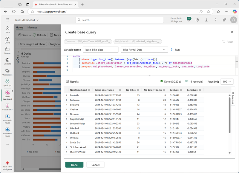
- Select Done and then close the Base queries pane.
-
Edit the Bikes and Docks bar chart visual, and change the query to the following code:
base_bike_data | project Neighbourhood, latest_observation, No_Bikes, No_Empty_Docks | order by Neighbourhood asc -
Apply the changes and verify that the bar chart still displays data for all neighbourhoods.
-
Edit the Bike Locations map visual, and change the query to the following code:
base_bike_data | project Neighbourhood, latest_observation, No_Bikes, Latitude, Longitude | order by Neighbourhood asc - Apply the changes and verify that the map still displays data for all neighbourhoods.
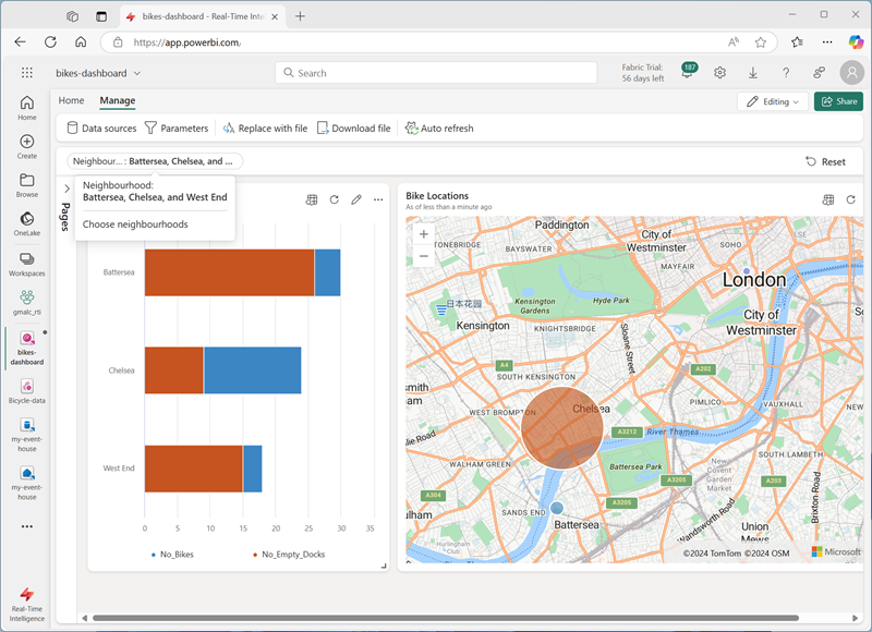
Add a parameter
Your dashboard currently shows the latest bike, dock, and location data for all neighbourhoods. Now lets add a parameter so you can select a specific neighbourhood.
- On the dashboard toolbar, on the Manage tab, select Parameters.
- Note any existing parameters that have been automatically created (for example a Time range parameter). Then Delete them.
- Select + Add.
- Add a parameter with the following settings:
- Label:
Neighbourhood - Parameter type: Multiple selection
- Description:
Choose neighbourhoods - Variable name:
selected_neighbourhoods - Data type: string
- Show on pages: Select all
- Source: Query
- Data source: Bike Rental Data
-
Edit query:
bikes | distinct Neighbourhood | order by Neighbourhood asc - Value column: Neighbourhood
- Label column: Match value selection
- Add “Select all” value: Selected
- “Select all” sends empty string: Selected
- Auto-reset to default value: Selected
- Default value: Select all
- Label:
-
Select Done to create the parameter.
Now that you’ve added a parameter, you need to modify the base query to filter the data based on the chosen neighbourhoods.
-
In the toolbar, select Base queries. Then select the base_bike_data query and edit it to add an and condition to the where clause to filter based on the selected parameter values, as shown in the following code:
bikes | where ingestion_time() between (ago(30min) .. now()) and (isempty(['selected_neighbourhoods']) or Neighbourhood in (['selected_neighbourhoods'])) | summarize latest_observation = arg_max(ingestion_time(), *) by Neighbourhood -
Select Done to save the base query.
-
In the dashboard, use the Neighbourhood parameter to filter the data based on the neighbourhoods you select.
- Select Reset to remove the selected parameter filters.
Add a page
Your dashboard currently consists of a single page. You can add more pages to provide more data.
- On the left side of the dashboard, expand the Pages pane; and select + Add page.
- Name the new page Page 2. Then select it.
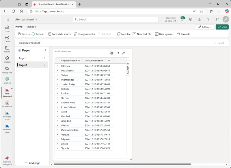
- On the new page, select + Add tile
-
In the query editor for the new tile, enter the following query:
base_bike_data | project Neighbourhood, latest_observation | order by latest_observation desc -
Apply the changes. Then resize the tile to fill the height of the dashboard.
Configure auto refresh
Users can manually refresh the dashboard, but it may be useful to have it automatically refresh the data at a set interval.
- On the dashboard toolbar, on the Manage tab, select Auto refresh.
- In the Auto refresh pane, configure the following settings:
- Enabled: Selected
- Minimum time interval: Allow all refresh intervals
- Default refresh rate: 30 minutes
- Apply the auto refresh settings.
Save and share the dashboard
Now you have a useful dashboard, you can save it and share it with other users.
- On the dashboard toolbar, select Save.
- When the dashboard is saved, select Share.
- On the Share dialog box, select Copy link and copy the link to the dashboard to the clipboard.
- Open a new browser tab and paste the copied link to navigate to the shared dashboard. Sign in again with your Fabric credentials if prompted.
- Explore the dashboard, using it to see the latest information about bikes and empty bike docks across the city.
Clean up resources
When you’ve finished exploring your dashboard, you can delete the workspace you created for this exercise.
- In the bar on the left, select the icon for your workspace.
- In the the toolbar, select Workspace settings.
- In the General section, select Remove this workspace.