Use Apache Spark in Azure Databricks
Azure Databricks is a Microsoft Azure-based version of the popular open-source Databricks platform. Azure Databricks is built on Apache Spark, and offers a highly scalable solution for data engineering and analysis tasks that involve working with data in files. One of the benefits of Spark is support for a wide range of programming languages, including Java, Scala, Python, and SQL; making Spark a very flexible solution for data processing workloads including data cleansing and manipulation, statistical analysis and machine learning, and data analytics and visualization.
This exercise should take approximately 45 minutes to complete.
Provision an Azure Databricks workspace
Tip: If you already have an Azure Databricks workspace, you can skip this procedure and use your existing workspace.
This exercise includes a script to provision a new Azure Databricks workspace. The script attempts to create a Premium tier Azure Databricks workspace resource in a region in which your Azure subscription has sufficient quota for the compute cores required in this exercise; and assumes your user account has sufficient permissions in the subscription to create an Azure Databricks workspace resource. If the script fails due to insufficient quota or permissions, you can try to create an Azure Databricks workspace interactively in the Azure portal.
- In a web browser, sign into the Azure portal at
https://portal.azure.com. -
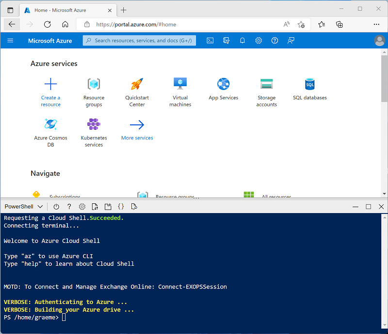
Use the [>_] button to the right of the search bar at the top of the page to create a new Cloud Shell in the Azure portal, selecting a PowerShell environment and creating storage if prompted. The cloud shell provides a command line interface in a pane at the bottom of the Azure portal, as shown here:
Note: If you have previously created a cloud shell that uses a Bash environment, use the the drop-down menu at the top left of the cloud shell pane to change it to PowerShell.
-
Note that you can resize the cloud shell by dragging the separator bar at the top of the pane, or by using the —, ◻, and X icons at the top right of the pane to minimize, maximize, and close the pane. For more information about using the Azure Cloud Shell, see the Azure Cloud Shell documentation.
-
In the PowerShell pane, enter the following commands to clone this repo:
rm -r mslearn-databricks -f git clone https://github.com/MicrosoftLearning/mslearn-databricks -
After the repo has been cloned, enter the following command to run the setup.ps1 script, which provisions an Azure Databricks workspace in an available region:
./mslearn-databricks/setup.ps1 - If prompted, choose which subscription you want to use (this will only happen if you have access to multiple Azure subscriptions).
- Wait for the script to complete - this typically takes around 5 minutes, but in some cases may take longer. While you are waiting, review the Exploratory data analysis on Azure Databricks article in the Azure Databricks documentation.
Create a cluster
Azure Databricks is a distributed processing platform that uses Apache Spark clusters to process data in parallel on multiple nodes. Each cluster consists of a driver node to coordinate the work, and worker nodes to perform processing tasks. In this exercise, you’ll create a single-node cluster to minimize the compute resources used in the lab environment (in which resources may be constrained). In a production environment, you’d typically create a cluster with multiple worker nodes.
Tip: If you already have a cluster with a 13.3 LTS or higher runtime version in your Azure Databricks workspace, you can use it to complete this exercise and skip this procedure.
- In the Azure portal, browse to the msl-xxxxxxx resource group that was created by the script (or the resource group containing your existing Azure Databricks workspace)
- Select your Azure Databricks Service resource (named databricks-xxxxxxx if you used the setup script to create it).
-
In the Overview page for your workspace, use the Launch Workspace button to open your Azure Databricks workspace in a new browser tab; signing in if prompted.
Tip: As you use the Databricks Workspace portal, various tips and notifications may be displayed. Dismiss these and follow the instructions provided to complete the tasks in this exercise.
- In the sidebar on the left, select the (+) New task, and then select Cluster.
- In the New Cluster page, create a new cluster with the following settings:
- Cluster name: User Name’s cluster (the default cluster name)
- Policy: Unrestricted
- Cluster mode: Single Node
- Access mode: Single user (with your user account selected)
- Databricks runtime version: 13.3 LTS (Spark 3.4.1, Scala 2.12) or later
- Use Photon Acceleration: Selected
- Node type: Standard_DS3_v2
- Terminate after 20 minutes of inactivity
- Wait for the cluster to be created. It may take a minute or two.
Note: If your cluster fails to start, your subscription may have insufficient quota in the region where your Azure Databricks workspace is provisioned. See CPU core limit prevents cluster creation for details. If this happens, you can try deleting your workspace and creating a new one in a different region. You can specify a region as a parameter for the setup script like this:
./mslearn-databricks/setup.ps1 eastus
Explore data using Spark
As in many Spark environments, Databricks supports the use of notebooks to combine notes and interactive code cells that you can use to explore data.
Create a notebook
- In the sidebar, use the (+) New link to create a Notebook.
- Change the default notebook name (Untitled Notebook [date]) to Explore data with Spark and in the Connect drop-down list, select your cluster if it is not already selected. If the cluster is not running, it may take a minute or so to start.
Ingest data
-
In the first cell of the notebook, enter the following code, which uses shell commands to download data files from GitHub into the file system used by your cluster.
%sh rm -r /dbfs/spark_lab mkdir /dbfs/spark_lab wget -O /dbfs/spark_lab/2019.csv https://raw.githubusercontent.com/MicrosoftLearning/mslearn-databricks/main/data/2019.csv wget -O /dbfs/spark_lab/2020.csv https://raw.githubusercontent.com/MicrosoftLearning/mslearn-databricks/main/data/2020.csv wget -O /dbfs/spark_lab/2021.csv https://raw.githubusercontent.com/MicrosoftLearning/mslearn-databricks/main/data/2021.csv -
Use the ▸ Run Cell menu option at the left of the cell to run it. Then wait for the Spark job run by the code to complete.
Query data in files
-
Under the existing code cell, use the + icon to add a new code cell. Then in the new cell, enter and run the following code to load the data from the files and view the first 100 rows.
df = spark.read.load('spark_lab/*.csv', format='csv') display(df.limit(100)) -
View the output and note that the data in the file relates to sales orders, but doesn’t include the column headers or information about the data types. To make more sense of the data, you can define a schema for the dataframe.
-
Add a new code cell and use it to run the following code, which defines a schema for the data:
from pyspark.sql.types import * from pyspark.sql.functions import * orderSchema = StructType([ StructField("SalesOrderNumber", StringType()), StructField("SalesOrderLineNumber", IntegerType()), StructField("OrderDate", DateType()), StructField("CustomerName", StringType()), StructField("Email", StringType()), StructField("Item", StringType()), StructField("Quantity", IntegerType()), StructField("UnitPrice", FloatType()), StructField("Tax", FloatType()) ]) df = spark.read.load('/spark_lab/*.csv', format='csv', schema=orderSchema) display(df.limit(100)) -
Observe that this time, the dataframe includes column headers. Then add a new code cell and use it to run the following code to display details of the dataframe schema, and verify that the correct data types have been applied:
df.printSchema()
Filter a dataframe
- Add a new code cell and use it to run the following code, which will:
- Filter the columns of the sales orders dataframe to include only the customer name and email address.
- Count the total number of order records
- Count the number of distinct customers
- Display the distinct customers
customers = df['CustomerName', 'Email']
print(customers.count())
print(customers.distinct().count())
display(customers.distinct())
Observe the following details:
- When you perform an operation on a dataframe, the result is a new dataframe (in this case, a new customers dataframe is created by selecting a specific subset of columns from the df dataframe)
- Dataframes provide functions such as count and distinct that can be used to summarize and filter the data they contain.
- The
dataframe['Field1', 'Field2', ...]syntax is a shorthand way of defining a subset of column. You can also use select method, so the first line of the code above could be written ascustomers = df.select("CustomerName", "Email")
-
Now let’s apply a filter to include only the customers who have placed an order for a specific product by running the following code in a new code cell:
customers = df.select("CustomerName", "Email").where(df['Item']=='Road-250 Red, 52')
print(customers.count())
print(customers.distinct().count())
display(customers.distinct())
Note that you can “chain” multiple functions together so that the output of one function becomes the input for the next - in this case, the dataframe created by the select method is the source dataframe for the where method that is used to apply filtering criteria.
Aggregate and group data in a dataframe
-
Run the following code in a new code cell to aggregate and group the order data:
productSales = df.select("Item", "Quantity").groupBy("Item").sum()
display(productSales)
Note that the results show the sum of order quantities grouped by product. The groupBy method groups the rows by Item, and the subsequent sum aggregate function is applied to all of the remaining numeric columns (in this case, Quantity)
-
In a new code cell, let’s try another aggregation:
yearlySales = df.select(year("OrderDate").alias("Year")).groupBy("Year").count().orderBy("Year")
display(yearlySales)
This time the results show the number of sales orders per year. Note that the select method includes a SQL year function to extract the year component of the OrderDate field, and then an alias method is used to assign a columm name to the extracted year value. The data is then grouped by the derived Year column and the count of rows in each group is calculated before finally the orderBy method is used to sort the resulting dataframe.
Note: To learn more about working with Dataframes in Azure Databricks, see Introduction to DataFrames - Python in the Azure Databricks documentation.
Query data using Spark SQL
-
Add a new code cell and use it to run the following code:
df.createOrReplaceTempView("salesorders")
spark_df = spark.sql("SELECT * FROM salesorders")
display(spark_df)
The native methods of the dataframe object you used previously enable you to query and analyze data quite effectively. However, many data analysts are more comfortable working with SQL syntax. Spark SQL is a SQL language API in Spark that you can use to run SQL statements, or even persist data in relational tables. The code you just ran creates a relational view of the data in a dataframe, and then uses the spark.sql library to embed Spark SQL syntax within your Python code and query the view and return the results as a dataframe.
Run SQL code in a cell
-
While it’s useful to be able to embed SQL statements into a cell containing PySpark code, data analysts often just want to work directly in SQL. Add a new code cell and use it to run the following code.
%sql

SELECT YEAR(OrderDate) AS OrderYear,
       SUM((UnitPrice * Quantity) + Tax) AS GrossRevenue
FROM salesorders
GROUP BY YEAR(OrderDate)
ORDER BY OrderYear;
Observe that:
- The ``%sql` line at the beginning of the cell (called a magic) indicates that the Spark SQL language runtime should be used to run the code in this cell instead of PySpark.
- The SQL code references the salesorder view that you created previously.
- The output from the SQL query is automatically displayed as the result under the cell.
Note: For more information about Spark SQL and dataframes, see the Spark SQL documentation.
Visualize data with Spark
A picture is proverbially worth a thousand words, and a chart is often better than a thousand rows of data. While notebooks in Azure Databricks include support for visualizing data from a dataframe or Spark SQL query, it is not designed for comprehensive charting. However, you can use Python graphics libraries like matplotlib and seaborn to create charts from data in dataframes.
View results as a visualization
-
In a new code cell, run the following code to query the salesorders table:
%sql SELECT * FROM salesorders - Above the table of results, select + and then select Visualization to view the visualization editor, and then apply the following options:
- Visualization type: Bar
- X Column: Item
- Y Column: Add a new column and select Quantity. Apply the Sum aggregation.
- Save the visualization and then re-run the code cell to view the resulting chart in the notebook.
Get started with matplotlib
-
In a new code cell, run the following code to retrieve some sales order data into a dataframe:
sqlQuery = "SELECT CAST(YEAR(OrderDate) AS CHAR(4)) AS OrderYear, \ SUM((UnitPrice * Quantity) + Tax) AS GrossRevenue \ FROM salesorders \ GROUP BY CAST(YEAR(OrderDate) AS CHAR(4)) \ ORDER BY OrderYear" df_spark = spark.sql(sqlQuery) df_spark.show() -
Add a new code cell and use it to run the following code, which imports the matplotlb and uses it to create a chart:
from matplotlib import pyplot as plt # matplotlib requires a Pandas dataframe, not a Spark one df_sales = df_spark.toPandas() # Create a bar plot of revenue by year plt.bar(x=df_sales['OrderYear'], height=df_sales['GrossRevenue']) # Display the plot plt.show() - Review the results, which consist of a column chart with the total gross revenue for each year. Note the following features of the code used to produce this chart:
- The matplotlib library requires a Pandas dataframe, so you need to convert the Spark dataframe returned by the Spark SQL query to this format.
- At the core of the matplotlib library is the pyplot object. This is the foundation for most plotting functionality.
-
The default settings result in a usable chart, but there’s considerable scope to customize it. Add a new code cell with the following code and run it:
# Clear the plot area plt.clf() # Create a bar plot of revenue by year plt.bar(x=df_sales['OrderYear'], height=df_sales['GrossRevenue'], color='orange') # Customize the chart plt.title('Revenue by Year') plt.xlabel('Year') plt.ylabel('Revenue') plt.grid(color='#95a5a6', linestyle='--', linewidth=2, axis='y', alpha=0.7) plt.xticks(rotation=45) # Show the figure plt.show() -
A plot is technically contained with a Figure. In the previous examples, the figure was created implicitly for you; but you can create it explicitly. Try running the following in a new cell:
# Clear the plot area plt.clf() # Create a Figure fig = plt.figure(figsize=(8,3)) # Create a bar plot of revenue by year plt.bar(x=df_sales['OrderYear'], height=df_sales['GrossRevenue'], color='orange') # Customize the chart plt.title('Revenue by Year') plt.xlabel('Year') plt.ylabel('Revenue') plt.grid(color='#95a5a6', linestyle='--', linewidth=2, axis='y', alpha=0.7) plt.xticks(rotation=45) # Show the figure plt.show() -
A figure can contain multiple subplots, each on its own axis. Use this code to create multiple charts:
# Clear the plot area
plt.clf()
# Create a figure for 2 subplots (1 row, 2 columns)
fig, ax = plt.subplots(1, 2, figsize = (10,4))
# Create a bar plot of revenue by year on the first axis
ax[0].bar(x=df_sales['OrderYear'], height=df_sales['GrossRevenue'], color='orange')
ax[0].set_title('Revenue by Year')
# Create a pie chart of yearly order counts on the second axis
yearly_counts = df_sales['OrderYear'].value_counts()
ax[1].pie(yearly_counts)
ax[1].set_title('Orders per Year')
ax[1].legend(yearly_counts.keys().tolist())
# Add a title to the Figure
fig.suptitle('Sales Data')
# Show the figure
plt.show()
Note: To learn more about plotting with matplotlib, see the matplotlib documentation.
Use the seaborn library
-
Add a new code cell and use it to run the following code, which uses the seaborn library (which is built on matplotlib and abstracts some of its complexity) to create a chart:
import seaborn as sns # Clear the plot area plt.clf() # Create a bar chart ax = sns.barplot(x="OrderYear", y="GrossRevenue", data=df_sales) plt.show() -
The seaborn library makes it simpler to create complex plots of statistical data, and enables you to control the visual theme for consistent data visualizations. Run the following code in a new cell:
# Clear the plot area plt.clf() # Set the visual theme for seaborn sns.set_theme(style="whitegrid") # Create a bar chart ax = sns.barplot(x="OrderYear", y="GrossRevenue", data=df_sales) plt.show() -
Like matplotlib. seaborn supports multiple chart types. Run the following code to create a line chart:
# Clear the plot area
plt.clf()

# Create a bar chart
ax = sns.lineplot(x="OrderYear", y="GrossRevenue", data=df_sales)
plt.show()
Note: To learn more about plotting with seaborn, see the seaborn documentation.
Clean up
In Azure Databricks portal, on the Compute page, select your cluster and select ■ Terminate to shut it down.
If you’ve finished exploring Azure Databricks, you can delete the resources you’ve created to avoid unnecessary Azure costs and free up capacity in your subscription.