Perform Data Analysis in Power BI
Lab story
In this lab, you’ll create the Sales Exploration report.
In this lab you learn how to:
- Create animated scatter charts
- Use a visual to forecast values
This lab should take approximately 30 minutes.
Get started
To complete this exercise, first open a web browser and enter the following URL to download the zip folder:
https://github.com/MicrosoftLearning/PL-300-Microsoft-Power-BI-Data-Analyst/raw/Main/Allfiles/Labs/08-perform-data-analysis-in-power-bi-desktop/08-perform-analysis.zip
Extract the folder to the C:\Users\Student\Downloads\08-perform-analysis folder.
- Open the 08-Starter-Sales Analysis.pbix file.
Note: You can dismiss the sign-in by selecting Cancel. Close any other informational windows. Select Apply Later, if prompted to apply changes.
Create an animated scatter chart
In this task, you’ll create a scatter chart that can be animated.
-
Create a new page and name it Scatter Chart.
-
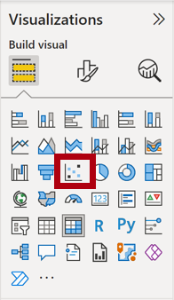
Add a Scatter Chart visual to the report page, and then position and resize it so it fills the entire page.
The chart can be animated when a field is added to the Play Axis well/area.

-
Add the following fields to the visual wells/areas:
The labs use a shorthand notation to reference a field. It will look like this: Reseller | Business Type. In this example, Reseller is the table name and Business Type is the field name.
- X Axis: Sales | Sales
- Y Axis: Sales | Profit Margin
- Legend: Reseller | Business Type
- Size: Sales | Quantity
- Play Axis: Date | Quarter
-
In the Filters pane, add the Product | Category field to the Filters On This Page well/area.
-
In the filter card, filter by Bikes.
-
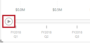
To animate the chart, at the bottom left corner, select Play.
-
Watch the entire animation cycle from FY2018 Q1 to FY2020 Q4.
The scatter chart allows understanding the measure values simultaneously: in this case, order quantity, sales revenue, and profit margin.
Each bubble represents a reseller business type. Changes in the bubble size reflect increased or decreased order quantities. While horizontal movements represent increases/decreases in sales revenue, and vertical movements represent increases/decreases in profitability.
-
When the animation stops, select one of the bubbles to reveal its tracking over time.
-
Hover the cursor over any bubble to reveal a tooltip describing the measure values for the reseller type at that point in time.
-
In the Filters pane, filter by Clothing only, and notice that it produces a very different result.
-
Save the Power BI Desktop file.
Create a forecast
In this task, you’ll create a forecast to determine possible future sales revenue.
-
Add a new page, and then rename the page to Forecast.
-
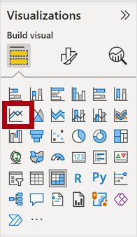
Add a Line Chart visual to the report page, and then position and resize it so it fills the entire page.

-
Add the following fields to the visual wells/areas:
- X-axis: Date | Date
- Y-axis: Sales | Sales
-
In the Filters pane, add the Date | Year field to the Filters On This Page well/area.
-
In the filter card, filter by two years: FY2019 and FY2020.
When forecasting over a time line, you’ll need at least two cycles (years) of data to produce an accurate and stable forecast.
-
Add also the Product | Category field to the Filters On This Page well/area, and filter by Bikes.
-
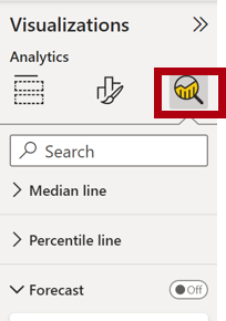
To add a forecast, beneath the Visualizations pane, select the Analytics pane.
-
Expand the Forecast section.
If the Forecast section isn’t available, it’s probably because the visual hasn’t been correctly configured. Forecasting is only available when two conditions are met: the axis has a single field of type date, and there’s only one value field.
-
Turn the Forecast option to On.
-
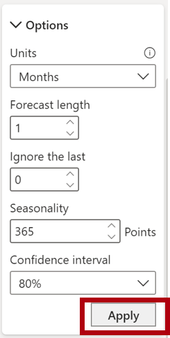
Configure the following forecast properties, then Apply:
- Units: Months
- Forecast length: 1 month
- Seasonality: 365
- Confidence interval: 80%
-
In the line visual, notice that the forecast has extended one month beyond the history data.
The gray area represents the confidence. The wider the confidence, the less stable—and therefore the less accurate—the forecast is likely to be.
When you know the length of the cycle, in this case annual, you should enter the seasonality points. Sometimes it could be weekly (7), or monthly (30).
-
In the Filters pane, filter by Clothing only, and notice that it produces a different result.