Design Power BI reports
Lab story
In this lab, you’ll create a three-page report. You’ll then publish it to the Power BI service, where you’ll open and interact with the report.
In this lab, you learn how to:
- Design a report.
- Configure visual fields and format properties.
- Sync slicers.
- Publish the report to the Power BI service.
- Interact with a report and its visuals.
This lab should take approximately 45 minutes.
Get started
To complete this exercise, first open a web browser and enter the following URL to download a zip file:
https://github.com/MicrosoftLearning/PL-300-Microsoft-Power-BI-Data-Analyst/raw/Main/Allfiles/Labs/08-design-power-bi-reports/08-design-report.zip
Extract the file to the C:\Users\Student\Downloads\08-design-report folder.
Open the 08-Starter-Sales Analysis.pbix file.
Note: You may see a sign-in dialog as the file loads. Select Cancel to dismiss the sign-in dialog. Close any other informational windows. Select Apply Later, if prompted to apply changes.
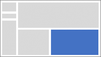
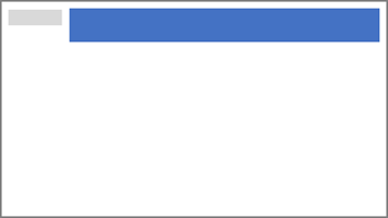
Design page 1
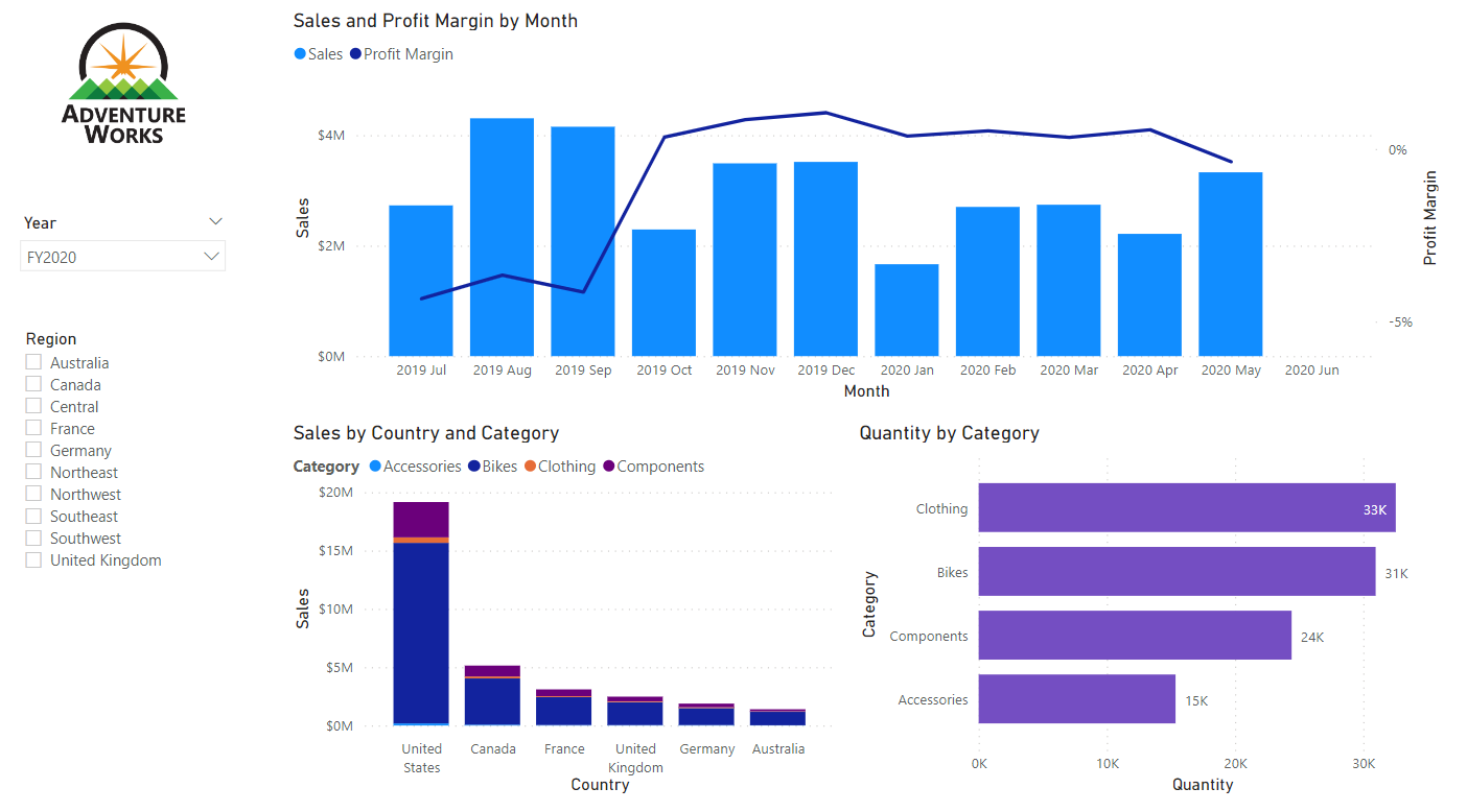
In this task, you’ll design the first report page. When you’ve completed the design, the page will look like the following:
-
In Power BI Desktop, to rename the page, at the bottom-left, right-click Page 1, then select Rename. Rename the page as Overview.
Tip: You can also double-click the page name to rename it.
-
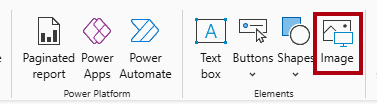
To add an image, on the Insert ribbon tab, from inside the Elements group, select Image.
-
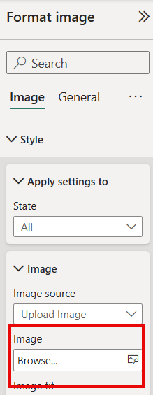
The Format Image pane will open beside the canvas. From this pane, select Image > Browse to select the image file in the next step.
-
In the Open window, navigate to the C:\Users\Student\Downloads\08-design-report folder.
-
Select the AdventureWorksLogo.jpg file, and then select Open.
-
Drag the image to position it at the top-left corner, and also drag the guide markers to resize it.

-
To add a slicer, first de-select the image by selecting an empty area of the report page, then select Slicer in the Visualizations pane.
-
In the Data pane, drag the
Date | Yearfield (not theYearlevel of the hierarchy) into the slicer Field well in the Visualizations pane.The labs use a shorthand notation to reference a field. It will look like this:
Date | Year. In this example,Dateis the table name andYearis the field name.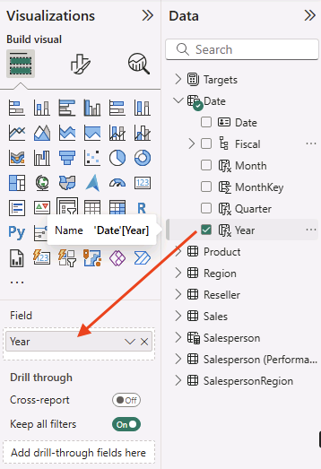
-
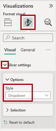
To convert the slicer from a list to a dropdown, in the Visualizations pane, select Format visual. Expand Slicer settings, and then set the Style dropdown to Dropdown.
-
Resize and position the slicer so it sits beneath the image and is the same width as the image.

-
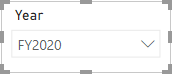
In the Year slicer, open the dropdown list, select FY2020, and then collapse the dropdown list.
The report page is now filtered by year FY2020.
-
De-select the slicer by selecting an empty area of the report page.
-
Create a second slicer, based on the
Region | Regionfield (not theRegionlevel of the hierarch). -
Leave the slicer as a list, and then resize and position the slicer beneath the Year slicer.
-
De-select the slicer by selecting an empty area of the report page.
-
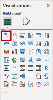
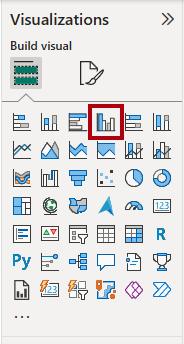
To add a chart to the page, in the Visualizations pane, select the Line and Stacked Column Chart visual type.

-
Resize and position the visual so it sits to the right of the logo, and so it fills the width of the report page.

-
Drag and drop the following fields into the visual:
Date | MonthSales | Sales
-
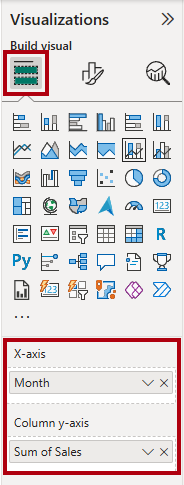
In the visual fields pane (located in the Visualizations pane), notice that the fields are assigned to the X-axis and Column y-axis wells.
By dragging fields into a visual, they’re added to default wells. For precision, you can drag fields directly into the wells, as you’ll do next.
-
From the Data pane, drag the
Sales | Profit Marginfield into the Line y-axis well.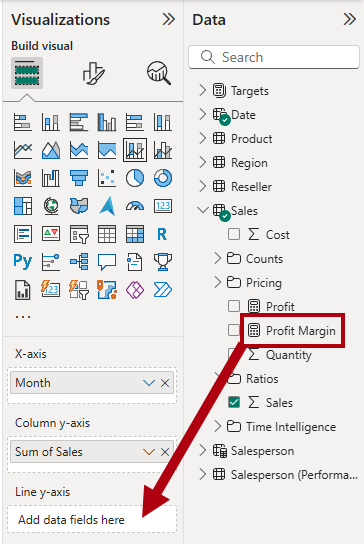
-
Notice that the visual only has 11 months.
The last month of the year, 2020 June, doesn’t have any sales yet. By default, the visual has eliminated months with
BLANKsales. You’ll now configure the visual to show all months. -
In the visual fields pane, in the X-axis well, for the Month field, select the down-arrow, and then select Show items with no data.
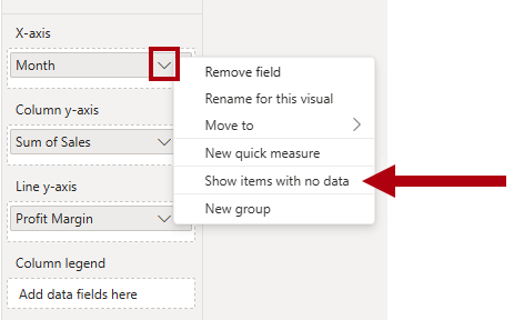
Notice that the month 2020 June now appears.
-
De-select the chart by selecting an empty area of the report page.
-
To add a chart to the page, in the Visualizations pane, select the Stacked Column Chart visual type.

-
Resize and position the visual so it sits beneath the column/line chart, and so it fills half the width of the chart above.
-
Add the following fields to the visual wells:
- X-axis:
Region | Group - Y-axis:
Sales | Sales - Legend:
Product | Category
- X-axis:
-
De-select the chart by selecting an empty area of the report page.
-
To add a chart to the page, in the Visualizations pane, select the Stacked Bar Chart visual type.
-
Resize and position the visual so it fills the remaining report page space.
-
Add the following fields to the visual wells:
- Y-axis:
Product | Category - X-axis:
Sales | Quantity
- Y-axis:
-
To format the visual, open the Format pane.
-
Expand the Bars section, and then in the Color group, set the Color property to a suitable color (to complement the column/line chart).
-
Set the Data Labels section to On.
-
Save the Power BI Desktop file.
The design of the first page is now complete.
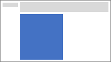
Design page 2
In this task, you’ll design the second report page. When you’ve completed the design, the page will look like the following:
Important: When detailed instructions have already been provided in the labs, the lab steps will provide more concise instructions. If you need the detailed instructions, you can refer back to other tasks in this lab.
-
To create a new page, at the bottom-left, select the plus icon. When the page is added, rename it as Profit.
-
Add a slicer based on the
Region | Regionfield. -
Use the Format pane to show the Select all option (located in the Slicer settings > Selection section).
-
Resize and position the slicer so it sits at the left side of the report page, and so it’s about half the page height.

-
Add a matrix visual, and resize and position it so it fills the remaining space of the report page

-
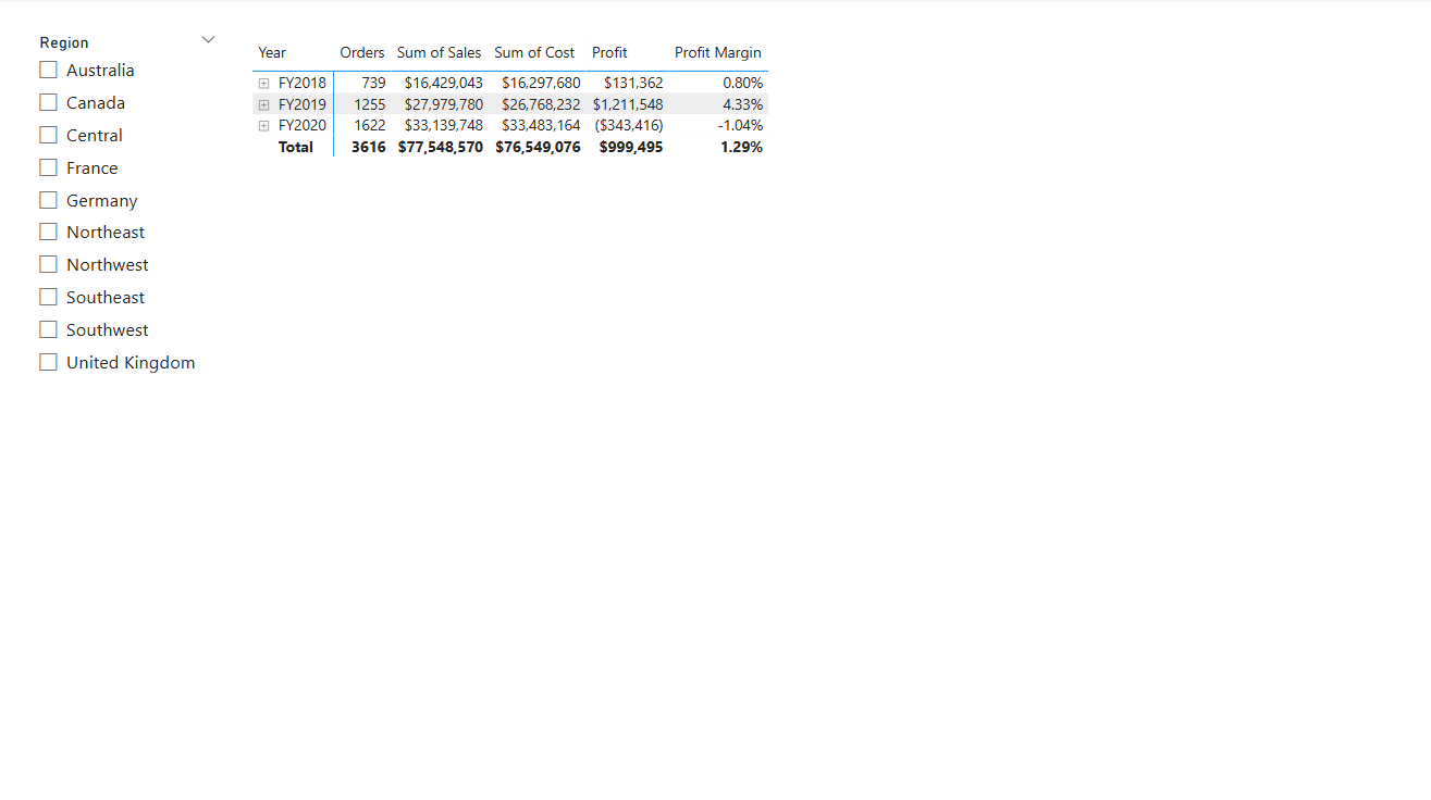
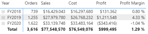
Add the
Date | Fiscalhierarchy to the matrix Rows well.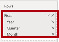
-
Add the following five
Salestable fields to the Values well:Orders(from theCountsfolder)SalesCostProfitProfit Margin
The fields will show in the visual with a prefix showing the aggregation type; “Sum of Sales.”
-
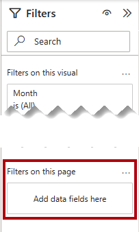
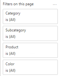
In the Filters pane (located at the left of the Visualizations pane), notice the Filters on this page section (you may need to expand open the pane and scroll down).
-
From the Data pane, drag the
Product | Categoryfield into the Filters on this page well.Fields added to the Filters pane can achieve the same result as a slicer. One difference is they don’t take up space on the report page. Another difference is that they can be configured to achieve more sophisticated filtering requirements.
-
Inside the filter card, at the top right, select the arrow to collapse the card.
-
Add each of the following
Producttable fields to the Filters on this page well, collapsing each, directly beneath theCategoryfield:SubcategoryProductColor
-
Save the Power BI Desktop file.
The design of the second page is now complete.
Design page 3
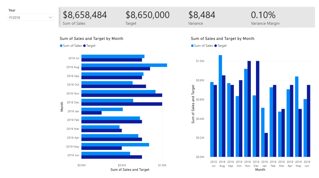
In this task, you’ll design the third—and final—report page. When you’ve completed the design, the page will look like the following:
-
Create a new page and rename it as My Performance.
-
To simulate the performance of row-level security filters, drag the
Salesperson (Performance) | Salespersonfield to the page level filters in the filter pane.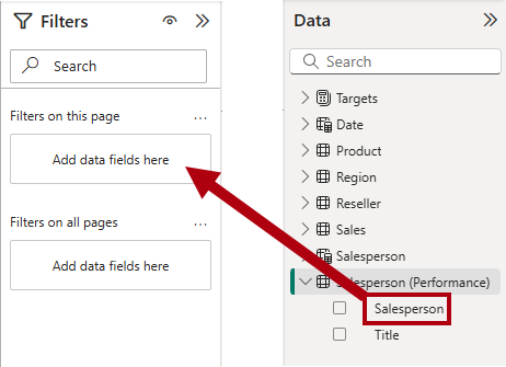
-
In the filter card, select Michael Blythe.
Data on the report page will now be filtered to display data for Michael Blythe only.
-
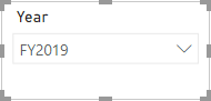
Add a dropdown slicer based on the
Date | Yearfield, and then resize and position it so it sits at the top-left corner of the page.
-
In the slicer, set the page to filter by FY2019.
-
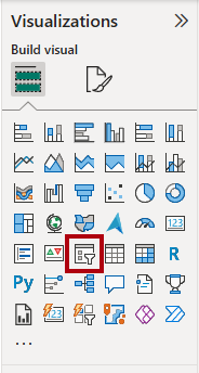
Add a Multi-row Card visual to the page, and then resize and reposition it so it sits to the right of the slicer and fills the remaining width of the page.
If you don’t see the Multi-row Card visual in the Visualizations pane, select the ellipsis (…) below the visuals and then Restore default visuals. You can now select Multi-row Card.
-
Add the following four fields to the visual:
Sales | SalesTargets | TargetTargets | VarianceTargets | Variance Margin
-
Format the visual:
- In the Callout values section, increase the font size property to 28pt.
-
In the General tab, in the Effects section, set the background color property to a light gray color (such as White, 10% Darker) to provide contrast.

-
Add a Clustered Bar Chart visual to the page, and then resize and position it so it sits beneath the multi-row card visual and fills the remaining height of the page, and half the width of the multi-row card visual.
-
Add the following fields to the visual wells:
- Y-axis:
Date | Month -
X-axis:
Sales | SalesandTargets | Target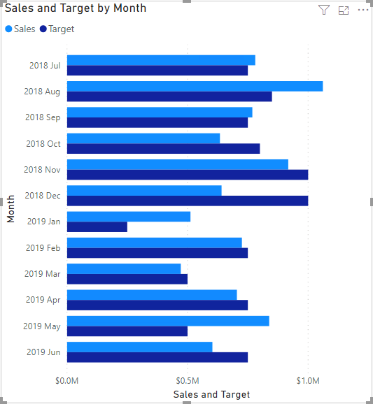
- Y-axis:
-
To create a copy of the visual, press Ctrl+C, and then press Ctrl+V.
-
Position the new visual to the right of the original visual.

-
To modify the visualization type, in the Visualizations pane, select Clustered Column Chart.
It’s now possible to see the same data expressed by two different visualization types. The design of the final page is complete.
Sync slicers
In this task, you’ll sync the Year and Region slicers.
-
On the Overview page, set the Year slicer to FY2018.
-
Go to the My Performance page, and then notice that the Year slicer has a different value.
When slicers aren’t synced, it can contribute to misrepresentation of data and frustration for report users. You’ll now sync the report slicers.
-
Return to the Overview page, and then select the Year slicer.
-
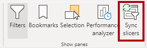
On the View ribbon tab, from inside the Show Panes group, select Sync Slicers.
-
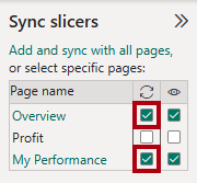
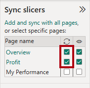
In the Sync Slicers pane (at the left of the Visualizations pane), in the second column (which represents syncing), check the checkboxes for the Overview and My Performance pages.
-
On the Overview page, select the Region slicer.
-
Sync the slicer with the Overview and Profit pages.
-
Test the sync slicers by selecting different filter options, and then verifying that the synced slicers filter by the same selection.
-
To close the Sync Slicer pane, select the Sync Slicer option located on the View ribbon tab.
Publish and explore the report
In this task, you’ll publish the report to the Power BI service. You will then explore the published report behavior.
Note: You’ll need at least a Power BI Free license to publish the report. Open the Microsoft Edge browser, and navigate to
https://app.powerbi.com. Sign in with the credentials for the Microsoft 365 tenant provided by your authorized lab hoster (ALH). When asked to solve a puzzle, or to start a free Fabric trial, you can skip this and close the browser.
Note: You can review the remainder of the exercise, even if you don’t have access to the Power BI service to perform the tasks directly.
-
Select the Overview page, then save the Power BI Desktop file.
-
On the Home ribbon tab, from inside the Share group, select Publish.
If you’re not signed in to Power BI Desktop already, you’ll need to first sign in before you publish the report.

-
In the Publish to Power BI window, notice that My workspace is selected.
This lab doesn’t go into detail about the different items within the Power BI service.
-
To publish the report, select Select. Wait until the publication completes.
-
When the publication succeeds, select Got It.
-
Open the Microsoft Edge browser, then navigate to
https://app.powerbi.com. -
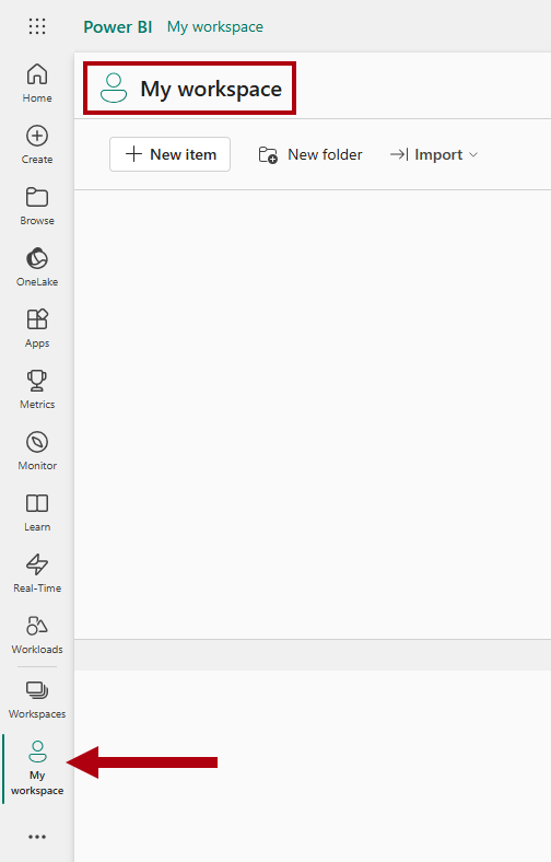
In the browser window, in the Power BI service, in the Navigation pane (located at the left, and it could be collapsed), expand My Workspace.
-
Review the contents of the workspace.
- There are different types of items that can exist in a workspace, but what’s relevant to this lab are semantic models and reports.
- You might need to refresh the browser if the semantic model isn’t visible.
- When you published the report, the data model was published as a semantic model.
-
To explore the report, select the 08-Starter-Sales Analysis report.
-
At the left, in the Pages pane, notice that the Overview page is selected.
-
In the Region slicer, while pressing the Ctrl key, select multiple regions.
-
In the column/line chart, select any month column to cross filter the page.
-
While pressing the Ctrl key, select another month.
By default, cross filtering filters all other visuals on the page.
-
Notice that the bar chart is filtered and highlighted, with the bold portion of the bars representing the filtered months.
-
Hover the cursor over the bar chart visual, and then at the top right, hover the cursor over the Filter icon.
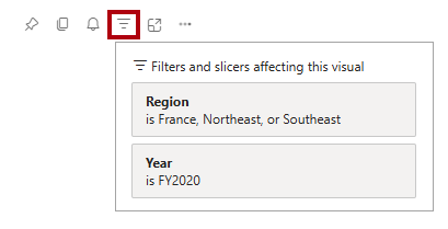
The filter icon allows users to understand all filters that are applied to the visual, including slicers and cross filters from other visuals.
-
Hover the cursor over a bar, and then notice the tooltip information.
-
To undo the cross filter, in the column/line chart, select an empty area of the visual.
-
Hover the cursor over the stacked column chart visual, and then at the top right, select the Focus mode icon.
Focus mode zooms the visual to full page size.

-
Hover the cursor over different segments of the bar charts to reveal tooltips.
-
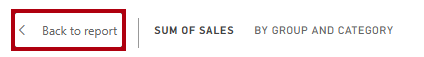
To return to the report page, at the top-left, select Back to Report.
-
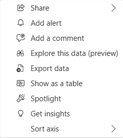
Hover the cursor over one of the visuals again, then at the top-right, select the ellipsis (…), and then notice the menu options. Try out each of the options, except the ones within Share.
-
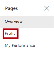
At the left, in the Pages pane, select the Profit page.
-
Notice that the Region slicer has the same selection as made on the Overview page, thanks to synced slicers.
-
In the Filters pane (located at the right), expand a filter card, and apply some filters.
The Filters pane allows you to define more filters than could possibly fit on a page as slicers.
-
In the matrix visual, use the plus (+) button to drill into the
Fiscalhierarchy. -
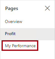
Select the My Performance page.
-
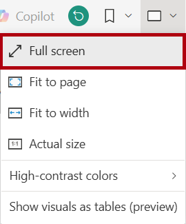
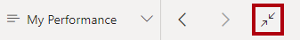
At the top right on the menu bar, select View, and then select Full Screen.
-
Interact with the page by modifying the slicer, and cross filtering the page.
-
At the bottom of the window, notice the commands to change page, navigate backwards or forwards between pages, or to exit full screen mode.
-
Select the right icon to exit full screen mode.
Lab complete
- Close Microsoft Edge browser.
- Close Power BI Desktop.