Enhance a Report in Power BI Desktop
Lab story
In this lab, you’ll enhance the Sales Analysis with advanced design features.
In this lab you learn how to:
- Sync slicers
- Create a drill through page
- Apply conditional formatting
- Create and use bookmarks & buttons
This lab should take approximately 45 minutes.
Get started
To complete this exercise, first open a web browser and enter the following URL to download the zip folder:
https://github.com/MicrosoftLearning/PL-300-Microsoft-Power-BI-Data-Analyst/raw/Main/Allfiles/Labs/07-design-report-in-power-bi-desktop-enhanced/07-enhanced-report.zip
Extract the folder to the C:\Users\Student\Downloads\07-enhanced-report folder.
Open the 07-Starter-Sales Analysis.pbix file.
Note: You can dismiss the sign-in by selecting Cancel. Close any other informational windows. Select Apply Later, if prompted to apply changes.
Sync slicers
In this task, you’ll sync the Year and Region slicers, continuing the development of the report created in the Design a Report in Power BI Desktop lab.
-
In Power BI Desktop, on the Overview page, set the Year slicer to FY2018.
-
Go to the My Performance page, and then notice that the Year slicer is a different value.
When slicers aren’t synced, it can contribute to misrepresentation of data and frustration for report users. You’ll now sync the report slicers.
-
Return to the Overview page, and then select the Year slicer.
-
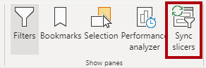
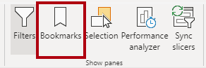
On the View ribbon tab, from inside the Show Panes group, select Sync Slicers.
-
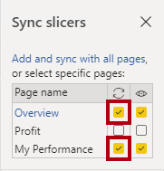
In the Sync Slicers pane (at the left of the Visualizations pane), in the second column (which represents syncing), check the checkboxes for the Overview and My Performance pages.
-
On the Overview page, select the Region slicer.
-
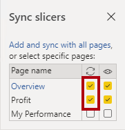
Sync the slicer with the Overview and Profit pages.
-
Test the sync slicers by selecting different filter options, and then verifying that the synced slicers filter by the same selection.
-
To close the Sync Slicer page, select the Sync Slicer option located on the View ribbon tab.
Configure a drill through page
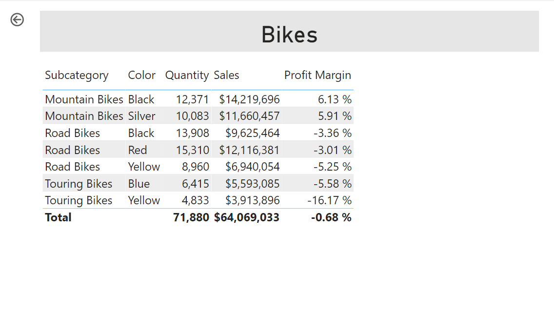
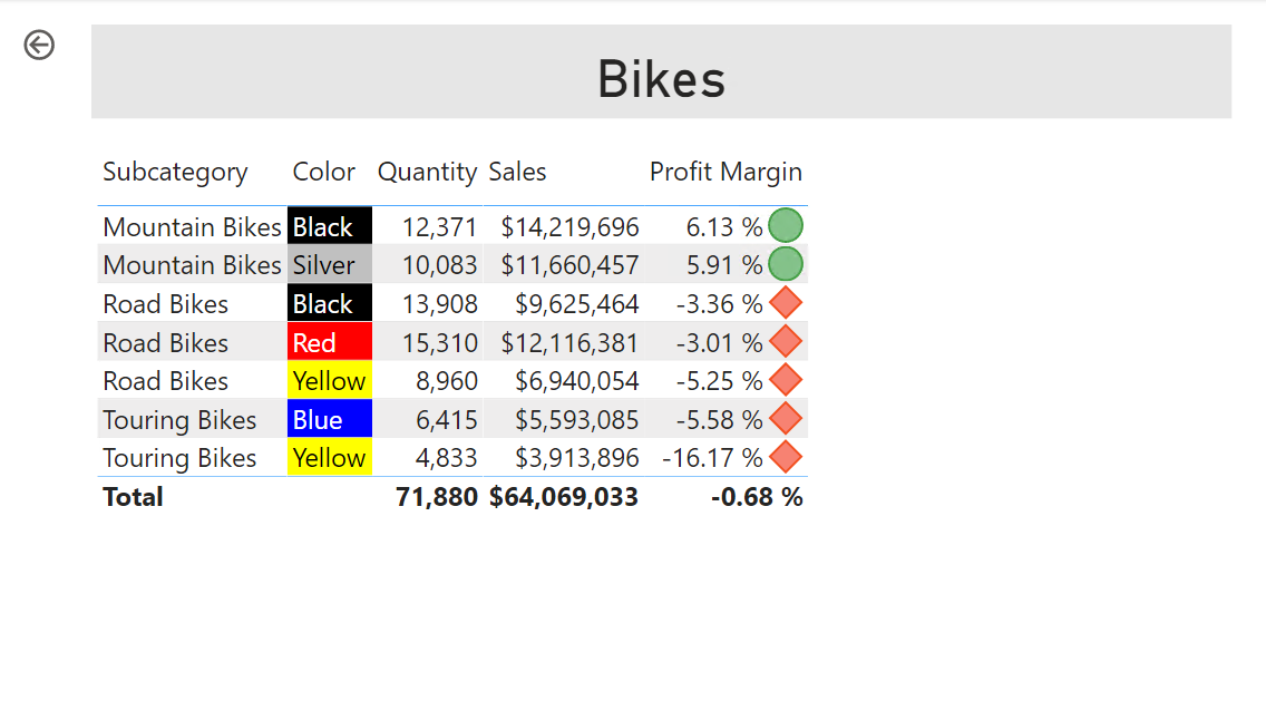
In this exercise, you’ll create a new page and configure it as a drill through page. When you’ve completed the design, the page will look like the following:
-
Add a new report page named Product Details.
-
Right-click the Product Details page tab, and then select Hide Page.
Report users won’t be able to go to the drill through page directly. They’ll need to access it from visuals on other pages. You’ll learn how to drill through to the page in the final exercise of this lab.
-
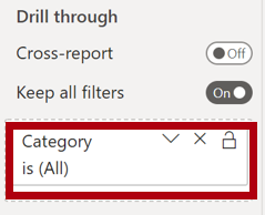
Beneath the Visualizations pane, in the Drill Through section, add the Product | Category field to the Add Drill-Through Fields Here box.
The labs use a shorthand notation to reference a field. It will look like this: Product | Category. In this example, Product is the table name and Category is the field name.
-
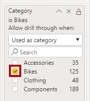
To test the drill through page, in the drill through filter card, select Bikes.
-
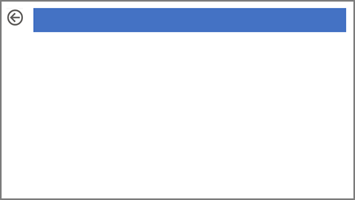
At the top-left of the report page, notice the arrow button.
An arrow button is added automatically when a field is added to the drill through well/area. It allows report users to navigate back to the page from which they drilled through.
-
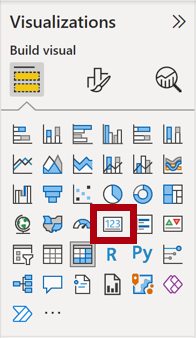
Add a Card visual to the page, and then resize and position it so it sits to the right of the button and fills the remaining width of the page.
-
Drag the Product | Category field into the card visual.
-
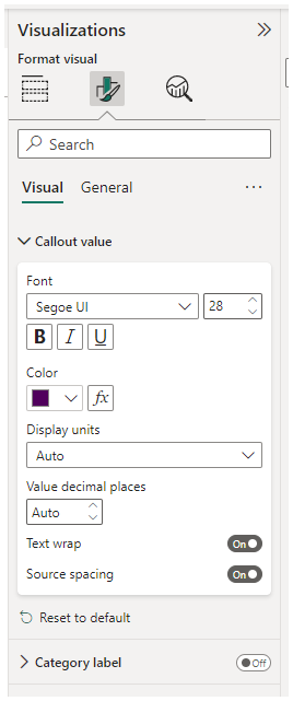
Configure the format options for the visual, and then turn the Category Label property to Off.
-
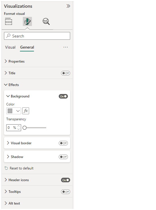
Set the Effects > Background color property to a light shade of gray such as White, 20% darker.
-
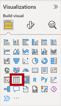
Add a Table visual to the page, and then resize and position it so it sits beneath the card visual and fills the remaining space on the page.
-
Add the following fields to the visual:
- Product | Subcategory
- Product | Color
- Sales | Quantity
- Sales | Sales
- Sales | Profit Margin
-
Configure the format options for the visual, and in the Values and Column headers sections, set the Text Size property to 20pt.
The design of the drill through page is almost complete. You’ll enhance the page with conditional formatting in the next exercise.
Add Conditional Formatting
In this exercise, you’ll enhance the drill through page with conditional formatting. When you’ve completed the design, the page will look like the following:
-
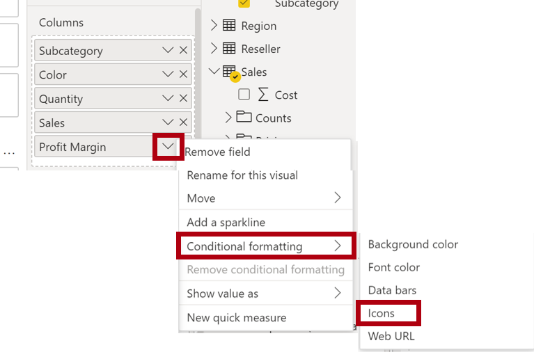
Select the table visual. In the visualization pane, select the down-arrow on the Profit Margin value, and then select Conditional Formatting | Icons.
-
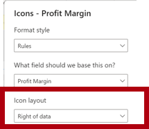
In the Icons – Profit Margin window, in the Icon Layout dropdown list, select Right of Data.
-
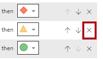
To delete the middle rule, at the right of the yellow triangle, select X.
-
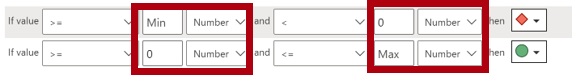
Configure the first rule (red diamond) as follows:
- In the second control, remove the value
- In the third control, select Number
- In the fifth control, enter 0
- In the sixth control, select Number
-
Configure the second rule (green circle) as follows, then select OK:
The rules can be interpreted as follows: display a red diamond if the profit margin value is less than 0; otherwise if the value is greater than or equal to zero, display a green circle.
- In the second control, enter 0
- In the third control, select Number
- In the fifth control, remove the value
- In the sixth control, select Number
-
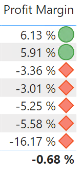
In the table visual, verify that the correct icons are displayed.
-
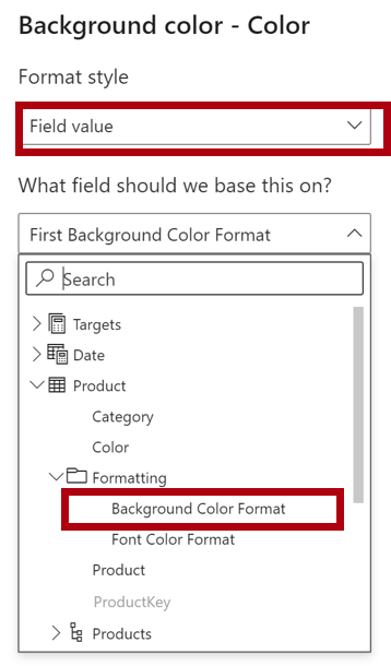
Configure background color conditional formatting for the Color field.
-
In the Background Color – Color window, in the Format Style dropdown list, select Field Value.
-
In the What field should we base this on? dropdown list, select Product | Formatting | Background Color Format, then OK.
-
Repeat the previous steps to configure font color conditional formatting for the Color field, using the Product | Formatting | Font Color Format field
You may recall that the background and font colors were source from the ColorFormats.csv file in the Prepare Data in Power BI Desktop lab, and then integrated with the Product query in the Load Data in Power BI Desktop lab.
Add Bookmarks and Buttons
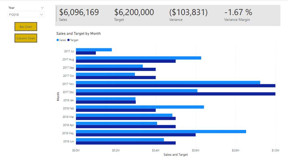
In this exercise you’ll enhance the My Performance page with buttons, allowing the report user to select the visual type to display. When you’ve completed the design, the page will look like the following:
-
Go to the My Performance page. On the View ribbon tab, from inside the Show Panes group, select Bookmarks.
-
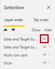
On the View ribbon tab, from inside the Show Panes group, select Selection.
-
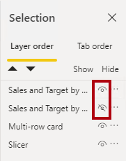
In the Selection pane, beside one of the Sales and Target by Month items, to hide the visual, select the eye icon.
-
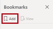
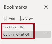
In the Bookmarks pane, select Add.
To rename the bookmark, double-click the bookmark.
-
If the visible chart is the bar chart, rename the bookmark as Bar Chart ON, otherwise rename the bookmark as Column Chart ON.
-
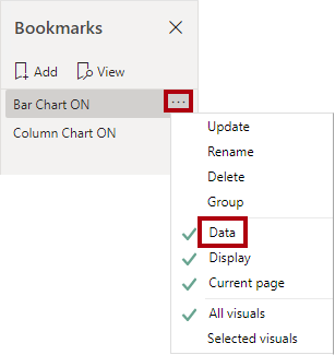
To edit the bookmark, in the Bookmarks pane, hover the cursor over the bookmark, select the ellipsis, and then select Data.
Disabling the Data option means the bookmark won’t use the current filter state. That’s important because otherwise the bookmark would permanently lock in the filter currently applied by the Year slicer.
-
To update the bookmark, select the ellipsis again, and then select Update.
In the following steps, you’ll create and configure a second bookmark to show the second visual.
-
In the Selection pane, toggle the visibility of the two Sales and Target by Month items.
In other words, make the visible visual hidden, and make the hidden visual visible.
-
Create a second bookmark, and name it appropriately (either Column Chart ON or Bar Chart ON).
-
Configure the second bookmark to ignore filters (Data option off), and update the bookmark.
-
In the Selection pane, to make both visuals visible, simply show the hidden visual.
-
Resize and reposition both visuals so they fill the page beneath the multi-card visual, and completely overlap one another.
To select the visual that is covered up, select it in the Selection pane.
-
In the Bookmarks pane, select each of the bookmarks, and notice that only one of the visuals is visible.
The next stage of design is to add two buttons to the page, which will allow the report user to select the bookmarks.
-
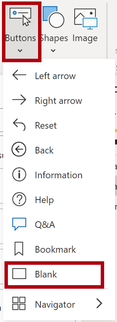
On the Insert ribbon, from inside the Elements group, select Button, and then select Blank.
-
Position the button directly beneath the Year slicer.
-
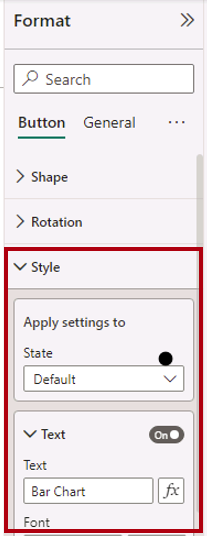
Select the button, and then in the Format button pane, select Button, expand Style section and turn the Text property to On.
-
Expand the Text section, and then in the Text box, enter Bar Chart.
-
Expand the Fill section, and then set a fill color using a complementary color.
-
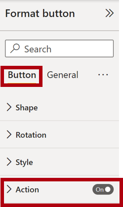
Select Button and turn the Action property to On.
-
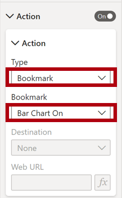
Expand the Action section, and then set the Type dropdown list to Bookmark.
-
In the Bookmark dropdown list, select Bar Chart ON.
-
Create a copy of the button by using copy and paste, and then configure the new button as follows:
Tip: The shortcut commands for copy and paste are Ctrl+C followed by Ctrl+V.
- Set the Button Text property to Column Chart
- In the Action section, set the Bookmark dropdown list to Column Chart ON
The design of the Sales Analysis report is now complete.
Publish and explore the report
In this exercise, you’ll publish the report to the Power BI service and explore the published report behavior.
Note: You can review the remainder of the exercise, even if you don’t have access to the online Power BI service to perform the tasks directly.
-
Select the Overview page.
-
In the Year slicer, select FY2020.
-
In the Region slicer, select Select All.
-
Save the Power BI Desktop file.
-
On the Home ribbon tab, from inside the Share group, select Publish.
If you’re not signed into Power BI Desktop already, you’ll need to sign-in to publish.

-
In the Publish to Power BI window, notice that My Workspace is selected.
- To publish the report, select Select.
- If prompted to replace the semantic model, select Replace.
- When the publication has succeeded, select Got It.
-
Close Power BI Desktop.
-
In a Microsoft Edge browser window, navigate to the Power BI service > My Workspace, then select the Sales Analysis report.
-
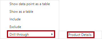
To test the drill through feature, navigate to Overview page > Quantity by Category visual. Then right-click the Clothing bar and select Drill Through | Product Details.
-
Notice that the Product Details page is for Clothing.
-
To return to the source page, at the top-left corner of the page, select the arrow button.
-
Select the My Performance page.
Select each of the buttons, and then notice that a different visual is displayed.