Create DAX calculations in semantic models
Lab story
In this lab, you’ll create calculated tables, calculated columns, and simple measures by using Data Analysis Expressions (DAX).
In this lab, you learn how to:
- Create calculated tables.
- Create calculated columns.
- Create measures.
This lab should take approximately 45 minutes.
Get started
To complete this exercise, first open a web browser and enter the following URL to download the zip file:
https://github.com/MicrosoftLearning/PL-300-Microsoft-Power-BI-Data-Analyst/raw/Main/Allfiles/Labs/04-create-dax-calculations\04-dax-calculations.zip
Extract the file to the C:\Users\Student\Downloads\04-dax-calculations folder.
Open the 04-Starter-Sales Analysis.pbix file.
Note: You may see a sign-in dialog as the file loads. Select Cancel to dismiss the sign-in dialog. Close any other informational windows. Select Apply Later, if prompted to apply changes.
Create the Salesperson calculated table
In this task, you’ll create the Salesperson calculated table (that will have a direct relationship to the Sales table).
A calculated table is created by first entering the table name, followed by the equals symbol (=), followed by a DAX formula that returns a table. The table name can’t already exist in the data model.
You enter a valid DAX formula in the formula bar. The formula bar includes features like auto-complete, Intellisense and color-coding, which allow you to quickly and accurately enter the formula.
-
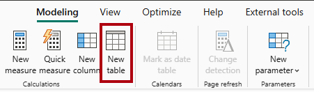
In Power BI Desktop, in Report view, on the Modeling ribbon, from inside the Calculations group, select New Table.
-
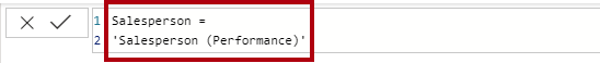
In the formula bar (which opens directly beneath the ribbon when you create or edit calculations), type
Salesperson =, press Shift+Enter, type'Salesperson (Performance)', and then press Enter.Note: For your convenience, all DAX definitions in this lab can be copied from the snippets file, located in the 04-dax-calculations\Snippets.txt file.
This table definition creates a copy of the
Salesperson (Performance)table. It copies the data only, however model properties like visibility, formatting, and others aren’t copied. -
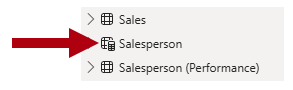
In the Data pane, notice that the icon for the new table has an additional calculator in front of it (denoting a calculated table).
Note: Calculated tables are defined by using a DAX formula that returns a table. It’s important to understand that calculated tables increase the size of the data model because they materialize and store values. Also, they’re recomputed whenever formula dependencies are refreshed, as will be the case for this data model when new (future) date values are loaded into tables.
Unlike Power Query-sourced tables, calculated tables can’t be used to load data from external data sources. They can only transform data based on what has already been loaded into the data model.
-
Switch to Model view, and notice that the
Salespersontable is available. -
Create a relationship from the
Salesperson | EmployeeKeycolumn to theSales | EmployeeKeycolumn.The labs use a shorthand notation to reference a field. It will look like this:
Salesperson | EmployeeKey. In this example,Salespersonis the table name andEmployeeKeyis the column name. -
Right-click the inactive relationship (dotted line) between the
Salesperson (Performance)andSalestables, and then select Delete. When prompted to confirm the deletion, select Yes. -
In the
Salespersontable, multi-select the following columns, and then hide them (set the Is Hidden property to Yes):EmployeeIDEmployeeKeyUPN
-
In the model diagram, select the
Salespersontable. -
In the Properties pane, in the Description box, enter: Salesperson related to sales
You may recall that descriptions appear as tooltips in the Data pane whenever the user hovers their cursor over a table or field.
-
For the
Salesperson (Performance)table, set the description to: Salesperson related to region(s)
The data model now provides two alternatives when analyzing salespeople. The
Salespersontable allows analyzing sales made by a salesperson, while theSalesperson (Performance)table allows analyzing sales made in the sales region(s) assigned to the salesperson.
Create the Date table
In this task, you’ll create the Date table.
-
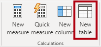
Switch to Table view. On the Home ribbon tab, from inside the Calculations group, select New Table.
-
In the formula bar, enter the following DAX:
 Date =
 CALENDARAUTO(6)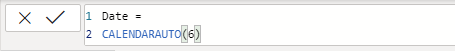
The
CALENDARAUTOfunction returns a single-column table comprising date values. The “auto” behavior scans all data model date columns to determine the earliest and latest date values stored in the data model. It then creates one row for each date within this range, extending the range in either direction to ensure full years of data is stored.This function can take a single optional argument that is the last month number of a year. When omitted, the value is 12, meaning that December is the last month of the year. In this case, 6 is entered, meaning that June is the last month of the year.
-
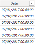
Notice the column of date values which might be formatted using US regional settings (that is, mm/dd/yyyy).
-
At the bottom-left corner, in the status bar, notice the table statistics, confirming that 1826 rows of data have been generated, which represents five full years’ data.

Create calculated columns
In this task, you’ll add more columns to enable filtering and grouping by different time periods. You’ll also create a calculated column to control the sort order of other columns.
Note: For your convenience, all DAX definitions in this lab can be copied from the Snippets.txt file.
-
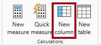
On the Table Tools contextual ribbon, from inside the Calculations group, select New Column.
A calculated column is created by first entering the column name, followed by the equals symbol (=), followed by a DAX formula that returns a single-value result. The column name can’t already exist in the table.
-
In the formula bar, type the following (or copy from the snippets file), and then press Enter:
The formula uses the date’s year value but adds one to the year value when the month is after June. That’s how fiscal years at Adventure Works are calculated.
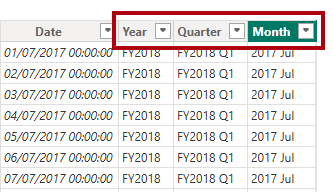
Year = "FY" & YEAR('Date'[Date]) + IF(MONTH('Date'[Date]) > 6, 1) -
Use the snippets file definitions to create the following two calculated columns for the
Datetable:QuarterMonth
-
Verify the new columns have been added.
-
To validate the calculations, switch to Report view.
-
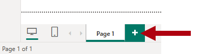
To create a new report page, select the plus icon next to Page 1.
-
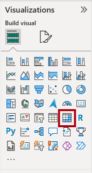
To add a matrix visual to the new report page, in the Visualizations pane, select the matrix visual type.
Tip: You can hover the cursor over each icon to reveal a tooltip describing the visual type.
-
In the Data pane, from inside the
Datetable, drag theYearfield into the Rows well.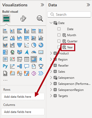
-
Drag the
Monthfield into the Rows well, directly beneath theYearfield. -
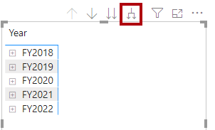
At the top-right of the matrix visual (or bottom, depending on the location of the visual), select the forked-double arrow icon (which will expand all years down one level).
-
Notice that the years expand to months, and that the months are sorted alphabetically rather than chronologically.
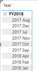
By default, text values sort alphabetically, numbers sort from smallest to largest, and dates sort from earliest to latest.
-
To customize the
Monthfield sort order, switch to Table view. -
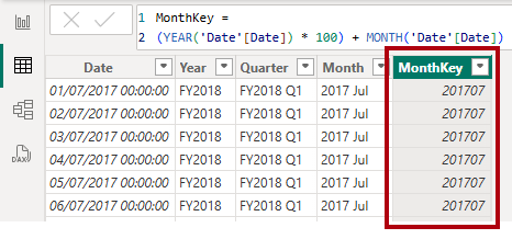
Add the
MonthKeycolumn to theDatetable.MonthKey = (YEAR('Date'[Date]) * 100) + MONTH('Date'[Date])This formula computes a numeric value for each year/month combination.
-
In Table view, verify that the new column contains numeric values (for example, 201707 for July 2017, and so on).
-
Switch back to Report view.
-
In the Data pane, select the
Monthfield. -
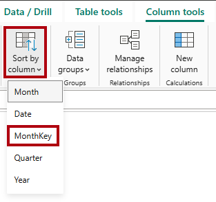
On the Column Tools contextual ribbon, from inside the Sort group, select Sort by Column, and then select MonthKey.
-
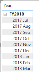
In the matrix visual, notice that the months are now chronologically sorted.
Complete the Date table
In this task, you’ll complete the design of the Date table by hiding a column and creating a hierarchy. You’ll then create relationships to the Sales and Targets tables.
-
Switch to Model view.
-
In the
Datetable, hide theMonthKeycolumn (set Is Hidden to Yes). -
In the Data pane, select the
Datetable, right-click theYearcolumn, and the select Create hierarchy.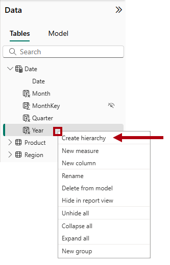
-
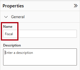
In the Properties pane, in the Name box, replace the value with Fiscal.
-
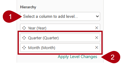
Two add levels to the hierarchy, in the Hierarchy dropdown list, select Quarter and then select Month, and then select Apply Level Changes.
-
Create the following two model relationships:
Date | DatetoSales | OrderDateDate | DatetoTargets | TargetMonth
-
Hide the following two columns:
Sales | OrderDateTargets | TargetMonth
Mark the Date table
In this task, you’ll mark the Date table as a date table.
-
Switch to Report view.
-
In the Data pane, select the
Datetable (not theDatefield). -
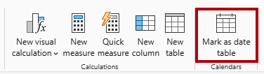
On the Table Tools contextual ribbon, from inside the Calendars group, select Mark as Date Table.
-
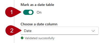
In the Mark as a Date Table window, slide the Mark as a Date Table property to On.
-
In the Choose a date column dropdown list, select Date.
-
Select Save.
-
Save the Power BI Desktop file.
Power BI Desktop now understands that this table defines date (time).
This design approach for a date table is suitable when you don’t have a date table in your data source. If you have a data warehouse, it would be appropriate to load date data from its date dimension table rather than “redefining” date logic in your data model.
Create simple measures
In this task, you’ll create simple measures. Simple measures aggregate values in a single column or count rows of a table.
-
In Report view, on Page 2, from the Data pane, drag the
Sales | Unit Pricefield into the matrix visual.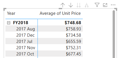
-
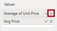
In the visual fields pane (located in the Visualizations pane), in the Values well, notice that
Unit Pricefield is configured as Average of Unit Price.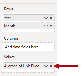
-
Select the down-arrow for Average of Unit Price, and then notice the available menu options.
Visible numeric columns allow report authors at report design time to decide how column values will summarize (or not). However, it can result in inappropriate reporting.
Some data modelers don’t like leaving things to chance, so they choose to hide these columns and instead expose aggregation logic defined in measures. It’s the approach you’ll now take in this lab.
-
To create a measure, in the Data pane, right-click the
Salestable, and then select New Measure. -
In the formula bar, add the following measure definition:
Avg Price = AVERAGE(Sales[Unit Price]) -
Add the
Avg Pricemeasure to the matrix visual, and notice that it produces the same result as theUnit Pricecolumn (but with different formatting). -
In the Values well, open the context menu for the
Avg Pricefield, and notice that it isn’t possible to change the aggregation technique.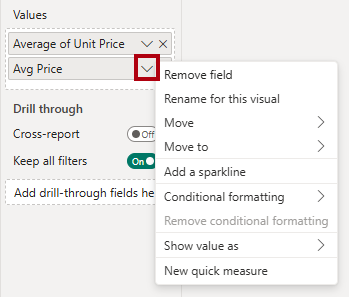
It’s not possible to modify the aggregation behavior of a measure.
-
Use the snippets file definitions to create the following five measures for the
Salestable:Median PriceMin PriceMax PriceOrdersOrder Lines
The
DISTINCTCOUNTfunction used in theOrdersmeasure counts orders only once (ignoring duplicates). TheCOUNTROWSfunction used in theOrder Linesmeasure operates over a table.In this case, the number of orders is calculated by counting the distinct
SalesOrderNumbercolumn values, while the number of order lines is simply the number of table rows (each row is a line of an order). -
Switch to Model view, and then multi-select the four price measures:
Avg Price,Max Price,Median Price, andMin Price. -
For the multi-selection of measures, configure the following requirements:
- Set the format to two decimal places.
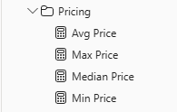
- Assign to a display folder named Pricing (use the Display folder property in the Properties pane).
-
Hide the
Unit Pricecolumn.The
Unit Pricecolumn is no longer available to report authors. They must use the pricing measures you’ve added to the model. This design approach ensures that report authors won’t inappropriately aggregate prices, for example, by summing them. -
Multi-select the
Order LinesandOrdersmeasures, and then configure the following requirements:- Set the format use the thousands separator.
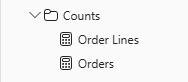
- Assign to a display folder named Counts.
-
In Report view, in the Values well of the matrix visual, for Average of Unit Price, select X to remove it.
-
Increase the size of the matrix visual to fill the page width and height.
-
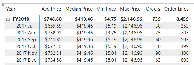
Add the following five measures to the matrix visual:
Median PriceMin PriceMax PriceOrdersOrder Lines
-
Verify that the results look sensible and are correctly formatted.
Create additional measures
In this task, you’ll create more measures that use more complex formulas.
-
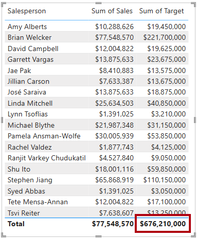
In Report view, select Page 1 and review the table visual of salespeople (on the right), noticing the total for the Sum of Target column.
-
Select the table visual, and then in the Visualizations pane, remove Sum of Target.
-
Rename the
Targets | Targetcolumn as TargetAmount.Tip: There are several ways to rename the column in Report view: In the Data pane, you can right-click the column, and then select Rename—or, double-click the column, or press F2.
-
Create the following measure on the
Targetstable:Target = IF( HASONEVALUE('Salesperson (Performance)'[Salesperson]), SUM(Targets[TargetAmount]) )The
HASONEVALUEfunction tests whether a single value in theSalespersoncolumn is filtered. When true, the expression returns the sum of target amounts (for just that salesperson). When false,BLANKis returned. -
Format the
Targetmeasure for zero decimal places.Tip: You can use the Measure Tools contextual ribbon.
-
Hide the
TargetAmountcolumn.Tip: You can right-click the column in the Data pane, and then select Hide.
-
Notice that the
Targetstable now appears at the top of the list.
Tables that comprise only visible measures are automatically listed at the top of the list.
-
Add the
Targetmeasure to the table visual. -
Notice that the Target column total is now
BLANK.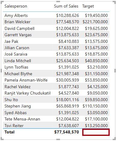
-
Use the snippets file definitions to create the following two measures for the
Targetstable:VarianceVariance Margin
-
Format the
Variancemeasure for zero decimal places. -
Format the
Variance Marginmeasure as percentage with two decimal places. -
Add the
VarianceandVariance Marginmeasures to the table visual. -
Resize the table visual so all columns and rows can be seen.
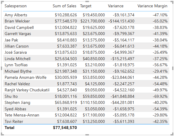
While it appears all salespeople aren’t meeting target, remember that the table visual isn’t yet filtered by a specific time period. You’ll produce sales performance reports that filter by a user-selected time period in the Design a Report in Power BI Desktop lab.
-
Save the Power BI Desktop file.
Lab complete
You may choose to save your Power BI report, though it’s not necessary for this lab. In the next exercise, you’ll work with a pre-made starter file.
- Navigate to the “File” menu in the top left corner and select “Save As”.
- Select Browse this device.
- Select the folder where you want to save the file and give it a descriptive name.
- Select the Save button to save your report as a .pbix file.
- If a dialog box appears prompting you to apply pending query changes, select Apply.
- Close Power BI Desktop.