Configure a semantic model in Power BI
Lab story
In this lab, you’ll commence developing the data model. It will involve creating relationships between tables, and then configuring table and column properties to improve the friendliness and usability of the data model. You’ll also create hierarchies and quick measures.
In this lab, you learn how to:
- Create model relationships.
- Configure table and column properties.
- Create hierarchies.
- Create quick measures.
- Configure a many-to-many relationship.
This lab should take approximately 45 minutes.
Get started
To complete this exercise, first open a web browser and enter the following URL to download the zip file:
https://github.com/MicrosoftLearning/PL-300-Microsoft-Power-BI-Data-Analyst/raw/Main/Allfiles/Labs/03-configure-semantic-model/03-model-data.zip
Extract the file to the C:\Users\Student\Downloads\03-model-data folder.
Open the 03-Starter-Sales Analysis.pbix file.
Note: You may see a sign-in dialog as the file loads. Select Cancel to dismiss the sign-in dialog. Close any other informational windows. Select Apply Later, if prompted to apply changes.
Create model relationships
In this task, you’ll create model relationships. The file was configured to not identify relationships between tables, which isn’t the default setting, but is recommended to prevent extra work creating the correct relationships for your model.
The labs use a shorthand notation to reference a field. It will look like this:
Product | Category. In this example,Productis the table name andCategoryis the field name.
-
In Power BI Desktop, to view all table fields, in the Data pane, right-click an empty area, and then select Expand All.
-
To create a table visual, in the Data pane, from inside the
Producttable, check theCategoryfield. -
To add another column to the table, in the Data pane, check the
Sales | Salesfield. -
Notice that the table visual lists four product categories, and that the sales value is the same for each, and the same for the total.
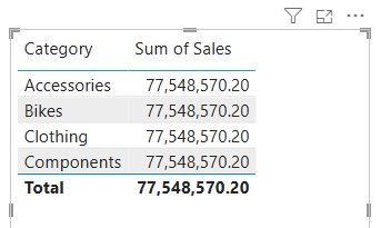
The issue is that the table is based on fields from different tables. The expectation is that each product category displays the sales for that category. However, because there isn’t a model relationship between these tables, the
Salestable isn’t filtered. You’ll now add a relationship to propagate filters between the tables. -
To switch to the model designer, at the left select the Model view icon.
-
On the Home ribbon, select Manage Relationships.
-
In the Manage Relationships window, notice that no relationships are yet defined.
-
To create a relationship, select + New relationship.
-
To configure a relationship from
Producttable toSalestable, in the From table dropdown list, select theProducttable, and in the To table dropdown list, select theSalestable.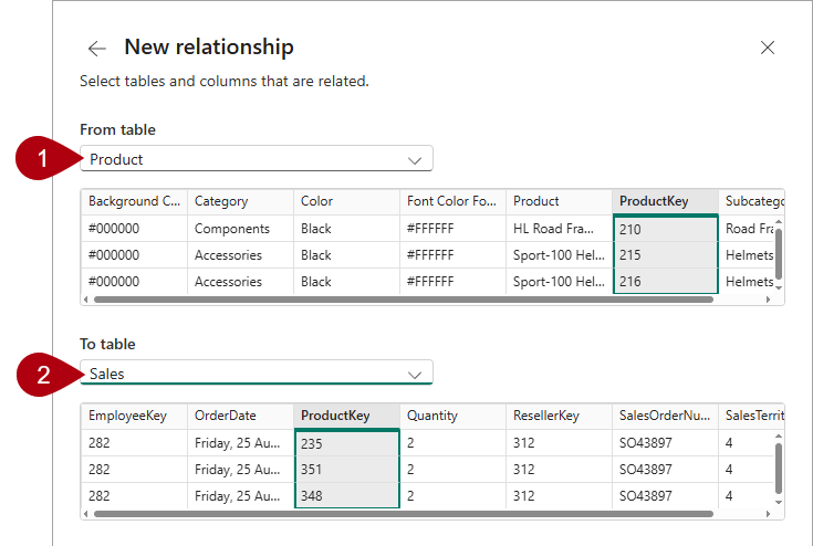
-
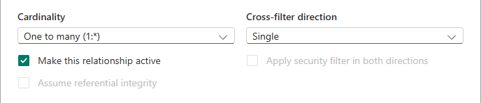
Notice the following properties were automatically configured:
- ProductKey columns in each table are selected. The columns were selected because they share the same name and data type. You may need to find matching columns with different names in real data.
- Cardinality type is One To Many (1:*). The cardinality was automatically detected, because Power BI understands that the
ProductKeycolumn from theProducttable contains unique values. One-to-many relationships are the most common cardinality, and all relationship you create in this lab will be this type. - Cross Filter Direction type is Single. Single filter direction means that filters propagate from the “one side” to the “many side”. In this case, it means filters applied to the
Producttable will propagate to theSalestable, but not in the opposite direction. - Make This Relationship Active is checked. Active relationships propagate filters. It’s possible to mark a relationship as inactive so filters don’t propagate. Inactive relationships can exist when there are multiple relationship paths between tables. In this case, model calculations can use special functions to activate them.
-
Select Save, notice in the Manage Relationships window that the new relationship is listed, and then select Close.
-
In the model diagram, notice there’s now a connector between the two tables (you might choose to reposition the tables to see the relationship more clearly).
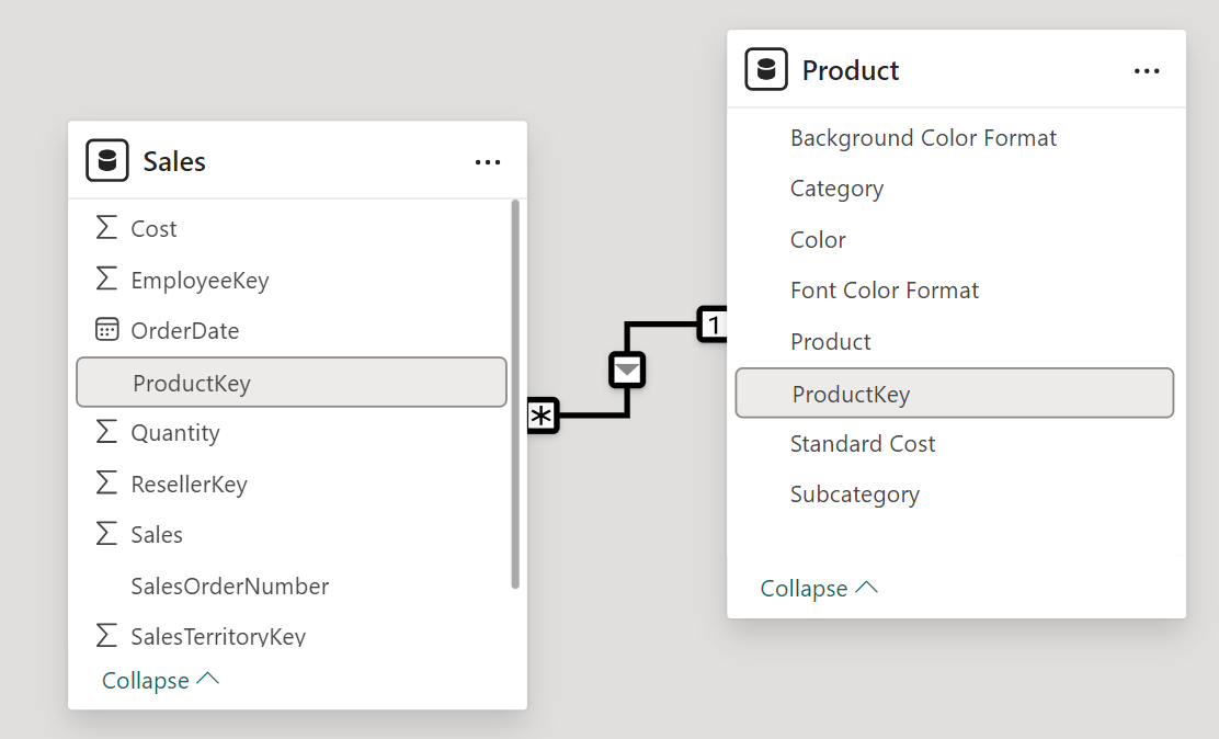
You can interpret many of the relationship properties by looking at the relationship line in the diagram:
- Cardinality is represented by the 1 and (*) indicators.
- Filter direction is represented by the arrow head.
- A solid line represents an active relationship; a dotted line represents an inactive relationship.
Tip: If you hover the cursor over the relationship to highlight the related columns._
-
Switch to Report view, and then notice that the table visual updated to display different values for each product category.
Filters applied to the
Producttable now propagate to theSalestable.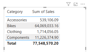
Create additional relationships
There’s an easier way to create a relationship. In the model diagram, you can drag and drop columns to create a new relationship.
-
To create a new relationship using a different technique, switch to Model view.
-
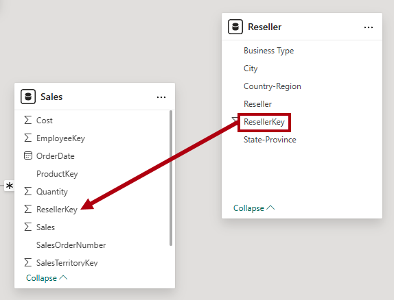
From the
Resellertable, drag theResellerKeycolumn onto theResellerKeycolumn of theSalestable.Important: Sometime a column doesn’t want to be dragged. If this situation arises, select a different column, and then select the column you intend to drag again, and then try again. Ensure that you see the new relationship added to the diagram.
-
In the New relationship window, review the configuration, and then select Save.
-
Use the new technique to create the following two model relationships:
Region | SalesTerritoryKeytoSales | SalesTerritoryKeySalesperson | EmployeeKeytoSales | EmployeeKey
-
In the diagram, arrange the tables so that the
Salestable is positioned in the center of the diagram, and the related tables are arranged about it. Position the disconnected tables to the side.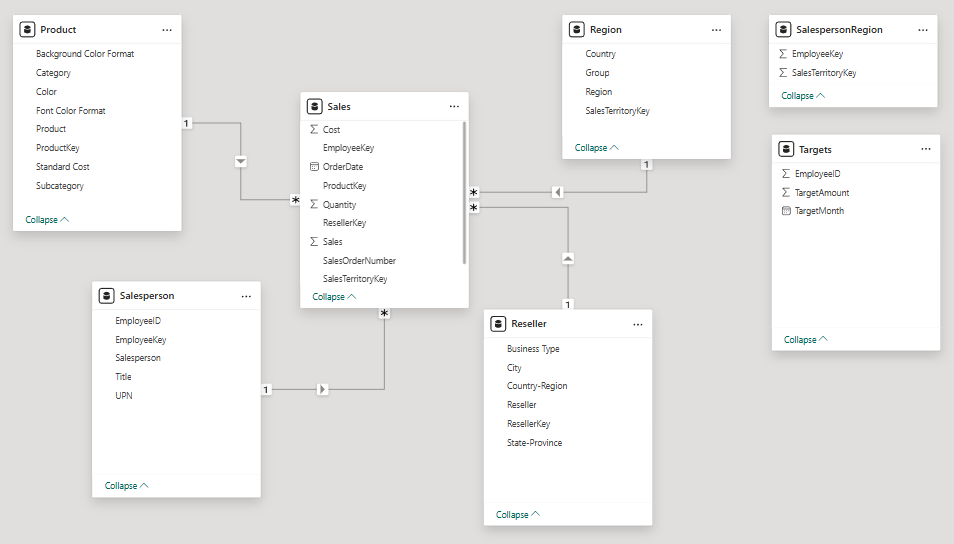
-
Save the Power BI Desktop file.
Configure the Product table
In this task, you’ll configure the Product table with a hierarchy and display folder.
-
Switch to Model view.
-
In the Data pane, if necessary, expand the
Producttable to reveal all fields. -
In the
Producttable, right-click theCategorycolumn, and the select Create hierarchy.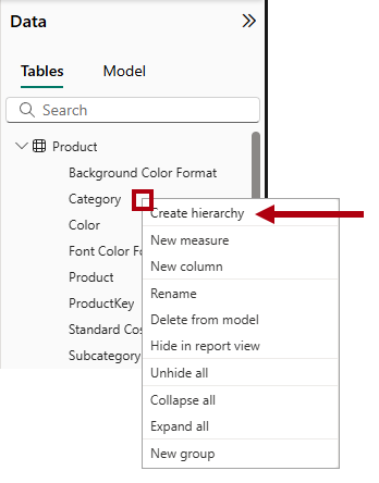
-
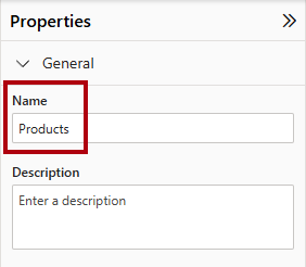
In the Properties pane, in the Name box, replace the value with Products.
-
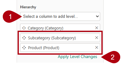
To add levels to the hierarchy, in the Hierarchy dropdown list, select Subcategory and then select Product, and then select Apply Level Changes.
-
In the Data pane, notice the
Productshierarchy. To reveal the hierarchy levels, expand it.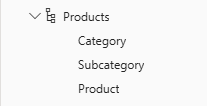
-
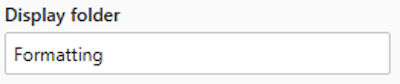
To organize columns into a display folder, in the Data pane, first select the
Background Color Formatcolumn. -
While pressing the Ctrl key, select the
Font Color Formatcolumn. -
In the Properties pane, in the Display Folder box, enter Formatting.
-
In the Data pane, notice that the two columns are now inside a folder.
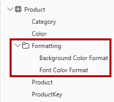
Display folders are a great way to organize tables, especially for tables that comprise many fields. They’re logical presentation only.
Configure the Region table
In this task, you’ll configure the Region table with a hierarchy and updated categories.
-
In the
Regiontable, create a hierarchy named Regions, with the following three levels:GroupCountryRegion
-
Select the
Countrycolumn (not theCountryhierarchy level). -
In the Properties pane, expand the Advanced section (located at the bottom of the pane), and then in the Data Category dropdown list, select Country/Region.
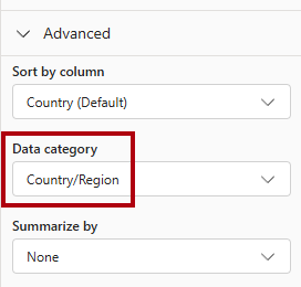
Data categorization can provide hints to the report designer. In this case, categorizing the column as country or region provides more accurate information to Power BI when it renders a map visualization.
Configure the Reseller table
In this task, you’ll configure the Reseller table to add a hierarchy and update data categories.
-
In the
Resellertable, create a hierarchy named Resellers, with the following two levels:Business TypeReseller
-
Create a second hierarchy named Geography, with the following four levels:
Country-RegionState-ProvinceCityReseller
-
Set the data category for the following columns (not within the hierarchy):
Country-Regionto Country/RegionState-Provinceto State or ProvinceCityto City
Configure the Sales table
In this task, you’ll configure the Sales table with updated descriptions, formatting, and summarization.
-
In the
Salestable, select theCostcolumn. -
In the Properties pane, in the Description box, enter: Based on standard cost
Descriptions can be applied to tables, columns, hierarchies, or measures. In the Data pane, description text is revealed in a tooltip when a report author hovers their cursor over the field.
-
Select the
Quantitycolumn. -
In the Properties pane, from inside the Formatting section, set the Thousands Separator property to Yes.
-
Select the
Unit Pricecolumn. -
In the Properties pane, from inside the Formatting section, set the Decimal Places property to 2.
-
In the Advanced group (you may need to scroll down to locate it), in the Summarize By dropdown list, select Average.
By default, numeric columns will summarize by summing values together. This default behavior isn’t suitable for a column like
Unit Price, which represents a rate. Setting the default summarization to average will produce a meaningful result.
Bulk update properties
In this task, you’ll update multiple columns using single bulk updates. You’ll use this approach to hide columns, and format column values.
-
In the Data pane (or model diagram), select the
Product | ProductKeycolumn. -
While pressing the Ctrl key, select the following 13 columns (spanning multiple tables):
Region | SalesTerritoryKeyReseller | ResellerKeySales | EmployeeKeySales | ProductKeySales | ResellerKeySales | SalesOrderNumberSales | SalesTerritoryKeySalesperson | EmployeeIDSalesperson | EmployeeKeySalesperson | UPNSalespersonRegion | EmployeeKeySalespersonRegion | SalesTerritoryKeyTargets | EmployeeID
-
In the Properties pane, set the Is Hidden property to Yes.
The columns were hidden because they’re either used by relationships or will be used in row-level security configuration or calculation logic.
You’ll use the
SalesOrderNumbercolumn in a calculation in the Create DAX Calculations in Power BI Desktop lab. -
Multi-select the following three columns:
Product | Standard CostSales | CostSales | Sales
-
In the Properties pane, from inside the Formatting section, set the Decimal Places property to 0 (zero).
Explore the model interface
In this task you’ll switch to Report view, review the data model interface, and configure the auto date/time setting.
-
Switch to Report view.
-
In the Data pane, notice the following:
- Columns, hierarchies and their levels are fields, which can be used to configure report visuals.
- Only fields relevant to report authoring are visible.
- The
SalespersonRegiontable isn’t visible—because all of its fields are hidden. - Spatial fields in the
RegionandResellertable are adorned with a spatial icon. - Fields adorned with the sigma symbol (Ʃ) will summarize, by default.
- A tooltip appears when hovering the cursor over the
Sales | Costfield.
-
Expand the
Sales | OrderDatefield, and then notice that it reveals aDate Hierarchy. TheTargets | TargetMonthfield delivers a similar hierarchy.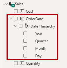
Important: These hierarchies weren’t created by you. They were created automatically as a default setting. There’s a problem, however. The Adventure Works financial year commences on July 1 of each year. But, in these automatically created date hierarchies, the date hierarchy year commences on January 1 of each year.
-
To turn off the auto date/time setting, navigate to File > Options and Settings > Options.
-
In the Options window, on the Current File section, navigate to Data Load > Time Intelligence, and uncheck Auto Date/Time.

-
In the Data pane, notice that the date hierarchies are no longer available.
Create quick measures
In this task, you’ll create two quick measures to calculate profit and profit margin. A quick measure creates the calculation formula for you. They’re easy and fast to create for simple and common calculations.
-
In the Data pane, right-click the
Salestable, and then select New Quick Measure.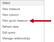
-
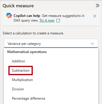
In the Quick Measure pane, in the Select a Calculation dropdown list, from inside the Mathematical Operations group, select Subtraction.
-
From the Data pane, drag the
Sales | Salesfield into the Base Value well.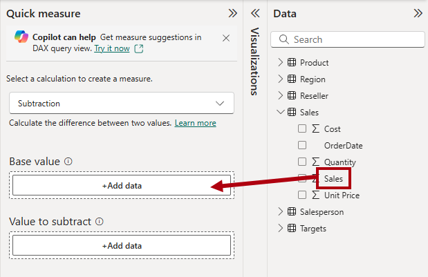
-
Drag the
Sales | Costfield into the Value to Subtract box.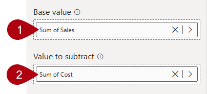
-
Select Add.
-
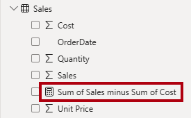
In the Data pane, inside the
Salestable, notice that new measure.Measures are indicated by the calculator icon.
-
To rename the measure, right-click it, select Rename, then rename as Profit.
Tip: To rename a field, you can also double-click it, or select it and press F2.
-
In the
Salestable, add a second quick measure, based on the following requirements:_Important: If the option to create a quick measure doesn’t appear in the context menu, use the command located on the Home ribbon, from inside the Calculations group.
- Use the Division mathematical operation.
- Set the Numerator to the
Sales | Profitfield. - Set the Denominator to
Sales | Salesfield. - Rename the measure as Profit Margin.
-
Ensure the
Profit Marginmeasure is selected, and then on the Measure Tools contextual ribbon, set the format to Percentage, with two decimal places.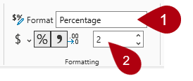
-
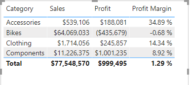
To test the two measures, first select the existing table visual on the page.
-
In the Data pane, check the
ProfitandProfit Marginmeasures to add them to the table.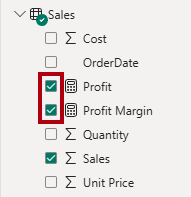
-
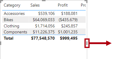
Select and drag the right guide to widen the table visual.
-
Verify that the measures produce reasonable results that are correctly formatted.
Create a many-to-many relationship
In this task, you’ll create a many-to-many relationship between the Salesperson table and the Sales table.
-
In Report view, select a blank area of the report page.
-
To create a new table visual, in the Data pane, check the following two fields:
Salesperson | SalespersonSales | Sales
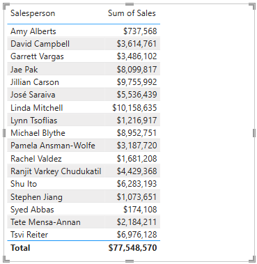
The table visual displays sales made by each salesperson. However, there’s another relationship between salespeople and sales. Some salespeople belong to one, two, or possibly more sales regions. In addition, sales regions can have multiple salespeople assigned to them.
From a performance management perspective, a salesperson’s sales (based on their assigned territories) need to be analyzed and compared with sales targets. You’ll create relationships to support this analysis in the next exercise.
-
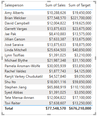
Notice that Michael Blythe has generated almost 9 million dollars of sales.
-
Switch to Model view, then drag the
SalespersonRegiontable to position it between theRegionandSalespersontables. -
Use the drag-and-drop technique to create the following two model relationships:
Salesperson | EmployeeKeytoSalespersonRegion | EmployeeKeyRegion | SalesTerritoryKeytoSalespersonRegion | SalesTerritoryKey
The
SalespersonRegiontable can be considered to be a bridging table. -
Switch to Report view, and then notice that the visual hasn’t updated—the sales result for Michael Blythe hasn’t changed.
-
Switch back to Model view, and then follow the relationship filter directions (arrowhead) from the
Salespersontable.Consider that the
Salespersontable filters theSalestable. It also filters theSalespersonRegiontable, but it doesn’t continue by propagating filters to theRegiontable (the arrowhead is pointing the wrong direction).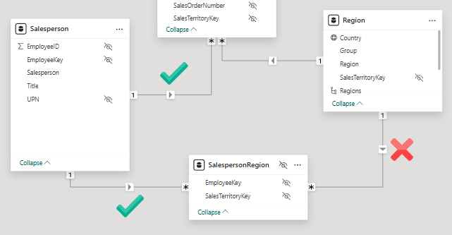
-
To edit the relationship between the
RegionandSalespersonRegiontables, double-click the relationship. -
In the Edit Relationship window, in the Cross Filter Direction dropdown list, select Both.
-
Check the Apply Security Filter in Both Directions checkbox.
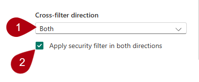
-
Select Save.
-
Notice that the relationship has a double arrowhead now.
-
Switch to Report view, and then notice that the sales values have still not changed.
The issue now relates to the fact that there are two possible filter propagation paths between the
SalespersonandSalestables. This ambiguity is internally resolved, based on a “least number of tables” assessment. To be clear, you shouldn’t design models with this type of ambiguity—the issue will be addressed in part later in this lab, and by the completion of the Create DAX Calculations in Power BI Desktop lab. -
Switch to Model view.
-
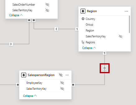
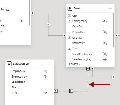
To force filter propagation via the bridging table, edit (double-click) the relationship between the
SalespersonandSalestables. -
In the Edit Relationship window, uncheck the Make This Relationship Active checkbox.
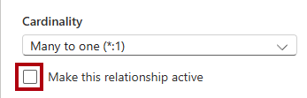
-
Select Save.
Filter propagation will now follow the only active path.
-
In the model diagram, notice that the inactive relationship is represented by a dotted line.
-
Switch to Report view, and then notice that the sales for Michael Blythe are now nearly 22 million dollars.
-
Notice also, that the sales for each salesperson—if added—would exceed the table total.
It’s a common observation of a many-to-many relationship due to the double, triple, etc. counting of regional sales results. Consider Brian Welcker, the second salesperson listed. His sales amount equals the total sales amount. It’s the correct result due to the fact that he’s the Director of Sales; his sales are measured by the sales of all regions.
While the many-to-many relationship is now working, it’s now not possible to analyze sales made by a salesperson (because the relationship is inactive). You’ll be able to reactivate the relationship when you introduce a calculated table that will allow analyzing sales made in the sales region(s) assigned to the salesperson (for performance analysis) in the Create DAX Calculations in Power BI Desktop lab.
-
Switch to Model view, and then in the model diagram, select the
Salespersontable. -
In the Properties pane, in the Name box, replace the text with Salesperson (Performance).
The renamed table now reflects its purpose: it’s used to report and analyze the performance of salespeople based on the sales of their assigned sales regions.
Relate the Targets table
In this task, you’ll create a relationship to the Targets table.
-
Create a relationship from the
Salesperson (Performance) | EmployeeIDcolumn and theTargets | EmployeeIDcolumn. -
In Report view, add the
Targets | Targetfield to the table visual. -
Resize the table visual so all columns are visible.
It’s now possible to visualize sales and targets—but for now take care for two reasons. First, there’s no filter on a time period, and so targets also include future target amounts. Second, targets aren’t additive, and so the total shouldn’t be displayed. They can either be disabled by formatting the visual or removed by using calculation logic.
- Save the Power BI Desktop file.
Lab complete
You may choose to save your Power BI report, though it’s not necessary for this lab. In the next exercise, you’ll work with a pre-made starter file.
- Navigate to the “File” menu in the top left corner and select “Save As”.
- Select Browse this device.
- Select the folder where you want to save the file and give it a descriptive name.
- Select the Save button to save your report as a .pbix file.
- If a dialog box appears prompting you to apply pending query changes, select Apply.
- Close Power BI Desktop.