Lab 05.1: Build canvas apps
In this module you will design and build a canvas app for the company employees to submit problem reports.
What you will learn
- Import and use a pre-built component library
- Create a Power Apps canvas app
- Connect to a data source
- Filter data
- Create data rows
- Use images with data rows
- Bonus Exercise (optional): Create a canvas app from an image
High-level lab steps
- Import company components
- Create app and layout main screen (including list of my items)
- Submit New Report
- Test
- Bonus Exercise (optional): Create a canvas app from an image
Prerequisites
- Must have completed Lab 02.1: Data model
Detailed steps
Exercise 1: Create canvas application
In this exercise, you will import a solution with shared components, create a view for the Problem Report table and create a canvas application.
Task 1: Import component library solution
In this task, you will import the shared components solution into your environment. This shared component library was built by another team at your company.
-
Navigate to the Power Apps maker portal page and make sure you are in the correct environment.
-
Select Solutions and select Import solution.
-
Select Browse.
-
Go to the Lab Resources folder, select the Shared Components solution file, and select Open. You may also download the file to your computer here.
TIP
The lab resources can be found here:
F:\Instructions\Labs\03\Resources\SharedComponents_1_0_0_4.zip -
Select Next.
-
Select Import and wait for the import to complete.
-
Select Publish all customizations and wait for the publishing to complete.
-
Open the Shared Components solution.
-
The solution should have one item in it: Lamna Healthcare Shared Components
-
Navigate to the Power Apps maker portal page and make sure you are in the correct environment.
-
Select Apps and select the Lamna Healthcare Shared Components App to edit the app.
-
If prompted, select your Region/Country and select Get started or select Skip.
NOTE
When the app is open in Edit mode, move on to next step, as the Preloader component shows a Loading icon but it is not actually waiting for something to load.
-
After the app opens, select the drop-down ˅ next to the Save button and select Save as.
-
Change app name to
Lamna Healthcare Shared Components Aand select Save. -
Select OK when prompted to save as a new library.
-
Close the Lamna Healthcare Shared Components tab in your browser.
Task 2: Create view
In this task, create a view that will show the current user’s problem reports. Later, this view will be used with the filter function in the canvas app.
-
Navigate to the Power Apps maker portal page and make sure you are in the correct environment.
-
Select Solutions and open the Company 311 solution.
-
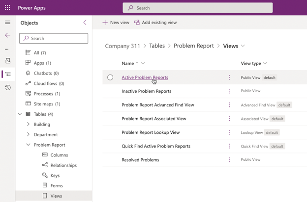
Locate and open the Problem Report table.
-
Select Views in the tree view in the Objects pane and open the Active Problem Reports view.
-
Select Edit filters.
-
You want to show the Problem Reports that were created by you. Change Status Reason to Created By and Equals to Equals current user.
-
Select Ok.
-
Select Save As.
-
Enter
My Reportsfor Name and select Save. -
Select Save and publish and wait for the publishing to complete.
-
Select the 🡠 Back button on the command bar to go back to the Problem Report table details.
Task 3: Create the user application
In this task, create a canvas app using the phone form factor.
-
Navigate to the Power Apps maker portal page and make sure you are in the correct environment.
-
Select Solutions and open the Company 311 solution.
-
Select + New > App > Canvas app.
-
Enter
Company 311 Phone Appfor App name, select Phone for format, and select Create. -
Select Skip if presented with a pop-up.
-
In the Tree view, select the three dots (…) beside Screen1 and select Rename.
-
Rename the screen to
Main Screenand press Enter on your keyboard.It’s always a good idea to give screens a meaningful name.
-
Select the Main Screen and then select + icon from the left navigation pane.
-
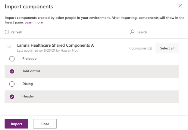
Select Get more components at the bottom of the Insert pane.
-
In the Lamna Healthcare Shared Components A Library, select Header and TabControl, and then select Import.
-
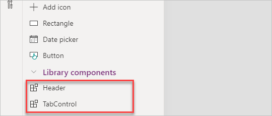
Expand Library components in the Insert pane, select Header and Tab Control. These are both components from the library you imported earlier in the lab.
-
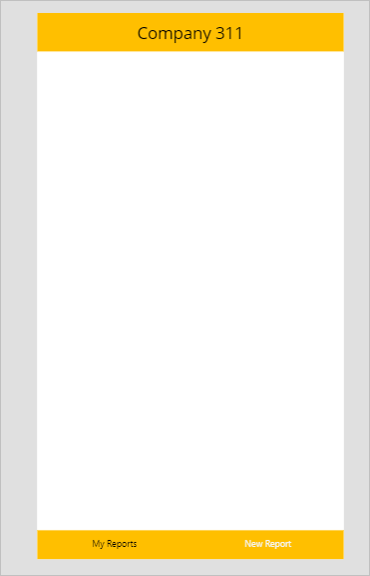
Move the Tab Control to the bottom of the screen and the Header Control to the top of the screen.
-
Select the Header Control.
-
You want to change the Text value of the Header Control. Use the Property selector to change the property to Text and then populate
Company 311as the value in the formula bar. You will use the Property selector to change properties of app components in this manner throughout this lab.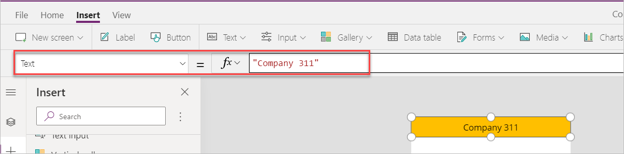
-
Set the Height of the Header Control to
75 -
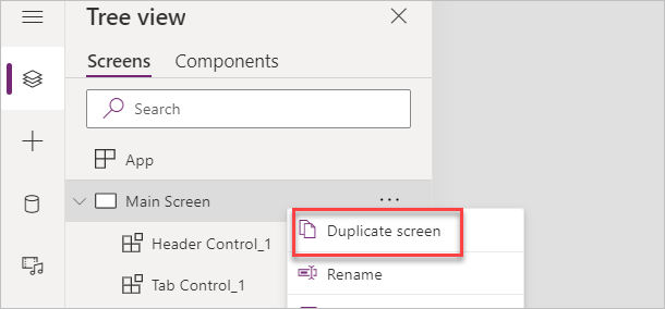
In the Tree view, right-click on the Main Screen and select Duplicate screen.
-
Rename the new screen
New Reports Screen -
Select the Tree view, select App and change the OnStart value to the formula below. This formula will create a new variable named My Tabs and set it to a table of tab items.
Set('My Tabs', Table( {
	Label: "My Reports",
	Screen: 'Main Screen',
	Icon: "",
	SelectedIcon:""
},
{
	Label: "New Report",
	Screen: 'New Reports Screen',
	Icon: "",
	SelectedIcon:""
}
))
IMPORTANT
When expressions are copied, the quotes and double quotes are sometimes replaced with their “smart” counterparts which are not valid in formulas. If you copy and paste the expression above, make sure the resulting formula does not contain any errors.
-
Select the Tab Control component in the Main Screen and change the Items value to
'My Tabs'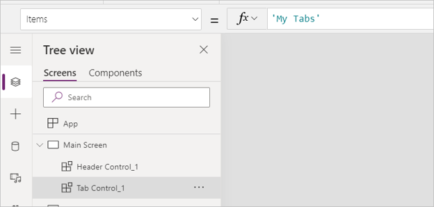
-
With the Main Screen Tab Control component still selected, change the SelectedColor value to
Color.WhiteSmoke -
Select the Tab Control inside the New Report Screen and set the Items value to
'My Tabs' -
With the New Report Screen Tab Control still selected, change the SelectedColor value to
Color.WhiteSmoke -
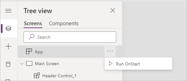
In the Tree view, right-click on App and select Run OnStart.
-
The tab names should update.
-
Select Save from the command bar.
Do not navigate away from this page.
Exercise 2: My reports
In this exercise, add a gallery that will show reports created by the current logged in user.
Task 1: Add gallery
-
In the tree view, select the Main Screen
-
Select Insert menu, then select Vertical gallery.
-
Select the tree view and rename the new gallery to
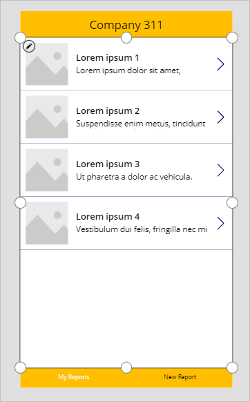
My Reports Gallery -
Resize and reposition My Reports Gallery, setting the Y value to
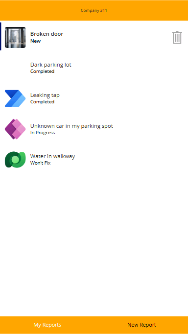
75and the Height value to1000Your Main Screen should resemble this example:
-
Select My Reports Gallery, go to the Properties pane, and select Problem Reports for Data Source. If you do not see Problem Reports, select See all tables or Search for the table.
-
Select the My Reports view you created for View.
-
Under Fields, select Edit (you may also have “7 selected” displayed; click “7 selected” to edit the fields).
-
Change Subtitle1 to statuscode. This is the Status Reason column.
-
Select Image control within the gallery by expanding My Reports Gallery in the tree view and selecting Image1.
-
Set Image value to the formula below. This allows images to be displayed correctly when view is used as a source.
`LookUp('Problem Reports', 'Problem Report' = ThisItem.'Problem Report').Photo`
- Select the Save icon.
Do not navigate away from this page.
Exercise 3: Allow removing reports
In this exercise, allow unassigned reports to be removed. This will allow users to easily remove any reports that were accidentally created.
Task 1: Allow remove
-
Expand the My Reports Gallery.
-
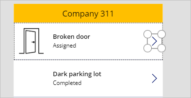
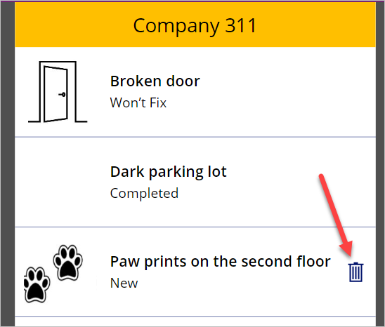
Select the NextArrow1 icon inside the My Reports Gallery.
-
In the Tree view, double-click NextArrow1 and rename it to
Remove Report -
While still selected on the Remove Report icon, change the Icon value to Icon.Trash.
-
Change the Visible value to the formula below. This formula will hide the icon if the status reason is not New.
If(ThisItem.'Status Reason' = 'Status Reason (Problem Reports)'.New, true, false) -
Make sure you still have the Remove Report icon selected. Change the OnSelect value to the formula below. This formula will remove the Problem Report row when a user selects the Remove Report (trash) icon.
Remove('Problem Reports', ThisItem) -
Change the Tooltip value to
"Remove this report" -
On the properties pane, set all the Padding values to
0. This allows the icon to better fill the space in the gallery row. -
Select Save.
Do not navigate away from this page.
Exercise 4: Add new report
In this exercise, add a form to the canvas app to submit new problem reports.
Task 1: Add new report form
-
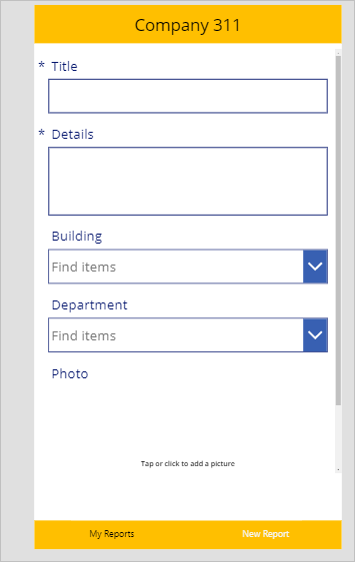
Select the New Reports Screen, select Insert, then select Edit Form.
-
Rename the form to
New Report Form -
Select New Report Form, go to the Properties pane, and select Problem Reports for Data source.
-
Select Edit fields (this may display as “4 selected” beside Fields; select “4 selected).
-
Remove the Status Reason Column.
-
Remove the Created On Column.
-
Select + Add field.
-
Select Building, Details, and Photo, and then select Add.
-
Close the Fields pane.
-
Resize and reposition the form, setting the Y value to
75and the Height value to900It takes most of the page and leave enough room for a button at the bottom.
-
Select the New Reports Screen.
-
Select Insert then select Button.
-
Rename the button
Submit Report -
Move the button below the form, or set X value to
180and Y value to990 -
Change the Submit Report button Text property to
Submit -
Select the Submit Report button and change the OnSelect value to the formula below. This formula will create a new Row in the Problem Reports table.
SubmitForm('New Report Form') -
Select the New Report Form.
-
Change the OnSuccess value to the formula below. This formula will show a notification after the new Problem Report row gets created and clears the form when the record creation is successful.
Notify("Created new problem report row");NewForm('New Report Form') -
Select the New Reports Screen.
-
Set the OnVisible value to the formula below. This formula will create a new form when the screen becomes visible.
NewForm('New Report Form') -
Select Save.
-
Select Publish.
-
Select Publish this version and wait for the publishing to complete.
Do not navigate away from this page.
Exercise 5: Test the application
In this exercise, test the canvas application by submitting a problem report.
Task 1: Test application
-
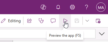
Select the Main Screen and select the Play icon to Preview the app.
-
The application should load, and the list should show all the reports you created.
-
Select the New Report tab.
-
The New Report Form should load. Fill out the form and select the area under the Photo label.
-
Select an image.
-
Select Submit.
-
The row should get created successfully and you should see the success message.
-
Select the My Reports tab.
-
You should see the new report you created. Select the Remove Report button to test the delete.
-
The row should be deleted and removed from the list.
-
Close the preview mode.
-
Close the app studio by closing the browser tab.
BONUS EXERCISE: Explore other ways to build canvas applications
In this exercise, create a canvas app from an image mockup. This exercise is optional and not required to continue to the next lab.
BONUS TASK 1: Create an app from an image
-
Navigate to the Power Apps maker portal page and make sure you are in the correct environment.
-
Select + Create on the left navigation.
-
Under the Start From section, select Image.
-
From the Convert into an app screen, select Next.
-
Name the app Report Problems and set the app format to Phone.
-
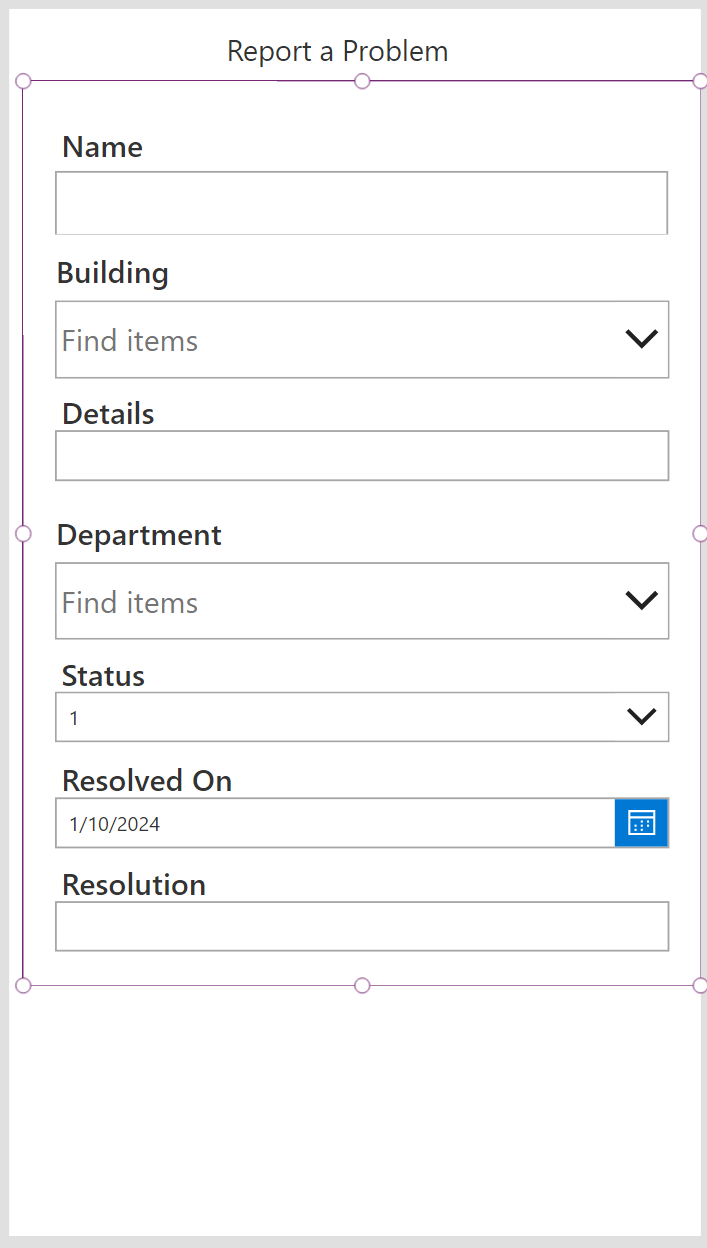
Select the Choose File button and select the Report a Problem.png file from your class resources folder, select the Next button. (You can find that file here)
-
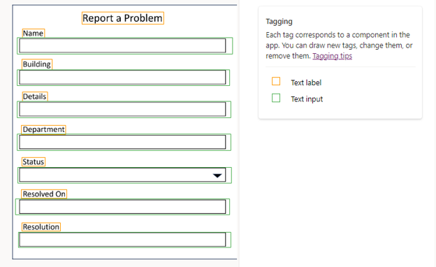
On the Draw tags and assign components screen, verify your screen matches the image below:
-
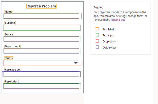
Select the Text Input box under the Status label, from the menu that appears, change the Data Type to Drop Down.
-
Select the Text Input box under the Resolved On label, from the menu that appears, change the Data Type to Date Picker.
-
Your tagged form should resemble the image below:
-
Select the Next button.
-
On the Set up your Data screen, ensure that Connect to a Dataverse table is selected, then select Next.
-
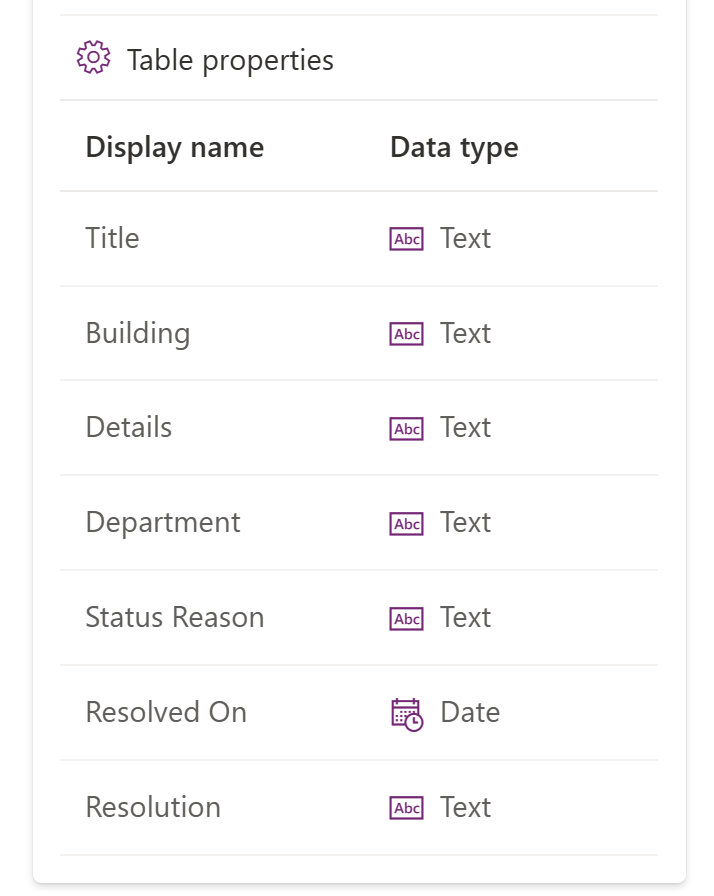
On the Select table screen, choose Problem Report, then select Next. Next, we will tag the specific fields to the correct column in Dataverse.
NOTE
When defining how the columns will be set up, you need to make sure that the selector includes both the Label and Input Field. Your app may not render correctly if not.
-
Select the Tag around the Name label and the input field.
-
Assign the item to the Title column, select Save.
-
Using the table below, repeat the above process for each item on the form to update the column that they represent.
| Field | Dataverse Column |
|---|---|
| Building | Building |
| Details | Details |
| Department | Department |
| Status | Status Reason |
| Resolved On | Resolved On |
| Resolution | Resolution |
- Once complete, your tagged columns should resemble the image below, select the Next button.
-
On the Review screen, verify that your Problem Report columns are mapped correctly.
-
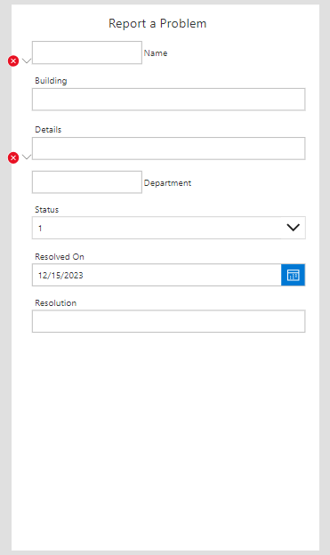
Select Create.
NOTE
It can take a few minutes for your new app to be created.
- Your newly created app will resemble the image below:
BONUS TASK 2: Modify your canvas app
When you create an app from an image, you are somewhat limited as to the types of fields that you can select. For this reason, some items such as lookup fields will not display properly since the data type was defined as text. For this reason, we will make some modifications to the application to fix this.
Both the Department and Building field are lookup fields. We are going to remove the generated ones and replace them with the actual fields from Dataverse.
-
On the left side of your app screen, select the Form1 control.
-
In the Properties section on the right of the screen, select Edit Fields.
-
Hover the Building_DataCardXXX (Custom) field and Remove it.
-
Hover the Department_DataCardXXX (Custom) field and Remove it as well.
Next, we are going to add the actual Lookup field from Dataverse to the app.
-
Select Add Fields.
-
From the menu that appears, select the Building and Department fields and select Add. Next, we are going to make some formatting changes to ensure that all the Data Cards on the form look the same.
-
Close the Fields pane.
-
Using the Sizing controls on Form1, make the form bigger so that the Department field displays.
-
In the Fields menu to the left of the canvas app screen, move the Building field below the Name field.
-
Move the Department field below the Building field.
-
On Form1, Select the Label control on the Details Data Card.
-
Change the Font to 21 and the Font Weight to Semibold.
-
Repeat that process for the Status, Resolved On and Resolution Data Cards.
-
On Form1 in Tree View, select the Name_DataCardXXX (Custom) control
-
Using the Sizing controls, change the Height of the control to about 142.
-
Move the Name Data Card’s, Textinput control to the bottom of the control, and expand the controls width so that it is the same width of the other controls on the form.
-
Move the controls TextLabel to align with the other labels on the form.
-
Change the Name Label Font to 21 and the Font Weight to Semibold.
-
If necessary, resize the Form control to ensure that the Resolution field is completely displayed.
-
Your completed App should resemble the Image below.