Analyze data in a data lake with Spark
Apache Spark is an open source engine for distributed data processing, and is widely used to explore, process, and analyze huge volumes of data in data lake storage. Spark is available as a processing option in many data platform products, including Azure HDInsight, Azure Databricks, and Azure Synapse Analytics on the Microsoft Azure cloud platform. One of the benefits of Spark is support for a wide range of programming languages, including Java, Scala, Python, and SQL; making Spark a very flexible solution for data processing workloads including data cleansing and manipulation, statistical analysis and machine learning, and data analytics and visualization.
This lab will take approximately 45 minutes to complete.
Before you start
You’ll need an Azure subscription in which you have administrative-level access.
Provision an Azure Synapse Analytics workspace
You’ll need an Azure Synapse Analytics workspace with access to data lake storage and an Apache Spark pool that you can use to query and process files in the data lake.
In this exercise, you’ll use a combination of a PowerShell script and an ARM template to provision an Azure Synapse Analytics workspace.
- Sign into the Azure portal at
https://portal.azure.com. -
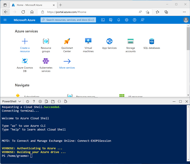
Use the [>_] button to the right of the search bar at the top of the page to create a new Cloud Shell in the Azure portal, selecting a PowerShell environment and creating storage if prompted. The cloud shell provides a command line interface in a pane at the bottom of the Azure portal, as shown here:
Note: If you have previously created a cloud shell that uses a Bash environment, use the the drop-down menu at the top left of the cloud shell pane to change it to PowerShell.
-
Note that you can resize the cloud shell by dragging the separator bar at the top of the pane, or by using the —, ◻, and X icons at the top right of the pane to minimize, maximize, and close the pane. For more information about using the Azure Cloud Shell, see the Azure Cloud Shell documentation.
-
In the PowerShell pane, enter the following commands to clone this repo:
rm -r dp500 -f git clone https://github.com/MicrosoftLearning/DP-500-Azure-Data-Analyst dp500 -
After the repo has been cloned, enter the following commands to change to the folder for this lab and run the setup.ps1 script it contains:
cd dp500/Allfiles/02 ./setup.ps1 - If prompted, choose which subscription you want to use (this will only happen if you have access to multiple Azure subscriptions).
-
When prompted, enter a suitable password to be set for your Azure Synapse SQL pool.
Note: Be sure to remember this password!
- Wait for the script to complete - this typically takes around 10 minutes, but in some cases may take longer. While you are waiting, review the Apache Spark in Azure Synapse Analytics article in the Azure Synapse Analytics documentation.
Query data in files
The script provisions an Azure Synapse Analytics workspace and an Azure Storage account to host the data lake, then uploads some data files to the data lake.
View files in the data lake
- After the script has completed, in the Azure portal, go to the dp500-xxxxxxx resource group that it created, and select your Synapse workspace.
- In the Overview page for your Synapse workspace, in the Open Synapse Studio card, select Open to open Synapse Studio in a new browser tab; signing in if prompted.
- On the left side of Synapse Studio, use the ›› icon to expand the menu - this reveals the different pages within Synapse Studio that you’ll use to manage resources and perform data analytics tasks.
- On the Manage page, select the Apache Spark pools tab and note that a Spark pool with a name similar to sparkxxxxxxx has been provisioned in the workspace. Later you will use this Spark pool to load and analyze data from files in the data lake storage for the workspace.
- On the Data page, view the Linked tab and verify that your workspace includes a link to your Azure Data Lake Storage Gen2 storage account, which should have a name similar to synapsexxxxxxx (Primary - datalakexxxxxxx).
- Expand your storage account and verify that it contains a file system container named files.
- Select the files container, and note that it contains folders named sales and synapse. The synapse folder is used by Azure Synapse, and the sales folder contains the data files you are going to query.
- Open the sales folder and the orders folder it contains, and observe that the orders folder contains .csv files for three years of sales data.
- Right-click any of the files and select Preview to see the data it contains. Note that the files do not contain a header row, so you can unselect the option to display column headers.
Use Spark to explore data
- Select any of the files in the orders folder, and then in the New notebook list on the toolbar, select Load to DataFrame. A dataframe is a structure in Spark that represents a tabular dataset.
-
In the new Notebook 1 tab that opens, in the Attach to list, select your Spark pool (sparkxxxxxxx). Then use the ▷ Run all button to run all of the cells in the notebook (there’s currently only one!).
Since this is the first time you’ve run any Spark code in this session, the Spark pool must be started. This means that the first run in the session can take a few minutes. Subsequent runs will be quicker.
-
While you are waiting for the Spark session to initialize, review the code that was generated; which looks similar to this:
%%pyspark df = spark.read.load('abfss://files@datalakexxxxxxx.dfs.core.windows.net/sales/orders/2019.csv', format='csv' ## If header exists uncomment line below ##, header=True ) display(df.limit(10)) - When the code has finished running, review the output beneath the cell in the notebook. It shows the first ten rows in the file you selected, with automatic column names in the form _c0, _c1, _c2, and so on.
-
Modify the code so that the spark.read.load function reads data from all of the CSV files in the folder, and the display function shows the first 100 rows. Your code should look like this (with datalakexxxxxxx matching the name of your data lake store):
%%pyspark df = spark.read.load('abfss://files@datalakexxxxxxx.dfs.core.windows.net/sales/orders/*.csv', format='csv' ) display(df.limit(100)) -
Use the ▷ button to the left of the code cell to run just that cell, and review the results.
The dataframe now includes data from all of the files, but the column names are not useful. Spark uses a “schema-on-read” approach to try to determine appropriate data types for the columns based on the data they contain, and if a header row is present in a text file it can be used to identify the column names (by specifying a header=True parameter in the load function). Alternatively, you can define an explicit schema for the dataframe.
-
Modify the code as follows (replacing datalakexxxxxxx), to define an explicit schema for the dataframe that includes the column names and data types. Rerun the code in the cell.
%%pyspark from pyspark.sql.types import * from pyspark.sql.functions import * orderSchema = StructType([ StructField("SalesOrderNumber", StringType()), StructField("SalesOrderLineNumber", IntegerType()), StructField("OrderDate", DateType()), StructField("CustomerName", StringType()), StructField("Email", StringType()), StructField("Item", StringType()), StructField("Quantity", IntegerType()), StructField("UnitPrice", FloatType()), StructField("Tax", FloatType()) ]) df = spark.read.load('abfss://files@datalakexxxxxxx.dfs.core.windows.net/sales/orders/*.csv', format='csv', schema=orderSchema) display(df.limit(100)) -
Under the results, use the + Code button to add a new code cell to the notebook. Then in the new cell, add the following code to display the dataframe’s schema:
df.printSchema() - Run the new cell and verify that the dataframe schema matches the orderSchema you defined. The printSchema function can be useful when using a dataframe with an automatically inferred schema.
Analyze data in a dataframe
The dataframe object in Spark is similar to a Pandas dataframe in Python, and includes a wide range of functions that you can use to manipulate, filter, group, and otherwise analyze the data it contains.
Filter a dataframe
-
Add a new code cell to the notebook, and enter the following code in it:
customers = df['CustomerName', 'Email'] print(customers.count()) print(customers.distinct().count()) display(customers.distinct()) - Run the new code cell, and review the results. Observe the following details:
- When you perform an operation on a dataframe, the result is a new dataframe (in this case, a new customers dataframe is created by selecting a specific subset of columns from the df dataframe)
- Dataframes provide functions such as count and distinct that can be used to summarize and filter the data they contain.
- The
dataframe['Field1', 'Field2', ...]syntax is a shorthand way of defining a subset of column. You can also use select method, so the first line of the code above could be written ascustomers = df.select("CustomerName", "Email")
-
Modify the code as follows:
customers = df.select("CustomerName", "Email").where(df['Item']=='Road-250 Red, 52') print(customers.count()) print(customers.distinct().count()) display(customers.distinct()) - Run the modified code to view the customers who have purchased the Road-250 Red, 52 product. Note that you can “chain” multiple functions together so that the output of one function becomes the input for the next - in this case, the dataframe created by the select method is the source dataframe for the where method that is used to apply filtering criteria.
Aggregate and group data in a dataframe
-
Add a new code cell to the notebook, and enter the following code in it:
productSales = df.select("Item", "Quantity").groupBy("Item").sum() display(productSales) -
Run the code cell you added, and note that the results show the sum of order quantities grouped by product. The groupBy method groups the rows by Item, and the subsequent sum aggregate function is applied to all of the remaining numeric columns (in this case, Quantity)
-
Add another new code cell to the notebook, and enter the following code in it:
yearlySales = df.select(year("OrderDate").alias("Year")).groupBy("Year").count().orderBy("Year") display(yearlySales) -
Run the code cell you added, and note that the results show the number of sales orders per year. Note that the select method includes a SQL year function to extract the year component of the OrderDate field, and then an alias method is used to assign a columm name to the extracted year value. The data is then grouped by the derived Year column and the count of rows in each group is calculated before finally the orderBy method is used to sort the resulting dataframe.
Query data using Spark SQL
As you’ve seen, the native methods of the dataframe object enable you to query and analyze data quite effectively. However, many data analysts are more comfortable working with SQL syntax. Spark SQL is a SQL language API in Spark that you can use to run SQL statements, or even persist data in relational tables.
Use Spark SQL in PySpark code
The default language in Azure Synapse Studio notebooks is PySpark, which is a Spark-based Python runtime. Within this runtime, you can use the spark.sql library to embed Spark SQL syntax within your Python code, and work with SQL constructs such as tables and views.
-
Add a new code cell to the notebook, and enter the following code in it:
df.createOrReplaceTempView("salesorders") spark_df = spark.sql("SELECT * FROM salesorders") display(spark_df) -
Run the cell and review the results. Observe that:
- The code persists the data in the df dataframe as a temporary view named salesorders. Spark SQL supports the use of temporary views or persisted tables as sources for SQL queries.
- The spark.sql method is then used to run a SQL query against the salesorders view.
- The results of the query are stored in a dataframe.
Run SQL code in a cell
While it’s useful to be able to embed SQL statements into a cell containing PySpark code, data analysts often just want to work directly in SQL.
-
Add a new code cell to the notebook, and enter the following code in it:
%%sql SELECT YEAR(OrderDate) AS OrderYear, SUM((UnitPrice * Quantity) + Tax) AS GrossRevenue FROM salesorders GROUP BY YEAR(OrderDate) ORDER BY OrderYear; -
Run the cell and review the results. Observe that:
- The
%%sqlline at the beginning of the cell (called a magic) indicates that the Spark SQL language runtime should be used to run the code in this cell instead of PySpark. - The SQL code references the salesorder view that you created previously using PySpark.
- The output from the SQL query is automatically displayed as the result under the cell.
- The
Note: For more information about Spark SQL and dataframes, see the Spark SQL documentation.
Visualize data with Spark
A picture is proverbially worth a thousand words, and a chart is often better than a thousand rows of data. While notebooks in Azure Synapse Analytics include a built in chart view for data that is displayed from a dataframe or Spark SQL query, it is not designed for comprehensive charting. However, you can use Python graphics libraries like matplotlib and seaborn to create charts from data in dataframes.
View results as a chart
-
Add a new code cell to the notebook, and enter the following code in it:
%%sql SELECT * FROM salesorders - Run the code and observe that it returns the data from the salesorders view you created previously.
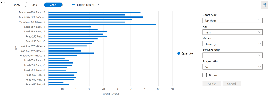
- In the results section beneath the cell, change the View option from Table to Chart.
- Use the View options button at the top right of the chart to display the options pane for the chart. Then set the options as follows and select Apply:
- Chart type: Bar chart
- Key: Item
- Values: Quantity
- Series Group: leave blank
- Aggregation: Sum
- Stacked: Unselected
-
Verify that the chart looks similar to this:
Get started with matplotlib
-
Add a new code cell to the notebook, and enter the following code in it:
sqlQuery = "SELECT CAST(YEAR(OrderDate) AS CHAR(4)) AS OrderYear, \ SUM((UnitPrice * Quantity) + Tax) AS GrossRevenue \ FROM salesorders \ GROUP BY CAST(YEAR(OrderDate) AS CHAR(4)) \ ORDER BY OrderYear" df_spark = spark.sql(sqlQuery) df_spark.show() -
Run the code and observe that it returns a Spark dataframe containing the yearly revenue.
To visualize the data as a chart, we’ll start by using the matplotlib Python library. This library is the core plotting library on which many others are based, and provides a great deal of flexibility in creating charts.
-
Add a new code cell to the notebook, and add the following code to it:
from matplotlib import pyplot as plt # matplotlib requires a Pandas dataframe, not a Spark one df_sales = df_spark.toPandas() # Create a bar plot of revenue by year plt.bar(x=df_sales['OrderYear'], height=df_sales['GrossRevenue']) # Display the plot plt.show() - Run the cell and review the results, which consist of a column chart with the total gross revenue for each year. Note the following features of the code used to produce this chart:
- The matplotlib library requires a Pandas dataframe, so you need to convert the Spark dataframe returned by the Spark SQL query to this format.
- At the core of the matplotlib library is the pyplot object. This is the foundation for most plotting functionality.
- The default settings result in a usable chart, but there’s considerable scope to customize it
-
Modify the code to plot the chart as follows:
# Clear the plot area plt.clf() # Create a bar plot of revenue by year plt.bar(x=df_sales['OrderYear'], height=df_sales['GrossRevenue'], color='orange') # Customize the chart plt.title('Revenue by Year') plt.xlabel('Year') plt.ylabel('Revenue') plt.grid(color='#95a5a6', linestyle='--', linewidth=2, axis='y', alpha=0.7) plt.xticks(rotation=45) # Show the figure plt.show() -
Re-run the code cell and view the results. The chart now includes a little more information.
A plot is technically contained with a Figure. In the previous examples, the figure was created implicitly for you; but you can create it explicitly.
-
Modify the code to plot the chart as follows:
# Clear the plot area plt.clf() # Create a Figure fig = plt.figure(figsize=(8,3)) # Create a bar plot of revenue by year plt.bar(x=df_sales['OrderYear'], height=df_sales['GrossRevenue'], color='orange') # Customize the chart plt.title('Revenue by Year') plt.xlabel('Year') plt.ylabel('Revenue') plt.grid(color='#95a5a6', linestyle='--', linewidth=2, axis='y', alpha=0.7) plt.xticks(rotation=45) # Show the figure plt.show() -
Re-run the code cell and view the results. The figure determines the shape and size of the plot.
A figure can contain multiple subplots, each on its own axis.
-
Modify the code to plot the chart as follows:
# Clear the plot area plt.clf() # Create a figure for 2 subplots (1 row, 2 columns) fig, ax = plt.subplots(1, 2, figsize = (10,4)) # Create a bar plot of revenue by year on the first axis ax[0].bar(x=df_sales['OrderYear'], height=df_sales['GrossRevenue'], color='orange') ax[0].set_title('Revenue by Year') # Create a pie chart of yearly order counts on the second axis yearly_counts = df_sales['OrderYear'].value_counts() ax[1].pie(yearly_counts) ax[1].set_title('Orders per Year') ax[1].legend(yearly_counts.keys().tolist()) # Add a title to the Figure fig.suptitle('Sales Data') # Show the figure plt.show() - Re-run the code cell and view the results. The figure contains the subplots specified in the code.
Note: To learn more about plotting with matplotlib, see the matplotlib documentation.
Use the seaborn library
While matplotlib enables you to create complex charts of multiple types, it can require some complex code to achieve the best results. For this reason, over the years, many new libraries have been built on the base of matplotlib to abstract its complexity and enhance its capabilities. One such library is seaborn.
-
Add a new code cell to the notebook, and enter the following code in it:
import seaborn as sns # Clear the plot area plt.clf() # Create a bar chart ax = sns.barplot(x="OrderYear", y="GrossRevenue", data=df_sales) plt.show() - Run the code and observe that it displays a bar chart using the seaborn library.
-
Add a new code cell to the notebook, and enter the following code in it:
# Clear the plot area plt.clf() # Set the visual theme for seaborn sns.set_theme(style="whitegrid") # Create a bar chart ax = sns.barplot(x="OrderYear", y="GrossRevenue", data=df_sales) plt.show() -
Run the code and note that seaborn enables you to set a consistent color theme for your plots.
-
Add a new code cell to the notebook, and enter the following code in it:
# Clear the plot area plt.clf() # Create a bar chart ax = sns.lineplot(x="OrderYear", y="GrossRevenue", data=df_sales) plt.show() - Run the code to view the yearly revenue as a line chart.
Note: To learn more about plotting with seaborn, see the seaborn documentation.
Delete Azure resources
If you’ve finished exploring Azure Synapse Analytics, you should delete the resources you’ve created to avoid unnecessary Azure costs.
- Close the Synapse Studio browser tab and return to the Azure portal.
- On the Azure portal, on the Home page, select Resource groups.
- Select the dp500-xxxxxxx resource group for your Synapse Analytics workspace (not the managed resource group), and verify that it contains the Synapse workspace, storage account, and Spark pool for your workspace.
- At the top of the Overview page for your resource group, select Delete resource group.
-
Enter the dp500-xxxxxxx resource group name to confirm you want to delete it, and select Delete.
After a few minutes, your Azure Synapse workspace resource group and the managed workspace resource group associated with it will be deleted.